DALL·E and ChatGPT Image: Full Guide, Differences, Prices and Uses
Understanding the real difference between DALL·E, DALL·E 3 and ChatGPT Image, with a field workflow, real limits, costs, a Midjourney comparison, and methods for a credible render.
DALL·E and ChatGPT Image: Full Guide, Differences, Prices and Uses
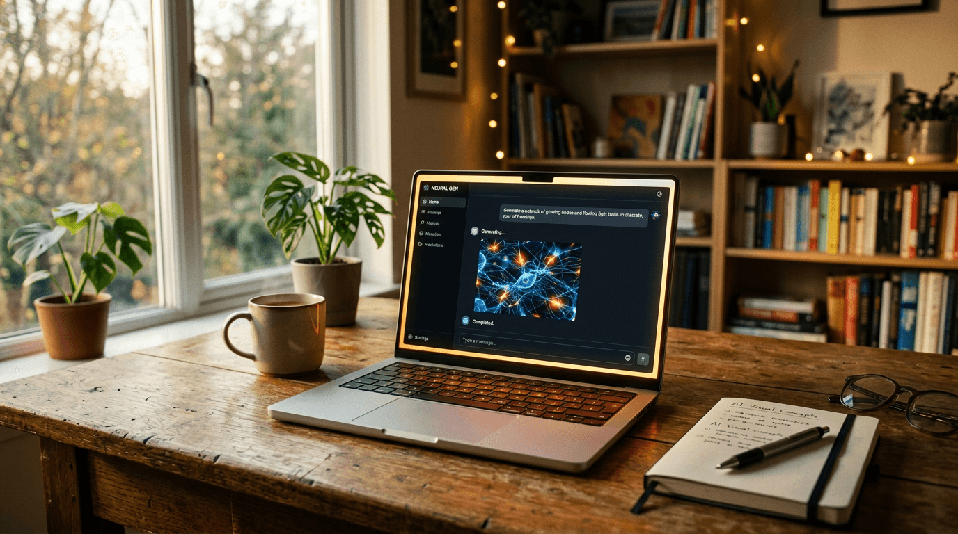
You open ChatGPT, you ask for an image, and you get a clean visual but not really alive. Too smooth. Too advertising. Not embodied enough. You tell yourself it is "normal for AI". No. The truth is that most beginners use chatgpt image as a magic button, with no clear visual direction. I have been there on campaigns where the client wanted "credible cinema" and not an artificial stock render. If you want solid images in 2026, you need a method, not a decorative prompt.
The goal of this guide is simple: to explain to you exactly the difference between dall·e 3, dall-e, dall e, dalle, dall.e and the current generation experience in ChatGPT, then to give you an actionable workflow you can use tonight. We will talk price, free access, real quality, comparison with Midjourney, business use cases, mistakes that break a render, and direction settings that truly change the game.
DALL·E, DALL·E 3 and ChatGPT Image: what is the difference?
The confusion comes from the vocabulary. When people say DALL·E, they sometimes mean the historical model, sometimes dall·e 3, and sometimes the "generate an image" experience in ChatGPT. In 2026 user practice, you mostly interact with a conversational interface that drives the image engine in the background. You do not always manipulate the raw parameters as in certain specialized interfaces.
chatgpt image brings an enormous advantage for beginners: you can iterate in natural language, asking for progressive corrections without reformulating your whole prompt from scratch. It is more educational than rigid commands. You can say "make the light more lateral", then "avoid the plastic skin effect", then "keep the framing but add light haze". This dialogue logic is very powerful for learning art direction.
But here is what many forget: a conversational interface does not erase the laws of the image. If your scene has no clear intention, the model compensates with visual clichés. You get something clean, but interchangeable. That is exactly what kills advertising or narrative renders. You always have to specify the subject, action, lighting mood, material texture, and realism constraint.
I have seen teams lose entire days believing that "DALL·E is worse than X". In reality, their prompts were vague. As soon as we set a strict direction, the results became usable. The best question is not "which tool is the strongest", but "which method gives me consistent images in series with a reasonable iteration time".
How to generate an image with ChatGPT
The most reliable beginner workflow holds in four steps. Step 1: narrative intention in one sentence. Step 2: structured initial prompt. Step 3: targeted iterations. Step 4: multi-screen validation. If you skip a step, you compensate with random regenerations, and you pay in time what you save in rigor.
Start by writing this sentence: "In three seconds, the viewer must believe that…". Example: "In three seconds, the viewer must believe that a site foreman is ending an exhausting day under a light rain." This sentence forces you to choose a visual reality. It eliminates the empty prompt of the "ultra realistic masterpiece" type.
Then, move to the structured prompt:
- Subject and precise action.
- Framing and viewing angle.
- Main and secondary light.
- Materials and imperfections.
- Targeted negative constraints.
Concrete example:
Construction worker 38 years old, soaked jacket, tired gaze, chest shot at eye level, cold end-of-day light with a weak warm bounce, visible drops on the fabric, natural skin with fine pores, realistic urban mood, avoid smoothed skin, avoid aggressive HDR, avoid CGI render.
After the first generation, do not open ten directions in parallel. Choose one direction, then correct one variable at a time. "Keep everything, increase the diffusion of the backlight by 20%." Then "keep everything, reduce the overall saturation by 10%." This discipline gives you a readable progression. It is exactly what I use when I have to output a consistent series in production.
💡 Frank's Cut: send your best variants to your smartphone before validating. If the image falls flat as a thumbnail, it is not ready, even if it seems "wow" on a big screen.
Free DALL·E: what you can do
The query dall-e free is legitimate, especially when you start with no budget. The problem is that the notion of free access depends on the offers, the quotas, and the periods. What is true one month can change the next. The good practice is to check the official information and to build a learning plan that does not depend on a fragile assumption.
What you can do for free or almost free, depending on the access contexts, is mostly to learn visual grammar. You can train your eye on composition, light, and material consistency. This phase is precious. But if you want to produce for clients, you need a stable cadence, so a predictable paid framework.
Never calculate your cost by the number of images generated. Calculate it by the number of truly usable images. It is an enormous mental shift. A session of 60 disordered attempts costs more than a session of 15 directed attempts. The real cost of an AI tool is the time lost from a lack of method.
If your budget is tight, combine the tools intelligently: initial generation on the tool that helps you clarify your intention, then finishing on the platform that gives you the best consistency for your use case. It is not "cheating", it is a pipeline. Pros reason in a value chain, not in a war of factions.
To structure your learning without wasting credits, also lean on our method to fix a prompt that does not work.
The real quality of DALL·E today
The real quality of DALL·E is better than what quick comments say, but less magical than what viral demos sell. It is capable of producing clean, readable visuals, often very useful in the concept phase. Where it breaks is when you demand a subtle narrative realism with many micro-consistencies.
In advertising or storytelling, the defects that betray AI are rarely "gross". They are details: texture too uniform, inconsistent reflections, light transitions too perfect, frozen facial expressions. To correct that, you have to talk in real-world cues. Add traces of use, material variations, and constraints on sharpness.
I had a concrete case on a food campaign: the generated images were "beautiful", but the sauce shone like plastic. We fixed it by explicitly asking for an imperfect viscosity, fine splashes, and a less specular side light. The result became credible without changing the concept. It is the proof that the level depends on the precision of the brief.
To follow the updates on the OpenAI side and the product terms, regularly check the official OpenAI page. You will avoid the obsolete information still circulating about old model behaviors.
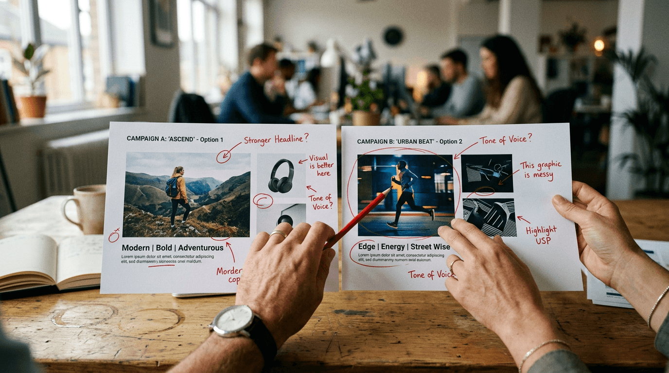
DALL·E vs Midjourney
The dall·e vs midjourney comparison is useful, but only if you compare complete workflows. Midjourney is often formidable for immediate visual impact and a strong stylized signature. ChatGPT Image shines through iterative conversation and accessibility for beginners who want to correct progressively with no heavy technical language.
If your goal is to prototype ideas fast with natural textual back-and-forth, ChatGPT Image is formidably practical. If your goal is a very marked aesthetic and aggressive style experimentation, Midjourney can take the lead on certain subjects. But it is not an absolute rule. The final level depends on iteration discipline.
In a pro environment, I often advise this logic: use ChatGPT Image to frame the narrative direction and stabilize the visual brief. Then compare a Midjourney pass on the key shots where the artistic signature must be stronger. You then choose based on the real render, not on the tool's reputation.
If you want to go deeper on this comparison logic in real conditions, read our field feedback Midjourney vs DALL·E for concept art. The important point is not "who wins", but "in which production context".
| Criterion | ChatGPT Image / DALL·E | Midjourney |
|---|---|---|
| Beginner onboarding | very accessible via conversation | simple, but demands prompt discipline |
| Guided iteration | excellent in natural dialogue | very good, more oriented toward commands/variations |
| Instant style | clean, versatile | frequent strong stylistic impact |
| Series consistency | good with a strict method | very good with a well-managed style reference |
| Non-technical team use | practical for fast collaboration | effective if the pipeline is already established |
For research data and comparative usage trends, a pass through Google Trends can also help you see the evolution of queries in your market.
For which uses ChatGPT Image is the most practical
chatgpt image is particularly powerful for three families of use. First family: creative pre-production. You can explore visual directions quickly with simple textual feedback. Second family: fast marketing content where clarity takes priority over extreme experimentation. Third family: teaching and beginner support thanks to the continuous conversation.
For solo creators, it is a good speed tool when you have to go from idea to visual without opening a complex stack. You can chain brainstorming, generation, correction, then the publication text in the same environment. This continuity hugely reduces mental friction. You stay focused on the intention.
In a team, it is useful for aligning marketing, design, and content. Instead of discussing a direction abstractly, you show concrete variants and you collect precise feedback. The gain is not just visual. It is organizational. Decisions arrive earlier, and the back-and-forth becomes smarter.
If your goal is to industrialize a style without falling into monotony, I also recommend our complete guide on character consistency from one image to another. It is one of the points that separates amateur accounts from truly credible productions.
The Trench Workflow: my field method step by step
When I train beginners, I give them a simple protocol that comes directly from creative sets. Step A: define the visual promise. Step B: build a skeleton prompt. Step C: run a 4-image test. Step D: objectively score each image. Step E: iterate on a single variable. Step F: validate in the final use context.
Scenario 1, premium e-commerce. You have to sell a watch with no plastic effect. Base prompt: realistic brushed steel material, controlled reflection, sober background, soft side light, no artificial glow. First test: beautiful image, but reflections too perfect. Correction: "keep everything, add realistic micro scratches and a subtle reflection variation on the strap". Result: credibility multiplied.
Scenario 2, local restaurant campaign. Goal: chef portrait in action, not a frozen studio. First attempt: too "clean advertising". Correction: "keep the framing, add irregular steam, visible flour on the sleeve, less aggressive local contrast". Second attempt: more living texture. Third attempt: "reduce red saturation 8%, keep the overall warmth". You finally get an image that breathes.
Scenario 3, startup editorial visual. You want to avoid the "smiling person in front of a laptop" archetype. Start with a concrete action: taking notes on a wall, morning light, controlled chaos on a desk. Add an authenticity constraint: no perfect corporate staging. The render immediately becomes more credible, more narrative, and therefore more memorable.
The secret of this workflow is not a hidden setting. It is disciplined repetition. Beginners want to gain quality without changing their method. Impossible. If you want pro, you have to decide like a pro: hypothesis, test, observation, correction. This loop is your best accelerator.
Troubleshooting - What Beginners Break
Mistake 1: prompts too vague. "Make a beautiful modern image" means nothing to a model. It fills in with clichés. The fix: write observable elements. Who? Doing what? Where? With what light? What materials? When you name these parameters, the errors decrease immediately.
Mistake 2: correcting everything at once. You modify the subject, mood, style and framing in a single request. Result: impossible to diagnose. Correct one variable at a time. If the image improves, you know why. If it degrades, you easily go back to the previous state. It is silly, but it is the basis of fast progress.
Mistake 3: chasing the "wow" before the readability. An image saturated with effects can impress, but miss its marketing goal. Always ask the question: "Is the message understood in 2 seconds?" If not, you have a decorative image, not a useful one.
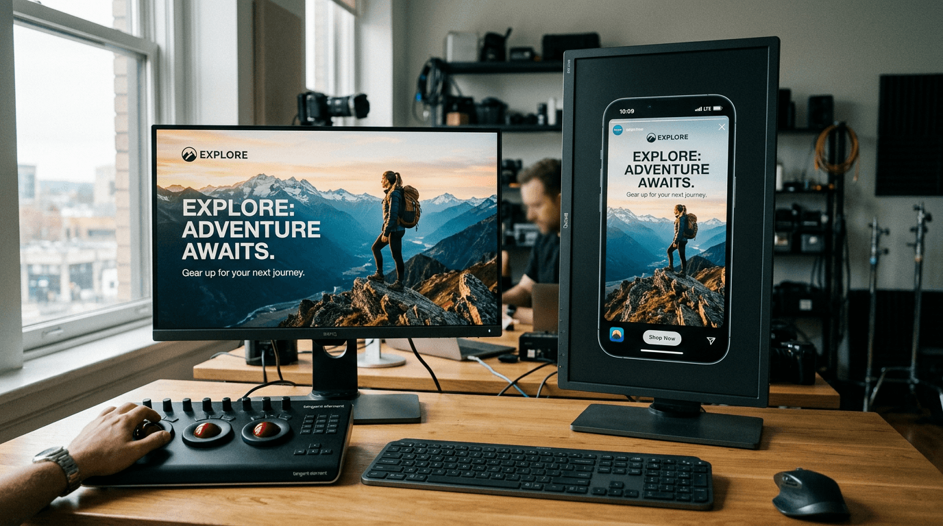
Mistake 4: forgetting the distribution context. A creative for social thumbnails does not have the same priorities as a print visual. Test systematically on mobile. Many "premium" images become confusing as soon as they are reduced.
Mistake 5: dependence on public prompt templates. They are useful for learning, dangerous for producing. You end up with the same style as everyone else. Keep the structure, but inject your world, your context, your material, your narrative. That is where your content becomes recognizable.
Mistake 6: neglecting light post-correction. Even a good generation can gain enormously with a subtle retouch: tonal balancing, reduction of an aggressive contrast, local tint adjustment. The goal is not to "cheat", it is to finalize a clean deliverable.
Core Concepts nobody explains enough
The first key concept is the difference between "beautiful" and "credible". An image can be visually appealing but narratively false. In commercial work, that is fatal. The viewer does not formulate the problem, but they feel it. So you have to work on plausibility, not only aesthetics.
The second concept is visual hierarchy. If everything is sharp, shiny and contrasted, nothing is important. A strong image guides the eye. You decide where the reading starts, where it continues, and where it ends. It is staging, not decoration.
The third concept is material consistency. Skin, fabric, metal, steam do not react the same to light. When you ask for "cinematic" without specifying the materials, the engine improvises and often falls into artificial standardization. Naming the materials radically changes the result.
The fourth concept is the use intention. An image for a landing page, an image for a social post, and an image for an investor pitch do not have the same role. Before generating, define the channel, the format, and the main message. You will avoid the "pretty but useless" renders.
The fifth concept is project memory. Keep a minimal log: prompt, corrections, final decision. Without a history, you repeat the same mistakes. With a history, you build a transmissible method, useful if you work in a team or if you have to redo a series a month later.
FAQ (PAA Optimization)
-
What is the concrete difference between DALL·E 3 and ChatGPT Image for a beginner? For a beginner, the most visible difference is the use experience. ChatGPT Image lets you iterate in natural conversation, which makes corrections more intuitive. You can ask for progressive adjustments without rebuilding your prompt entirely each time. DALL·E 3, as a model, remains the technological base of generation in many contexts, but the conversational interface changes the way of working. In practice, what matters is your ability to guide the image precisely. With no method, even the best engine will produce generic, hard-to-use renders.
-
Can you create truly professional visuals with chatgpt image? Yes, it is possible, but not in "one miracle prompt" mode. A professional result comes from a process: clear intention, structured prompt, controlled iteration, multi-screen validation, and a light retouch if necessary. Many beginners fail because they aim for the spectacular before visual consistency. In a real context, a pro image has to hold up in its distribution channel, tell something quickly, and avoid the defects that betray AI. When you apply a strict control grid, ChatGPT Image becomes a very solid tool for commercial content.
-
Is DALL-E free enough to learn seriously? To learn the fundamentals, free or limited access can be enough at the start, because the essential thing is to understand the visual logic and the formulation of prompts. You can progress fast by analyzing what truly improves the credibility of an image. On the other hand, to produce regularly, free access is often too unstable. The quotas or terms can evolve, which breaks your rhythm. The most important thing is to reason in cost per usable image. A disciplined method reduces waste, even with a modest budget.
-
How do I avoid the plastic effect frequent in generated images? The plastic effect often comes from a mix of instructions that are too generic and artificial contrasts. To avoid it, describe precise materials, impose targeted negative constraints, and ask for physically plausible light. Specify for example a consistent main source and a discreet secondary one. Also avoid "ultra sharp" or "hyper detailed" formulations everywhere, because they can stiffen the texture. Then check the render on mobile and at real size. The defects of skin, reflections and micro-contrast appear very fast in those two complementary contexts.
-
Should you choose DALL·E or Midjourney when starting from scratch? If you are starting, first choose the tool that lets you understand the relationship between intention and result the fastest. ChatGPT Image is often more accessible thanks to the natural dialogue. Midjourney can offer a strong visual signature very quickly, but also demands a discipline of formulation and sorting. The best choice depends on your immediate goal: guided learning, marketing prototyping, or advanced stylistic exploration. In all cases, the method stays the priority. With a bad method, you will waste time on any platform.
-
Which business uses are the most relevant for ChatGPT Image? The most effective uses are pre-production visuals, fast marketing creatives, A/B variants, and editorial illustration images when speed matters. It is also excellent for aligning a non-technical team, because everyone can propose adjustments in simple language. Where you have to be vigilant is on series consistency and the final quality of materials, especially for premium campaigns. With a clear validation routine, ChatGPT Image becomes a very good lever for creative productivity and decision-making.
-
How do I build a durable workflow without drowning in iterations? Set a fixed framework. An intention written in one sentence, a structured base prompt, a limited initial test, then a single modified variable per cycle. Add a quick score per image with a few stable criteria, then decide. This system prevents you from going in circles and gives you measurable progress. Archive the useful attempts with a short comment to capitalize. A durable workflow is not complicated. It is just rigorous. It is that rigor that turns a motivated beginner into a creative able to regularly deliver credible visuals.
Quality never comes from a tool alone. It comes from an eye, a method and a repeated standard. You can start simple, but start rigorous.