Creating AI Advertising Product Packshots That Hold Up in Post
A debrief-to-export packshot workflow to produce clean, believable product shots with AI.
The client sends you a bottle. You generate a "premium" packshot. The glass melts, the label is unreadable, the reflection shows a ghost landscape. Four hours of masks in post.
AI advertising product packshots are technical shots: product readability, material fidelity, integration in post with no debt. Here is the debrief-to-export workflow I use in an agency. Not a tutorial to make it "pretty". A protocol to deliver a shot the motion designer can cut out without swearing.
What an AI packshot must guarantee before any creative effect
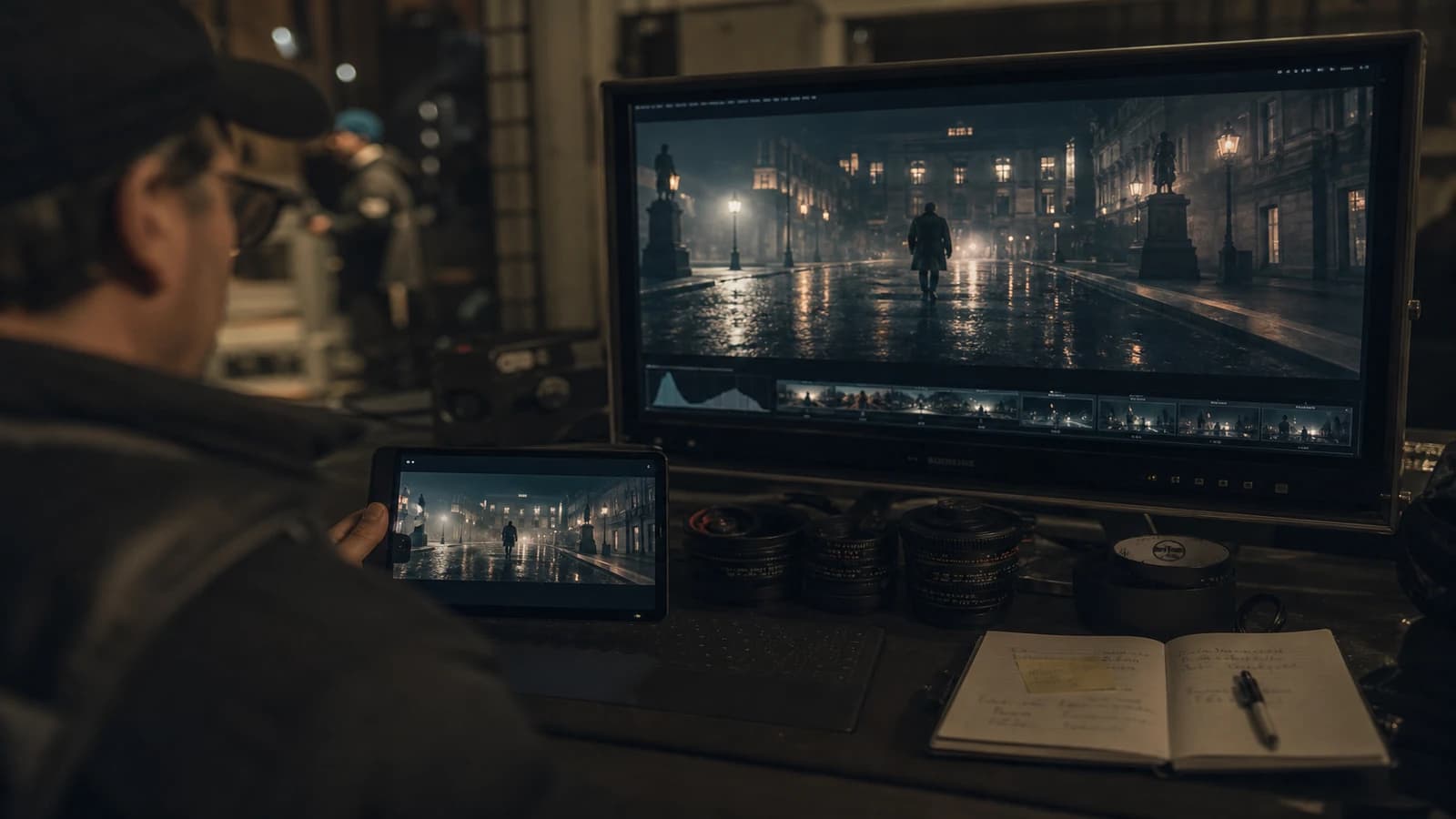
An advertising packshot is not an artistic still life. It is a technical asset. The designer must read the logo. The colorist must isolate the product with no halo. The editor must be able to move it onto an animated background without the glass starting to breathe.
Label readability comes first. If the text is gibberish, you lose the campaign. Strategies: photograph the real product and inject it in image-to-image, generate a bottle with no text then composite the label in post, or use an angle where the text face is partially off-frame but the branding stays recognizable by shape and color.
Material fidelity distinguishes glass from plastic, brushed metal from mirror chrome. AI loves cheap chrome. For advertising, you want controlled reflections: one or two visible soft sources, not a whole environment in the bottle.
Post integration requires clean edges, a believable contact shadow, a separable background. If you know from the brief that the packshot will go on an animated gradient, generate on a solid or neutral green/gray background. Do not fix in masking what you could have simplified in the prompt.
| Packshot criterion | Acceptable ad threshold | Action if it fails |
|---|---|---|
| Label text | Logo and name readable | Composite the real label |
| Glass reflections | 1 to 2 sources, no ghost set | Change angle or neutral background |
| Geometry | No label/bottle fusion | Img2img from a product photo |
| Contact shadow | Soft, anchored to the ground | Add in post, no floating |
| Product color | Reasonable Delta E vs sample | Grade on the client swatch |
For shiny surfaces in motion, complete with avoiding glass and metal artifacts in AI video. For skin and material texture in general, see how to generate photorealistic AI images without the plastic look.
Debrief-to-export workflow
Step 1: a fifteen-minute product debrief
Collect: a photo of the real product from several angles, the vector logo file, the pantone or hex of the packaging colors, legal constraints (claims, pictograms). Note the hero angle: the face the ad will show the most. Note the materials: thick glass, brushed aluminum cap, matte stopper. If the client only has the physical product, you shoot a clean phone session with window light. That photo becomes your shape reference.
Step 2: choose the generation strategy
Three paths. Pure text: fast, risky on the text and the geometry. Image-to-image from a product photo: better shape, you control the deformation weight. Hybrid: generation of the bottle with no label plus a graphic composite. In an agency, the hybrid wins on cosmetics and premium drinks.
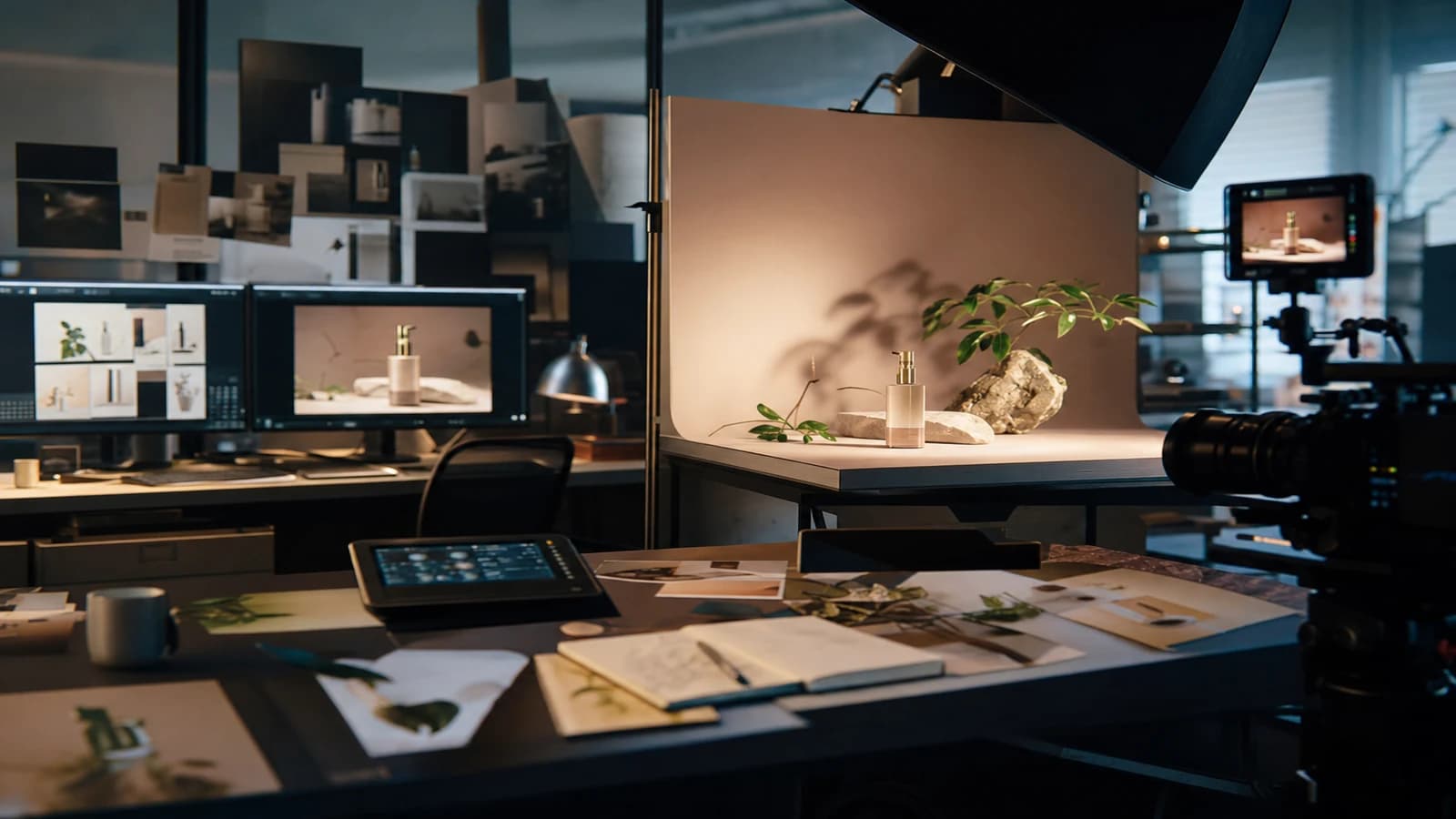
Step 3: lock the boring studio light
A large key, a soft gradient or neutral gray background, no complex set in the reflections. Typical prompt: "product photography, cosmetic bottle on seamless grey, softbox reflection, 85mm, f/8 look, label sharp, no environment in glass". Boring lighting is a compliment in packshot. The creative adds the drama in post or in layout.
Step 4: short batch and ruthless sorting
Four to six variations, same framing, same focal length. ABC sort: A usable as is, B recoverable with a light mask, C rejected. On a packshot, a reflection showing an impossible window is enough to classify it C. Do not "save" a B with three hours of clone stamp unless the client pays for the pick-up.
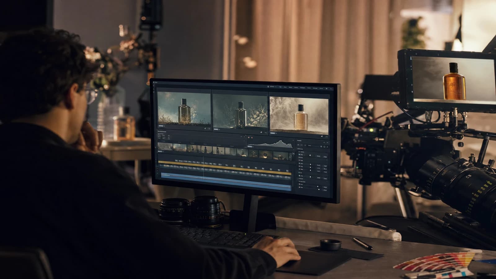
Step 5: technical, not creative, post
Clean cut-out (a penned mask or AI matte with a manual touch-up on the glass edges). Contact shadow on a separate layer. Color correction toward the client swatch. Sharpen only the label if needed, never the glass which reveals the noise. Export PSD or 16-bit PNG if motion takes the file.
Step 6: delivery QA
Check at 100 percent and 400 percent zoom on the glass edges. Check on a white background and a black background. Send a preview on the final layout if possible. The packshot that floats on a purple gradient reveals the halos the studio gray hid.
Scenario A: perfume bottle, thick glass, 24h deadline
An iPhone photo of the product under a window. Img2img Flux at moderate weight. Six variations, gray background, 85mm. One A variation. Label slightly blurry: composite of the vector logo in perspective in Photoshop. PNG plus PSD delivery. The motion client animates the bottle on a gold background. Zero forest reflection.
Scenario B: drink can, mandatory text
Pure text generation fails on the logo. Hybrid workflow: a can with no text generated in img2img from a flat photo. An approximate dewrap or a manual placement of the client artwork. Angle variation by a light 3D rotation in post rather than a full regeneration. Color consistency via the brand red swatch.
Scenario C: cosmetic hands plus product
The product alone is clean. The hand holding it deforms the bottle. You separate: a validated product-only packshot, then inserting a product in an actor's hand without artifacts as a composite. Do not ask the model to hold the perfect bottle in one pass if the hand-object geometry is the weak point.
Field troubleshooting
Glass that melts between two video frames. Animated packshot: short clips, minimal movement, neutral background. If the rotation is mandatory, consider a real 3D rotation of the cut-out PNG rather than a full generative AI video.
Unreadable label. Do not insist on pure text. Composite. It is the ad standard, not a cheat.
Landscape reflection in the bottle. Reduce the visible reflective surface. Tilt the product. A solid softbox background. See the glass and metal reflections guide.
Product color that drifts. Grade on a physical sample under D65. Not on a non-calibrated screen. Document the chain for the client.
Floating shadow. A drawn or generated contact shadow on a layer, Gaussian blur proportional to the product height. A hard shadow with no transition equals a collage look.
Client wants "more premium". Often they want more contrast and fewer parasitic reflections, not more glow. Raise the clarity on the label, darken the background, keep a single highlight on the glass.
Grouped product (a set of three bottles). The multiple geometry fuses the glasses. Fix: generate each bottle alone, composite in post with consistent shadows. Do not ask the model to hold three perfect shapes in one pass.
Cap and body of different colors. Two materials, two finishes. Fix: a prompt that names each zone or inpaint the cap after generating the body. A single material in the prompt gives a cheap monochrome bottle.
Agency deliverables: what motion really expects
The motion designer does not only want a pretty PNG. They want a file they can animate without redoing the geometry. Deliver the cut-out product in high resolution, the shadow on a separate layer, the label as a smart object if it was composited, and a client-validated color reference file. Add a capture of the pantone swatch next to the final render so nobody "corrects" the brand hue by adding a creative LUT on top.
If the packshot goes into a print layout, also export a CMYK version or leave the file in 16-bit RGB with a documented profile. AI generates in RGB. A badly managed conversion kills the packaging reds. Warn the designer.
For multi-format campaigns, generate a square or horizontal master with reframing margin. The 9:16 vertical must not crop into the logo. Anticipate on the packshot board: a safe zone around the product. You will save an hour per social network variant.
The AI packshot quote must include the time for label compositing and zoom QA. If you bill like a classic still photo without these lines, you lose money on each glass bottle. Be transparent with the client: the AI plus retouch hybrid is the standard, not the exception.
💡 Frank's Cut: photograph the real product in addition to the AI. Image-to-image with a product ref beats the pure text prompt on shapes. Always keep a photo under window light in the client folder. It saves you when the brief changes angle at noon.
The Adobe documentation on color management for advertising helps calibrate the exports. For product lighting standards, the Broncolor resources on studio light stay a concrete reference, even when the "camera" is a model.
FAQ
Foire aux questions
Réponses rapides aux questions les plus fréquentes sur cet article.
Can I make a 100 percent AI ad packshot with no product photo?
Sometimes for concepts or products not yet manufactured. For a launch campaign with real packaging, it is risky. Without a physical reference, the shape, text and color drift. Minimum viable: a smartphone photo of the prototype under diffuse light. You gain in shape and material credibility. The label composite often stays necessary for legal text. On a launch, plan a photo reshoot as soon as the physical packaging exists to replace the text zones if the client demands absolute fidelity. AI serves the sprint, photo the final lock.
What focal length for an AI product packshot?
85mm or equivalent for most bottles and boxes. Avoid the wide angle that distorts the edges and bloats the product. For small objects (jewelry, lipstick), 100 to 120mm in full-frame equivalent. Note the focal length in the prompt and keep it constant over the whole batch. Focal consistency eases the cut-out and the multi-shot composite. If you must show several products in a row, keep the same focal length and the same virtual camera distance on each still before compositing. Changing the focal length between bottles of the same range gives the impression that one is bigger than the other with no marketing intention.
Should I generate in PNG or JPG?
16-bit PNG for the intermediate delivery to motion or the designer. High-quality JPG only for client previews. The glass and the background gradients suffer JPG compression. If the product goes into a print layout, keep the master with no destructive compression.
How do I handle reflections on a transparent bottle?
A solid background, a large softbox, a slightly tilted angle to control what is reflected. One or two highlights, no detailed environment. If the brief requires a stylized reflection, add it in post on a layer rather than in generation. Generating complex reflections is the first place AI invents worlds.
The client requires the editable file: what do I deliver?
A PSD or equivalent with layers: cut-out product, shadow, possibly a separate label, an optional background. Document the fonts and the pantones. If you composited the label, deliver the smart object. The motion designer will thank you when they have to turn the bottle three degrees without redoing everything.
Static packshot or AI product video?
Static first, validated, cut out. Animation next by a 3D rotation of the PNG, by a light morph, or by a very short AI clip if the geometry holds. Do not launch a full AI rotation on a packshot not validated as a still. You multiply the glass artifacts by the number of frames.
How do I avoid the plastic effect on matte packaging?
Material keywords in the prompt: matte plastic, soft touch coating, no glossy CGI. Diffuse light, no hard specular point. In post, lower the highlights on the matte zones. Compare to the physical swatch. AI plastic shines by default. You must turn it off.
AI packshot and rights: what do I tell the client?
Document what is generated, retouched, composited from client assets. The hybrid packshot (photo shape plus AI background plus logo composite) is the agency norm. The technique does not replace the contractual frame. Archive the prompts and the versions. See also selling AI-generated images: legality for the commercial context.
Which image engine for packshots?
Flux and SDXL in img2img from a product photo often give the best results on the shape. Midjourney can serve for mood exploration, less for label fidelity. Test two engines on the same brief and compare at 200 percent zoom on the glass and the text. The winning engine becomes the standard of the client folder. Do not change midway through a campaign without revalidating the color swatch.