ChatGPT Announces Image 2: The New OpenAI Image Generator, Decoded Like a Production Brief
What the new image generation changes in ChatGPT for cinema and advertising, how to integrate it without falling back into plastic, and the field workflow to go from prompt to a credible shot.
You spend three hours polishing a prompt in a local tool, you finally get an "almost" good image, you open it on your phone, and there you see the truth: it looks like a poster, not a shot. You wonder if the next cloud model will fix that in one go, or just give you more speed to produce fake-beautiful faster.
When ChatGPT announces an Image 2 (the new generation of the integrated image engine, on the OpenAI side often tied to the evolution of GPT Image-type models in the API and to the Images experience in the app), the promise is not "more magic pixels". It is above all: less friction between your intention and the render, edits that do not break the light, and a speed that changes the game when you iterate like in an editing room.
Here we do not praise a logo. We break down what it changes for you if you deliver visuals for advertising, series, or pitch, and how you stay on the right side of credibility. For the "AI image with no catalog effect" foundation, our guide how to generate photorealistic AI images without the plastic look stays the compass. For the honest match between local stacks, also see Flux vs SDXL: which AI to choose for realistic images.
The concepts that really matter (with no marketing bullshit)
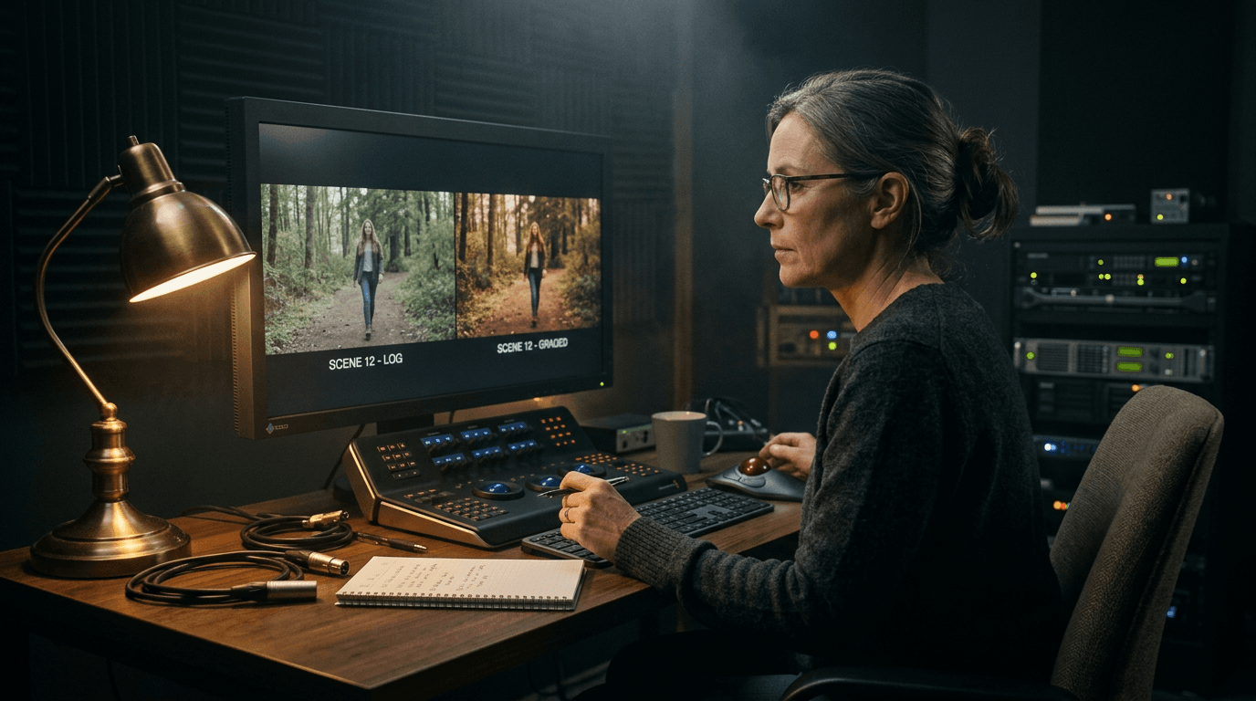
Image 2, in set language, is a generation and editing layer that lives where you already write: in the conversation. You no longer "leave" your reasoning to go to another tab, you do not rebuild a node graph at each client round. You go from a text brief to an image, then you tighten with natural-language instructions.
Technically, on the API side, OpenAI positions GPT Image models with editing and rendering capabilities that aim for fidelity to the instructions and consistency of details under successive retouches. On the ChatGPT product side, the Images experience pushes guided exploration: you can iterate as with an art director who does not talk to you in "seeds" but in intentions.
What changes for you, the creative, comes down to four levers.
Iteration speed. When an iteration takes ten seconds instead of forty, you test more variations of light and framing. Speed is not a comfort. It is image quality, because it lets you escape the first pretty result.
Editing without erasing the scene. The classic nightmare: "replace the jacket" and you lose the skin, the eyes, the background blur. The recent models insist on the preservation of the unconcerned zones. In production, that means less Photoshop cutout to repair a mistake.
Obedience to the brief. Less "pretty generic image", more respect for precise constraints: angle, lens, palette, number of characters, prop held in the hand. You go from the "vibe" to the framing.
Delivery chain. You export for an edit, an animatic storyboard, a look board. You need consistency between shots. The cloud tool becomes a starting point, not a factory that defines your style for you.
💡 Frank's Cut: keep a "visual contract" text file for each project: target ratio (16:9 for video, 2.39:1 if you simulate anamorphic), color temperature in simple words (tungsten, cloudy day), and three prohibitions (no smooth skin, no smartphone HDR, no flare everywhere). When the model slips, you resend the contract before changing the prompt.
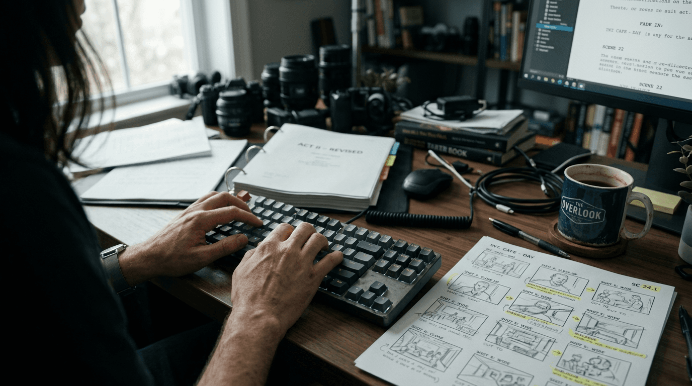
The trench workflow: from the announcement to a cinema render
You do not "test" Image 2 as a curiosity. You go through a protocol close to a small production. Here is the field version, in three scenarios, with settings expressed as you would give them to an operator.
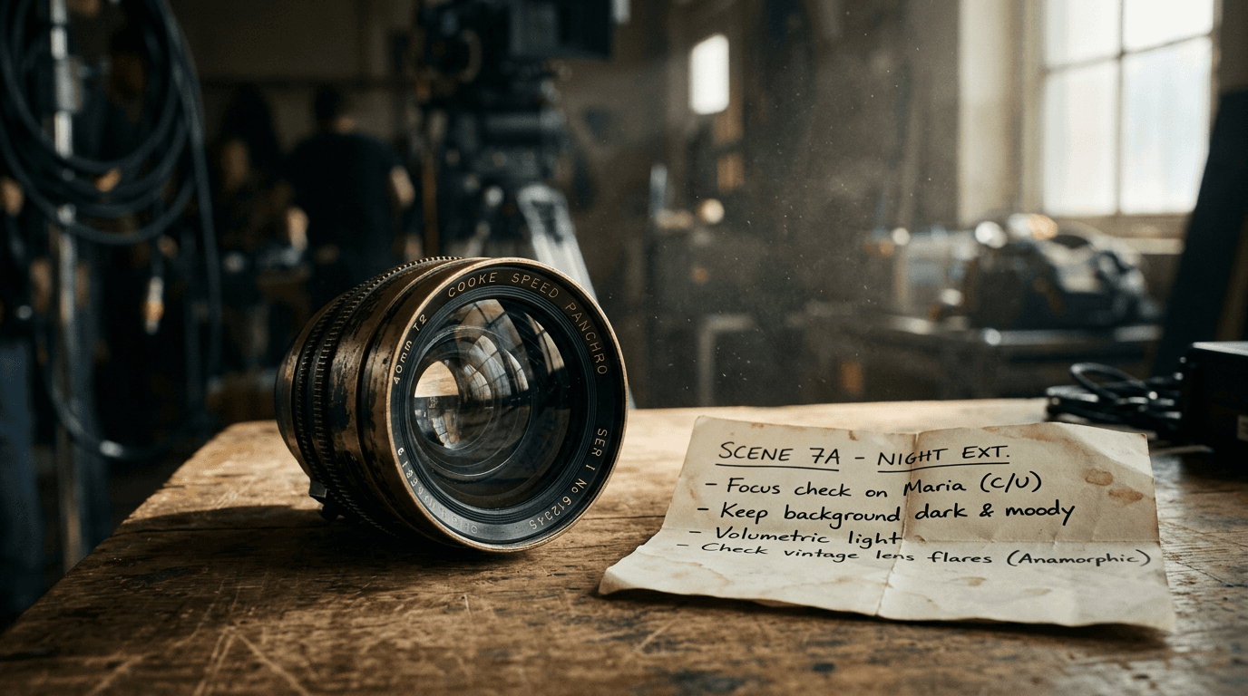
Scenario A: keyframe for a cosmetics ad (skin, texture, honesty)
Goal: a close-up that holds on screen, not a stock ad.
Step 1, locked brief. You write five lines maximum, in this order: framing (close-up, slight low angle), light (large side window, low contrast, soft shadows), material (skin with visible pores, light dew on the cheeks), lens (50mm, shallow depth of field), prohibition (no aggressive beauty retouching).
Step 2, first generation. You explicitly ask for fine grain, discreet color noise, no artificial sharpness. If the interface offers a style or an intensity, you stay on realism rather than illustration. You avoid the words that trigger plastic: "perfect", "flawless", "studio lighting" if you do not want a studio.
Step 3, surgical editing. You do not ask "redo everything". You ask: "reduce the local contrast on the cheeks", "add a micro wrinkle under the eye", "darken the background by half a stop". The good recent models understand the hierarchy: first the global light, then the texture.
Step 4, mobile check. You export, you look at it on a phone at real size. If it looks like a poster, you add grain and lower the saturation of the reds.
Scenario B: wide interior shot (depth, geometry, readability)
Goal: a living room or an office that breathes, with clear vanishing lines to prepare a tracking shot or an image-to-video transition.
Step 1, spatial anchoring. You name three planes: foreground (object), mid-ground (character), background (window or wall). You ask for a realistic depth of field: not everything sharp from foreground to infinity unless you simulate a very closed lens.
Step 2, motivated light. You choose a source: floor lamp, kitchen neon, daylight with a half-open curtain. You forbid rim lights everywhere if you want to avoid the "three textbook points" AI look.
Step 3, iteration by layers. You first correct the architecture (vanishing lines, parallels), then the objects, finally the color. If you mix everything, the model "smooths" to please.
To move toward a credible AI film, our complete workflow to go from an idea to a realistic AI film holds your hand on the continuity between images and movement.
Scenario C: "series" look board (phantom actor consistency)
Goal: three frames that seem to come from the same episode.
Step 1, phantom character. You define an approximate age, a haircut, a jacket, a visible scar or piece of jewelry. You repeat these terms identically between images. You do not introduce useless synonyms that break the semantic seed.
Step 2, locked palette. You set two dominant colors and one shadow tint. You refuse the rainbow if your show is down to earth.
Step 3, controlled variation. You change only one parameter between images: angle, time of day, or emotion. If you change three parameters, you recreate three worlds.
Step 4, story deliverable. You name the files with scene, shot, version. You do not expect the chat to become a database. That is your job.
To structure your prompts like a photo brief, see how to write an ultra-realistic cinematic prompt for AI.
Table: cloud integrated into ChatGPT vs local workshop (Flux, SDXL)
This is not a "single winner" match. It is a choice of constraint.
| Criterion | ChatGPT Images (new generation, Image 2 type) | Local workshop (ComfyUI, Flux, SDXL) |
|---|---|---|
| Iteration speed | Very high, little friction | Variable depending on GPU, but powerful graphs |
| Fine control | Natural language, guided edits | Nodes, LoRA, ControlNet, surgical settings |
| Long consistency | Good for short series if the brief is stable | Often superior for characters locked across hundreds of frames |
| Entry cost | Subscription / API credits | GPU, config time, maintenance |
| "AI look" risk | Present if you push the generic | Present if you over-guide or over-smooth |
| Production integration | Direct export from the chat flow | File pipeline, scripts, PNG metadata |
💡 Frank's Cut: if you do advertising for a real brand, your problem is not the model, it is the proof. Document what is generated, what is retouched, and what is filmed. The day a client compares your visual to a shoot, you want the transition to hold, not the software to have won a beauty contest.
Massive troubleshooting: what beginners break (and the exact setting)
1. "It shines too much, it looks like a 2000s TV ad"
Cause: overexposure of the highlights, global contrast too pushed, saturation of the reds and oranges too high.
Fix: ask for a lower exposure, a softer rolloff on the highlights, targeted desaturation on the skin. Add grain and a light veil on the blacks. You aim for a discreet S-curve, not a poster.
2. "The hands are almost good, so it is worse"
Cause: the human brain tolerates a blurry hand, it does not tolerate an almost-correct hand.
Fix: change the framing. Sometimes the right move is not to regenerate ten times, it is to cut the hand off-frame or to ask for gloves, a long sleeve, an object that occupies the fingers. In production, we cheat too.
3. "The faces change between two images"
Cause: an unstable brief, synonyms, or edits that resample the identity.
Fix: freeze a list of traits and reuse the same sentence word for word. Avoid "beautiful", "charming", "attractive" in cascade. Prefer measurable physical signs.
4. "The background eats the subject"
Cause: poorly described depth of field, or sharpness everywhere.
Fix: impose a single sharp zone. Name the approximate distance to the subject. Add a light atmospheric haze if the scene allows it.
5. "It looks like an AI video pipeline without me asking"
Cause: words like 8K, hyper detailed, cinematic lighting with no context. That pushes clichés.
Fix: replace them with precise sources: red neon at 2 m on the left, practical at 2700K, bounce on the wall. The light becomes motivated, not "cinema" generic.
6. "The edit erased everything"
Cause: an instruction too broad, or a conflict between two simultaneous requests.
Fix: one edit at a time. Wait for the result, then chain. Name the zones: "zone A shoulder, zone B background".
7. "I cannot reach the look of my reference"
Cause: you copy words, not a structure of light.
Fix: describe the direction, the hardness, the color of the shadows, the depth. If you are working the realistic daytime part, glue that back to the motivated light vocabulary of the photo brief (same chapter as the link on cinematic prompts above).
💡 Frank's Cut: when you are stuck, make a neutral gray: ask for a desaturated version to read the geometry. If the geometry is weak, no color grading will save the image. Pros do the same with a monochrome on set.
The announcement of an Image 2 does not make you an entrepreneur. It gives you a lever. The lever turns into money when you package a method: brief, iterations, client validation, clean export.
FAQ (short answers for search)
ChatGPT Image 2, what exactly is it?
It is the new generation of the image engine integrated into ChatGPT, with better obedience to the brief, cleaner edits, and a higher iteration speed. On the developer side, OpenAI often aligns these capabilities with the GPT Image family in the API. The exact name in the interface can vary, what matters is the behavior: less friction, more control.
Does it replace Flux or SDXL locally?
No. It complements them. The cloud excels when you want to talk to the tool like an assistant. The local excels when you want to lock a character with LoRA and graph tools. To decide based on your hardware, go back to the decision grid in the body of the article (cloud vs local table above).
How do I avoid the plastic render with Image 2?
You forbid smoothness at the brief level, you add grain, skin texture, imperfections, you avoid the "perfect" adjectives, and you check on a small screen. The same detailed safety rails apply as for any engine: see the intro of this article and the grain / saturation / framing protocol.
What is the difference between generation and editing in the ChatGPT flow?
Generation starts from a broad intention. Editing transforms an existing image with precise zones and goals. You gain quality when you layer short steps rather than a giant request.
Is Image 2 suited for professional storyboarding?
Yes, as a starting point and exploration. For a studio-signed storyboard, you combine consistency (same brief), file naming, and often a retouch for the hands and the texts in the image. Think animatic board, not final storyboard with no human pass.
How do I integrate these images into an AI video without flicker?
You prepare stable frames, a stable palette, and you avoid micro face variations between shots. The transition is done in the video tool with strong references. The guiding thread: the same visual bible rules as in Scenario C above, then export to your video chain.
Is it legal to use ChatGPT Images for a commercial client?
It depends on your contract, the jurisdiction, and the terms of the service at the moment you read these lines. You have to check the usage rights, the confidentiality of the uploaded content, and the content policy. When you deliver to a third party, document the provenance and the limitations.
Which setting do I change first if the image is "too clean"?
Grain, then the curve of the highlights, then selective saturation. Cleanliness is often a problem of light and contrast, not of resolution.
You do not need Image 2 to do the moral work for you. You need it to save you time on the iteration so you stay available for what matters: direction, taste, and consistency with what you promise your audience. That is where cinema begins. All the rest is syntax.