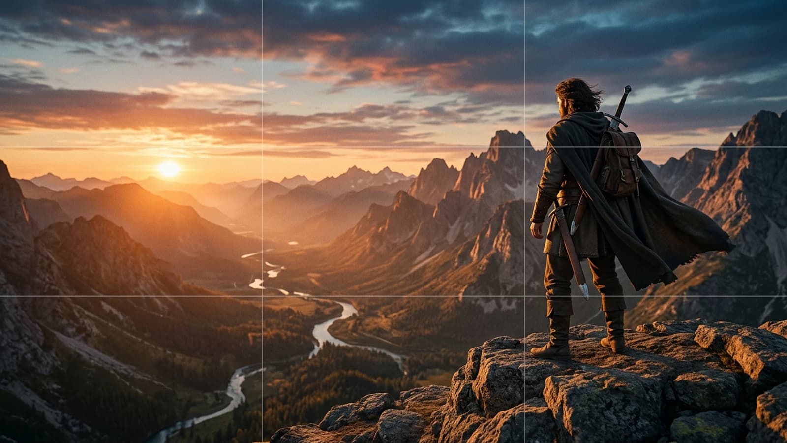
How to Use the Rule of Thirds in AI Generation
Using the rule of thirds to immediately improve readability, balance and visual impact in an AI image.
The rule of thirds, everyone cites it.
Few people really use it.
In AI generation, it is even more glaring. The model loves to recenter, smooth, balance in a clean way but with no intention. Result, beautiful image, empty image.
The rule of thirds is not a decor recipe.
It is a narration weapon.
In this guide, you are going to learn to use it like a director, not like a student who applies a rule on autopilot.
Hook, why your images seem clean but with no impact
You take a portrait, you put it in the center, you add a clean background, a correct light, a flattering grade.
It passes.
Then you compare with a real film frame.
And there, you feel the hole.
What is missing is the reading tension. A cinema image makes you travel a visual path. Your AI image gives you everything at once with no hierarchy.
The rule of thirds helps you create this path.
Core concepts, understanding the rule of thirds with no mythology
What it really is
You divide your frame into 3 columns and 3 rows.
You get 4 strong intersections.
These zones naturally attract the eye. If you place your main subject on these points, you create a more lively dynamic than a neutral centering.
What it is not
It is not "always put the face on the left corner".
It is not "centering forbidden".
It is not a religion.
It is a decision structure.
Why it is crucial in local AI
With Flux or SDXL, the models can:
- smooth the composition
- recenter the characters
- neutralize the narrative imbalances
If you do not force the composition, you get a mediocre, stable image with no tension point.
The 4 narrative uses of the thirds
- Anticipation: subject on a third, empty space in front of them.
- Isolation: subject on a third edge, large opposite void.
- Confrontation: two subjects on opposite thirds.
- Tipping: passage from the third to the center when the action explodes.
To go deeper into the staging logic around these choices, also look at how to think like a director with AI. When you move the subject onto a third, how to choose the right camera angles in AI avoids the camera heights that contradict the gaze space.
Strict prompt template
In [SCENE DESCRIPTION], add explicit thirds instructions:
- subject on left third intersection
- eye line aligned with upper third
- negative space on right third
- secondary object on lower right third
3 detailed beginner scenarios
Scenario 1, static portrait with no intention
You place the subject in the center in 90 percent of the images.
The render is clean, but the narration is dead.
Symptoms:
- no gaze trajectory
- catalog photo impression
- loss of subtle emotion
Correction:
- Move the subject's gaze toward the opposite third.
- Place the face near a high intersection.
- Leave a narrative space in front of the gaze.
- Add a discreet secondary element in the opposite third.
Scenario 2, rule of thirds applied mechanically
You place everything on the intersections, all the time.
Result, it is as monotonous as the centering.
Symptoms:
- feeling of a repeated formula
- no evolution of intention
- interchangeable shots
Correction:
- Alternate thirds and center according to the emotional state.
- Reserve the centering for moments of confrontation or blockage.
- Use the thirds for the rise, the center for the shock.
Scenario 3, overload of the "empty" third
You understood the negative space, but you fill this zone with neons, smoke, useless details.
Symptoms:
- visual competition
- eye that flutters
- involuntary tension
Correction:
- Keep the empty third really breathing.
- Allow a single readable secondary element.
- Reduce the contrast and detail of the breathing zone.
Pro insight
The void is not a lack, it is a silent sentence. In cinema, the silence often hurts more than an effect.
Ultra granular workflow, rule of thirds in real production
Step 1, define the shot intention
Key question: "What must this shot make me feel."
Write an answer of 6 to 10 words max.
Step 2, choose the thirds strategy
Options:
- left third for anticipation
- right third for escape or distance
- double third for relation
- center for frontal impact
Step 3, build the composition sentence
Example of syntax: "female lead on upper left third, looking toward right negative space, empty hallway on right third, subtle practical lamp on lower right third"
You give the model a clear grammar.
Step 4, set the local generation
Recommended base:
| Parameter | Starting value | Reason |
|---|---|---|
| Ratio | 16:9 | cinema consistency |
| Resolution | 1536x864 | good detail level |
| Steps | 30 to 40 | structure stability |
| CFG | 5 to 6.5 | precise guidance with no rigidity |
| Seed | fixed | reliable comparison |
| Denoise img2img | 0.25 to 0.4 | preserves composition |
Step 5, produce 4 controlled versions
- Clean left third
- Clean right third
- Centered control version
- Version with a double subject
You compare and you choose according to the narrative intention, not according to beauty alone.

Step 6, human reading test
Show the image for 2 seconds and ask 2 questions:
- What do you look at first.
- What do you feel.
If the answer does not match your intention, redo the composition before any other tweak.
Step 7, decline into a sequence
Practical rule:
- shot 1 third to establish
- shot 2 opposite third for tension
- shot 3 center for decision
- shot 4 third for consequence
You get a narrative movement with no overload.
Step 8, continuity control
Before the final edit:
- same gaze logic
- same dominant palette
- same detail density on the void zones
Step 9, light post
Add:
- subtle even grain
- slight reduction of digital sharpness
- local contrast on the main subject
You must feel film, not CGI render.
To connect this logic to the global structure of a sequence, move on with how to structure an AI video like a real film. If the grid seems right but the image stays soft, go through how to fix a bad visual composition before changing the model.
Massive trench warfare, what beginners do wrong
1) Applying the thirds to every shot
Mistake: mechanical rigidity.
Fix: alternate thirds and center according to the dramatic evolution.
2) Ignoring the gaze space
Mistake: character looks off-frame with no visual air.
Fix: free up space in front of the gaze.
3) Confusing void and nothingness
Mistake: void with no intention.
Fix: void oriented narratively.
4) Thirds + detail overload
Mistake: parasitic zones everywhere.
Fix: clear hierarchy, one subject, one secondary, that is all.
5) Destructive reframe in post
Mistake: breaking the composition afterward.
Fix: compose right from the generation.
6) Subject too small on the intersection
Mistake: subject lost despite the rule.
Fix: adjust the camera distance and the scale.
7) Uncontrolled horizon
Mistake: involuntary discomfort.
Fix: stable horizon except for an explicit intention.
8) Void zone too contrasted
Mistake: it attracts more than the subject.
Fix: lower the local contrast of the void.
9) Continuity forgotten between shots
Mistake: inconsistent thirds logic from one shot to the next.
Fix: sequence composition map.
10) Aesthetic-only validation
Mistake: "pretty therefore validated".
Fix: reading test and emotion test before validation.
11) No scene sheet
Mistake: permanent reinvention.
Fix: short sheet with intentions and placements.
12) Forgetting the visual consequence
Mistake: flat scene end.
Fix: the last shot must show a perceptible transformation.
Composition validation at the edit

Detailed practical case, a suspense scene in 4 shots
You want to create a 20-second scene. Character in a hallway, hears a noise, stops, decides to move forward.
Shot 1, anticipation
Subject on the left third, gaze toward the right, large void in front.
Sought effect, waiting.
Shot 2, off-frame threat
Subject on the right third this time, reverse gaze, darker background on the left.
Sought effect, slight disorientation.
Shot 3, decision
Subject almost centered, slight emotional push-in.
Sought effect, passage from doubt to action.
Shot 4, consequence
Subject from behind on the lower third, door in the background on the opposite upper third.
Sought effect, projection toward the unknown.
Why it works
You use the thirds as a dynamic language, not a fixed grid.
You alternate placements to accompany the mental state of the character.
Progression control table
| Shot | Placement | Dominant emotion | Mistake to avoid | Fix |
|---|---|---|---|---|
| 1 | left third | waiting | automatic centering | force the gaze space |
| 2 | right third | doubt | inconsistent inversion | keep the axis logic |
| 3 | slight center | decision | shock too brutal | visual transition |
| 4 | lower third | consequence | shot too decorative | reinforce the direction |
Progressive exercise, from simple to pro
Level 1, single image
Make 10 images with a single character and apply three placements, center, left third, right third. Write what each version makes you feel.
Level 2, mini sequence
Compose 4 shots keeping the same character, the same main light, the same palette. Goal, create a mini emotional progression.
Level 3, client test
Show the 4 shots to an external person and ask:
- which shot creates the most tension.
- which shot seems the most fake.
- which version makes you want to see what comes next.
You then adjust only the composition.
Control checklist before publication
- main subject readable in under one second
- thirds chosen with explicit intention
- consistent gaze space
- void zones not polluted
- logical progression of placements
- absence of involuntary recentering
If a point breaks, you fix it before upscaling or editing.
Field workshop, applying the thirds in portrait, product, and scene
To really master this rule, work on three different cases.
Case A, emotional portrait
Subject on the upper left third, gaze toward the right void zone.
Goal, make the waiting felt.
Classic trap, filling the void zone with a too-strong set.
Correction, lower the contrast and details on the void side.
Case B, narrative product shot
Object on the lower right third, human hand on the left third for relation.
Goal, avoid the cold packshot image.
Classic trap, object too centered by commercial reflex.
Correction, keep the center for the key moment, not for the whole sequence.
Case C, two-character scene
Character A on the left third, character B on the right third, gaze level aligned.
Goal, make the relation readable with no dialogue.
Classic trap, involuntary gaze height misalignment.
Correction, check the eye line before the final validation.
Progress routine
Repeat these three cases every week with a new set context. You will develop a placement instinct that becomes automatic and robust.
Fast decision guide, thirds or center
Use this mental grid:
- if the scene expresses a waiting, choose a third with space in front
- if the scene expresses a domination, choose a marked asymmetric framing
- if the scene expresses a frontal shock, come back temporarily to the center
- if the scene expresses a solitude, leave a large void opposite the subject
- if the scene expresses a relation, place the two characters on opposite thirds
The idea is not to be "creative at random". The idea is to make your choice readable and repeatable.
And above all, do not forget this simple rule, when you hesitate between beauty and readability, choose readability. A slightly less spectacular but perfectly clear image always beats a brilliant but confused image.
Make this choice for thirty days, shot after shot, and you will see your level explode, not because the tool changes, but because your eye becomes precise, demanding, and narrative.
Core addendum
What you call "rule of thirds" in a prompt is often an implicit translation of an older knowledge: place the gaze, then decide who "owns" the empty space. The classic resources that describe the rule of thirds insist on the same point: the grid serves to avoid passive centering, not to freeze a single aesthetic. On the cinema side, the American Society of Cinematographers regularly publishes framing and light analyses that show how shots decide the viewer's hierarchy. You can also lean on the BFI (British Film Institute) to feed your culture of editing and sequential reading, which avoids treating each image as an isolated poster.
In AI practice, your core addendum comes down to this: write the intention in one sentence, place the pivot on a grid node consistent with this intention, and reserve at least one zone of the frame for the visual consequence (waiting, threat, or relief). It is this chain that transforms a geometric suggestion into narration.
Troubleshooting addendum
When the grid seems respected but the image "does not take", start by distinguishing geometry and photography. A slightly unstable horizon, a too-contrasted vanishing line in the void, or a parasitic object on the edge can cancel the effect of the thirds without you realizing it. Do a "four-edges audit" pass, then a second pass on the contrast hierarchy: often the subject is mathematically on a third, but visually dominated by a reflection or a dominant texture elsewhere.
If the model recenters despite your instructions, reduce the semantic load of the prompt: fewer decorative adjectives, more placement verbs. Work in a fixed seed to isolate the composition variable, and only use img2img to correct the geometry, not to mask a fuzzy brief. As a last resort only, reframe in post, but document why, otherwise you will repeat the same mistake over the whole series.
Scenarios
Shop scenario, product on a display. You want an editorial look: place the product on the lower right third, leave an upper left third almost empty for the logo or the typo in post, and place a hand or a reflection on the opposite third to avoid the dead packshot. The trap is a too-sharp background that competes with the object.
Tense dialogue scenario, synthetic shot reverse shot. You alternate two close-ups: character A on the left third gaze toward the right, character B on the right third gaze toward the left, same eye height, same grain density. If you swap at random, the mental geography of the viewer breaks even before the edit.
Action scenario, tipping to center. You install the waiting on a third with space in front, then you break on an almost-centered shot at the moment of physical contact or revelation. With no this explicit passage, the center stays decorative instead of becoming an owned narrative shock.
FAQ
Foire aux questions
Réponses rapides aux questions les plus fréquentes sur cet article.
Is the rule of thirds mandatory in AI cinema
No, no rule is an absolute obligation, but the rule of thirds stays an effective shortcut to get out of the automatic centering that many models favor. What matters is that you use it as a reading language: a third is only "good" if the eye understands fast what is important, in what order, and with what space to breathe. If you apply it with no intention, you fall back into another flat mechanics. The adult way is therefore to master the grid to make it invisible at the right moment, then to violate it when the scene demands it, in full awareness. The goal is not obedience, it is clarity.
Should I always place the eyes on the upper third line
Not at all, this line is a frequent landmark for the portrait because it structures the space above the head, but the emotion can demand something else. A gaze lower in the frame can suggest fatigue, shame, or psychological weight, while a very high gaze can reinforce urgency or vigilance. What must stay stable is not the rule itself, it is the consistency with the character's state and the function of the shot in the sequence. You therefore validate first the global reading, then the precision of the eyes relative to the action.
What to do if the model automatically recenters my subject
Start by reformulating the composition with simple and hierarchized terms, repeating the main placement before the texture details. Set a seed to compare the real effect of each modification, and avoid accumulating three fuzzy repositionings in a single pass. If you use img2img, keep a moderate denoise so as not to erase the geometry you just gained. When the recentering persists, examine whether a word of the prompt is not implicitly pushing toward a "beautiful balanced photo" in the catalog sense. Often, removing two luxury adjectives helps more than raising the CFG endlessly.
How to use the thirds in a dialogue scene
Think geography first: each character must occupy a stable side of the imaginary space, and your shots must respect the axis so as not to flip the viewer for no reason. Then, place the gaze toward the space that belongs to the other, even if the latter is sometimes off-frame. The thirds serve to keep this continuity: a character on the left third who looks toward the right naturally prepares the reverse shot on the right third. If you swap the placements with no dramatic motif, the dialogue becomes unreadable, not because the actors are bad, but because the camera lies about the scene.
Why do my thirds images still stay bland
The spatial structure does not replace a light intention, a credible material, or a contrast hierarchy. An image can be correctly cut while staying flat if the light is uniform, if the set is too symmetric, or if two rival zones attract the eye with the same intensity. The thirds help you lay the skeleton, but you still must decide which shot carries the emotional decision, where the main line of force is, and which secondary detail supports the plot without stealing it. With no these layers, the grid becomes a simple decorative frame.
What is the best exercise to progress fast
Take a short scene and generate three strict versions of the same moment: centered, left third, right third, without changing the style or the light between them. Edit them on a single music or a single silence, then observe where your attention goes, what you feel, and what seems honest or artificial to you. Note in one sentence what each version tells, even if the text does not change. In a week of comparable repetitions, you develop a much more solid reflex than with random generations. It is the contrast between versions that forms the judgment, not the accumulation of new prompts.
Which article to follow next
Move on with how to frame an AI image like a cinema pro to lock shot scales, frame edges, and sequence consistency beyond the grid alone. You can also reread how to fix a bad visual composition if you get stuck on conflicts between subject, set, and narrative void. These two guides complete the rule of thirds without replacing it: they help you decide when the geometry must give way to the rhythm or the reverse shot.