Office Interior: Fixing the Cyan Light of AI Offices
Why AI open spaces turn blue and how to bring back a credible tungsten / window hierarchy.
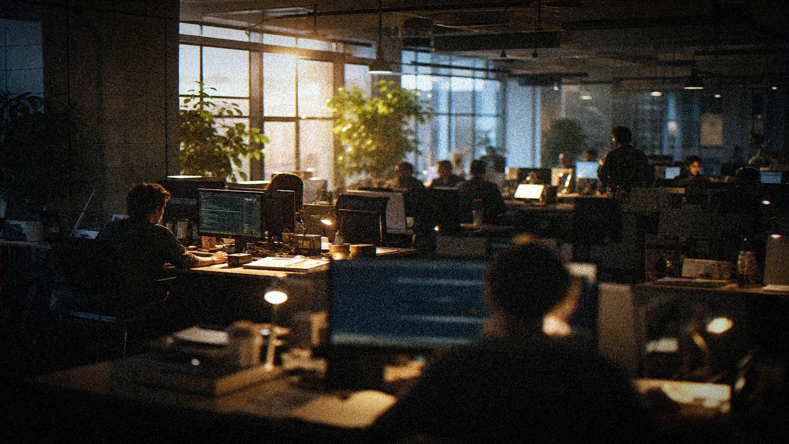
AI-generated office scenes often fall into the same trap: everything turns cyan. Cold skin, bluish walls, clinical whites, waiting-room atmosphere. The result lacks depth, human warmth and professional credibility.
It is not just a matter of taste. In a realistic office interior, the sources are mixed: window, ceiling lights, screens, table lamps. If you do not hierarchize these sources, the engine merges everything into a colored soup.
The goal here is clear: get back a credible light and a visual consistency that holds over several shots.
Why the cyan takes over
Typical causes:
-
Overexposed windows
The high zones turn blue and contaminate the shot. -
Absence of a local warm source
With no lamp or warm contrast, the engine chooses the coldness. It is a question of color temperature: you need a warm dominant to counterbalance the blue of the windows. -
Too-dominant screens
The monitors become the main light. -
Cold-contrast-oriented post-production
Curves and LUTs further accentuate the cyan.
The correction starts at the brief.
Light logic for a credible office
You must define a simple hierarchy:
- main source: window or artificial key;
- secondary source: ceiling light or lamp;
- accents: screens and small reflections.
The viewer must intuitively understand where the light comes from.
Scene preparation: 10 points to lock
- office type (open space, closed office, meeting room);
- perceived time of day;
- outdoor weather;
- type of ceiling lighting;
- presence of table lamps;
- relative window/ceiling power;
- desired color dominant;
- subject position;
- camera distance;
- final distribution format.
With no these points, you get a generic light.
Effective prompting against excessive cyan
Example:
realistic office interior, balanced daylight from windows and warm practical desk lights,
natural skin tones, neutral whites, subtle contrast, no cyan cast
The term no cyan cast helps, but only if the rest is consistent.
Office framings that better support AI
Solid
- chest shot near a practical lamp;
- medium shot with a controlled window behind;
- keyboard or notebook insert in mixed light.
Fragile
- wide shot of the whole open space with burned windows;
- fast pan over rows of screens;
- subject backlit with no fill.
Correction workflow in production
Phase 1: pilot image
Validate a frame where:
- natural skin;
- neutral whites;
- window readable with no violent clip.
Phase 2: short animation
3 to 5 seconds, minimal movement.
Phase 3: quality sorting
Reject:
- any full-cyan shot;
- blue-gray skin;
- inconsistent shadows.
Phase 4: local correction
- limit cyan in the highs;
- subtly warm the skin tones;
- protect the white papers and walls.
Phase 5: multi-shot harmonization
Align the complete scene, not just one shot.
Office light QA table
| Criterion | Question | Validation |
|---|---|---|
| Skin | Credible tone in mixed light? | Yes |
| Window | Detail still readable? | Yes |
| Whites | Neutral with no blue drift? | Yes |
| Shadows | Consistent source? | Yes |
| Screens | Accent or color pollution? | Accent |
| Continuity | Same atmosphere on all shots? | Yes |
Practical case 1: HR open-space video
Goal: show a welcoming team.
Initial failure:
- cold faces;
- cyan ceilings;
- "hospital" atmosphere.
Correction:
- addition of visible warm lamps;
- reduced window exposure;
- cyan saturation lowered locally.
Result: a living and human office.
Practical case 2: CEO interview in a closed office
Goal: calm authority.
Approach:
- soft side window key;
- warm table lamp behind;
- slightly colder background;
- neutral skin.
Mastered warm/cold contrast, with no toxic drift.
Practical case 3: glass meeting room
Risk: blue reflections everywhere.
Solutions:
- angle avoiding direct reflections;
- partially closed curtains;
- reduced screen intensity;
- selective grade on the highlights.
The shot stays corporate without being icy.
Anti-cyan grading: simple method
Recommended order:
- neutralize the global balance;
- protect the flesh tones;
- compress the high windows;
- add local warmth;
- check on mobile.
Mobile often amplifies the cold drift. Mandatory test.
Sound and office credibility
Even in an office, the sound matters:
- light ventilation;
- discreet keyboard;
- distant atmosphere;
- no absolute silence.
A credible interior always has a sonic life.
Managing brand colors
If the brand imposes a corporate blue, careful:
- keep the blue on the branding elements;
- avoid it contaminating the skin;
- separate branding and skin light.
A color charter must not kill the human credibility.
Checklist before delivery
- no global cyan dominant;
- natural skin;
- controlled windows;
- credible whites;
- continuity between shots;
- mobile test validated;
- clean sound.
Foire aux questions
Réponses rapides aux questions les plus fréquentes sur cet article.
Why do AI offices turn blue automatically?
The engines often favor a daylight/screens reading. With no explicit warm source and clear hierarchy, the cyan drift becomes dominant.
How to keep neutral whites?
Neutralize the balance before stylization and check papers/walls as a reference.
Should you avoid visible screens?
No, but they must stay accents. If they become the main source, they pollute the whole shot.
Can you fully correct in post?
Partially. If the generation is already contaminated everywhere, it is better to regenerate with a better hierarchy.
Which setup works well for office interviews?
Soft side window + warm practical lamp + slightly colder background.
How to validate quickly as a team?
Use a simple skin/whites/window/continuity grid and validate on desktop + mobile screen.
A good office shot must not look spectacular. It must look true, readable, professional, and human.
Advanced workshop: deep open space and glass walls
Open spaces with large glass walls are difficult because they mix a lot of light zones. If you try to expose everything perfectly, you lose the subject. You must accept a hierarchy:
- priority to the subject;
- background readable but secondary;
- controlled windows.
Use contrast zones:
- near subject warmer;
- middle neutral;
- background slightly cold.
This structure gives depth with no uniform blue.
Simulated multi-camera pipeline
If you generate several angles of the same scene:
- lock a color reference;
- generate the angles in the same light logic;
- align all the shots on the master shot;
- adjust the minor gaps in post.
Do not start from scratch on each shot. It is the best way to break the continuity.
Typical mistakes in post
- pushing the teal in the shadows with no limit;
- correcting the windows then forgetting the skin;
- applying a strong LUT before the primary balance;
- ignoring the mobile render.
The correction of an office must stay sober. You look for credibility, not a grading demonstration.
Complementary FAQ
How to handle a white wall that turns blue?
Lower the cyan contribution in the highlights and reintroduce a touch of local warmth.
What is the first client rejection signal?
The faces' tone. If the team seems sick or cold, the shot is rejected, even if the setting is clean.
Can you stylize an office without losing the realism?
Yes, by stylizing the background and the accents, not the skin and the reference whites.
How to avoid the "stock photo office" effect?
Add consistent micro imperfections: displaced paper, discreet reflection, light texture variation. With no excess.
Designing an office scene that tells something
A credible office is not a clean setting with laptops. It is a workspace with visual priorities. If you want to avoid the artificial coldness, give a narrative intention:
- tense meeting;
- focused work;
- warm onboarding;
- calm end of day.
Each intention modifies light, prop density, and shot rhythm.
Office light architecture by scenario
Individual focus scenario
Main subject at their station.
Configuration:
- soft side key;
- warm table lamp;
- more neutral background.
Meeting scenario
Several people around a table.
Configuration:
- controlled ceiling source;
- balanced windows;
- local accent on the main speaker.
Living open-space scenario
Light movement and diffuse activity.
Configuration:
- neutral base;
- small punctual warm sources;
- non-dominant screens.
In all cases, keep a readable dominant source.
Subject placement and social readability
A fake office also shows in the human placements:
- too much frontality;
- frozen interactions;
- inconsistent distances.
For credible shots:
- favor 3/4 angles;
- keep useful negative space;
- avoid perfect alignments of silhouettes.
The composition must seem lived, not posed.
Managing screens and interfaces
Screens pose two problems:
- cyan pollution;
- text artifacts.
Solutions:
- avoid readable text in full frame;
- reduce the perceived screen brightness;
- treat the screens as secondary accents;
- recrop if necessary in post.
If the screens dominate, the skin loses immediately.
Multi-shot workflow for corporate video
For a 45-second corporate film:
- welcome shot;
- employee focus shot;
- team interaction shot;
- tool/document detail shot;
- meeting shot;
- exit shot.
For each shot, keep:
- same temperature logic;
- same contrast level;
- same skin render.
The sequence consistency is worth more than one perfect isolated shot.
Reference white control
In an office, you often have neutral markers:
- paper sheets;
- white walls;
- light shirts.
Use them to check the drifts.
If your whites turn blue or green depending on the shots, your continuity is broken.
Handling glass and reflections
Glass walls can create ghost reflections.
Good practices:
- slightly offset camera angle;
- controlled outdoor brightness;
- adjusted interior contrast;
- removal of the specular peaks.
The goal is not to eliminate every reflection, but to make them plausible.
Sonic atmosphere of a modern office
The credible office sound is not silence.
Base layer:
- light ventilation;
- discreet keyboards;
- distant activity;
- small chair or folder noise.
This sonic texture anchors the shot in the real.
Managing the edit rhythm
An office can quickly become visually monotonous.
Recommended rhythm:
- alternation of wide shots and detail shots;
- cuts on micro actions;
- short breathing;
- clear voice if interview.
The rhythm gives the impression of activity without forcing the camera.
Advanced case: office with changing natural light
If the scene simulates a late afternoon, the temperature can evolve slightly. But careful:
- variation too strong = false continuity;
- variation too weak = flat image.
Set a light and consistent progression shot by shot.
Advanced case: colorful coworking space
Colorful spaces can contaminate the skin.
Approach:
- neutralize the skin first;
- leave the colors on the setting;
- limit the extreme color bounces.
You keep the style of the place without tipping into a synthetic render.
Team quality assurance pipeline
Set up a three-pass review:
- technical (color drift, exposure);
- human (tones, gazes, behavior);
- narrative (clarity of the message).
Each pass validates or rejects. No vagueness.
How to present options to the client
Propose three variants maximum:
- realistic neutral option;
- slightly stylized option;
- more contrasted option.
Show them in the same reading conditions. The client compares cleanly and decides faster.
Optimization for social media
On social, the light zones compress hard.
Adapt:
- highlights a bit more contained;
- global contrast slightly softened;
- reduced cyan saturation;
- voice a bit denser.
You increase the robustness without betraying the master.
Complementary FAQ 2
How to handle an open space with very cold ceiling neon lights?
Introduce local warm sources and protect the skin with selective correction.
Should you show the screens in full sharpness?
Not necessary. A slight blur or a reduced exposure avoids the artifacts and keeps the human focus.
Why do my white walls change tint between shots?
Variation of balance and unharmonized sources. Align the shots on a single neutral reference.
Can you keep a deliberate cold aesthetic?
Yes, if the skin stays credible. A cold aesthetic does not require a cyan skin.
What is the best opening shot for an office video?
A readable establishing shot with a clear dominant source, then a close human shot.
How to avoid the "empty office" effect?
Add small actions, discreet sounds, plausible objects, and depth variations.
Final workshop: anti-cyan protocol in 15 minutes
Before export:
- check the reference whites;
- check the tones on 3 frames per shot;
- lower the global cyan if necessary;
- warm the skin locally;
- control the windows;
- test mobile.
If these six steps pass, your office interior is ready for distribution.
A good office shot does not scream "style". It inspires trust, readability, and human presence.
Extension: handling glass offices at end of day
End of day creates difficult mixes: outdoor still blue, interior already warm. It is an excellent case to see whether your light hierarchy is solid.
Procedure:
- set a target exposure on the subject;
- keep the window readable but secondary;
- add a local warm source for the skin;
- stabilize the tints between shots.
If you let the window dominate, the cyan comes back immediately.
Interview + b-roll office sequence
For a consistent render:
- use the same color master shot;
- drift the b-roll slightly, but stay in the same family;
- check that the skin in interview and in b-roll stays compatible.
This consistency gives an impression of mastered production.
Complementary FAQ 3
How to handle the RGB LEDs present in the setting?
Keep them as accents, not as key. Otherwise the skin absorbs inconsistent dominants.
Can you correct a too-cold office without warming everything?
Yes, via selective correction on the tones and zones near the subject, while keeping a globally neutral atmosphere.
What to do if the client wants "more corporate"?
Reinforce the clarity, simplify the palette, and stabilize the whites. Corporate does not mean clinical blue.
How to avoid light continuity errors between two production days?
Save a scene color reference and validate each new shot against this reference before the final edit.
Final block: visual maintenance method on a long project
If you produce a series of office content over several weeks, the cyan drift comes back easily. Set up a visual maintenance:
- keep a validated reference image;
- keep a locked base preset;
- document each exception;
- do a weekly check on mobile.
This routine avoids the gradual slide toward a cold and artificial render.
You can also create a mini tracking table:
| Week | Skin tone | Whites | Windows | Status |
|---|---|---|---|---|
| 1 | stable | neutral | controlled | OK |
| 2 | stable | neutral | controlled | OK |
| 3 | slight drift | cold | stronger | to fix |
This type of tracking seems simple, but it secures the global consistency of a corporate project.
A credible office interior rarely relies on a spectacular retouch. It relies on a discipline of small consistent decisions.
Last useful marker: systematically validate the scene with a white page visible in the frame, sheet, slide, document. If this zone stays neutral and the skin stays human, your color correction is generally healthy for a corporate distribution.
This check is fast, objective, and very effective to avoid the last-minute drifts.
If you work on a series of internal content, add a mini quarterly control with three reference shots. This practice quickly spots the style slides caused by modified presets or different exports between teams.
Once this control is installed, the visual consistency of office content becomes much simpler to maintain over time.
Applied over several deliveries, this discipline reinforces client trust and strongly reduces the feedback linked to color.
It is also an excellent frame to train new editors without losing the quality level.
In the end, the stability of this type of workflow saves time, money, and a lot of serenity in post-production.
This rigor becomes a real competitive advantage.
In the long term, it is also a real comfort for the whole creative team.
Related articles
 Tutoriels
Calibrating Interior and Exterior Light in AI Generation
A method to keep solid lighting consistency when a scene alternates interior, exterior and different times of day.
 Tutoriels
How to Describe Light Like a Director of Photography in a Prompt
Key, fill, color, hardness, practicals, and how to avoid the 'nice lighting' with no geometry.
 Tutoriels
Two-Character Dialogue Scene: Gaze and Light Matches in AI
Shot reverse shot, 180° and character sheets for an AI dialogue that does not break at the cut.