Magnific AI: Improving the Details of Your 3D Images and Renders
A masterclass guide to use Magnific AI on 3D renders, with a pro workflow, precise settings and realism control.
Magnific AI: Improving the Details of Your 3D Images and Renders
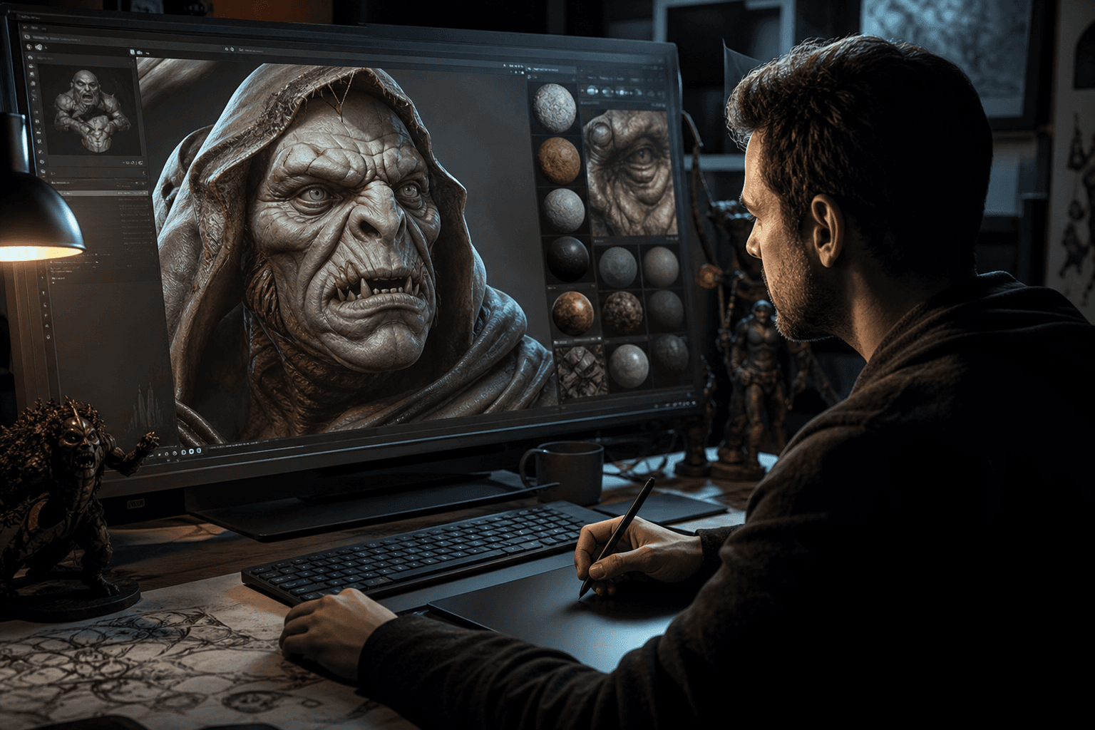
You spend hours on a 3D render. Clean composition, correct light, solid visual intention. Then when you zoom in, the materials look soft, the micro-details are missing, and your "pro" image suddenly becomes a test render. You launch Magnific AI in aggressive mode, and there a new problem: too many invented details, textures that bleed, plastic skin, surfaces that no longer match your original shader. Welcome to the zone where many creators lose control of their image.
Here's the thing: Magnific AI is not a "make it beautiful" button. It is an amplification tool. It amplifies your direction when it is clear. It also amplifies your mistakes when your pipeline is fuzzy. If you want a premium and credible render, especially in 3D or archviz, you must treat Magnific as a controlled finishing step.
This guide is designed for ambitious beginners who want to move from a "correct" render to a really broadcastable image, with no fake effect. We are going to cover the complete method, the critical settings, the real scenarios, the mistakes that come back all the time, and the final validation before delivery.
What Magnific AI really changes on a 3D render
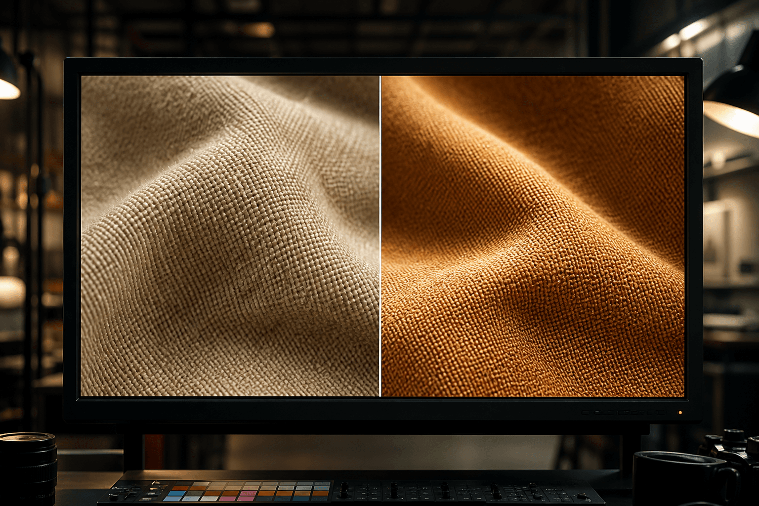
First impact, the material reading. Magnific can reinforce the separation between surfaces, add perceptual relief, and make an image visually more "dense". It is very useful when your base render is clean but lacks texture.
Second impact, the perception of narrative sharpness. An image does not need to be sharp everywhere. It needs to be readable where the eye must go. Magnific lets you push this readability, provided you do not uniformize the whole image.
Third impact, the perceived credibility. On 3D renders, the main danger is the synthetic look. Magnific can help break this look by enriching the controlled imperfections, but it can also reinforce it if you over-push the parameters.
Fourth impact, the finishing speed. What took several manual passes in post can be sped up, especially for presentation visuals or client iterations. But the time saved in generation must be reinvested in quality control.
Preparing the render before touching Magnific
A large part of the final result is decided before Magnific. If your source image is confused, Magnific does not miraculously "repair" it. It adds information to it, sometimes useful, sometimes destructive.
Start by validating your base render on three points: clear composition, readable light, consistent materials. If one of the three is weak, correct it in your 3D software before going to enhancement.
Then, export cleanly with a sufficient resolution and with no destructive compression. An already damaged source limits the finishing potential.
Then define a precise improvement goal: "reinforce the fabric", "better read the wood materials", "add a light organic grain". With no goal, you over-process.
Finally, lock a reference zone. You must be able to compare before/after with a clear criterion, not by feeling.
Trench workflow: Magnific AI step by step
Step 1: frame the detail intention
Before uploading, decide where the detail must increase and where it must stay sober. This visual hierarchy is essential.
On a 3D portrait, you mainly want to reinforce eyes, textile materials, controlled skin micro-relief. On an architecture scene, you want to clarify the dominant materials without turning the surfaces into visual noise.
Write a 2-line intention note. It seems simple, but it avoids the contradictory decisions at the moment of the settings.
Then prepare an exported baseline version with clear naming (sceneA_base_v1). You will need it for the serious comparisons.
Step 2: first moderate pass
On Magnific, always start with a conservative pass. The goal is to measure the response of the image, not to get the final render in one shot.
Then test two close variants instead of five extreme variants. You must learn the sensitivity of the visual.
Observe the critical zones at 100%: face contour, hair, material junctions, geometric object edges. If these zones slip, immediately lower the intensity.
Keep the intermediate versions. A "less impressive" version is often better in the edit or in print.
💡 Frank's Cut: if the image seems "wow" at first glance but tires the eye after 10 seconds, you have probably pushed the details too far.
Step 3: realism control
Realism is not the quantity of details. It is the consistency of the details with the logic of light and material.
First check the texture consistency. A leather must not look like a fine stone. A concrete must not receive a "skin" micro-relief.
Then check the depth consistency. If the backgrounds gain too many micro-details, you lose the depth-of-field hierarchy.
Finally check the color consistency. Some enhancement passes can drift the colored micro-contrasts. Correct in post if necessary.
Step 4: finishing pass and export
Once the main version is validated, do a light finishing pass in your grading or editing tool. Adjust local contrast, perceived sharpness level, and global grain.
Prepare several exports according to use: web, social, print, client presentation. A single version does not cover all the channels.
Test the readability on different screens. A render that seems premium on a calibrated monitor can seem over-processed on a standard laptop.
Always archive base + versions + setting notes. This traceability saves you a lot of time on future projects.
To keep a pipeline consistency, connect this method with our complete guide on the Flux models, our grading method for AI videos, our visual continuity protocol, and our continuity checklist.
Comparison table: fast enhancement vs controlled enhancement
| Approach | Initial time | Realism control | Artifact risk | Final quality |
|---|---|---|---|---|
| Single aggressive pass | Very fast | Low | High | Variable |
| Two moderate passes | Medium | Good | Medium | Good |
| Moderate pass + QA + finishing | Longer | High | Low | High |
| Versioned pipeline per use | Long at the start | Very high | Low | Very high |
Real scenarios: where Magnific really helps
Scenario A: 3D product packshot for premium e-commerce
You have to deliver product visuals where each material counts. The base render is solid, but the fine details of the textile and the metallic surfaces are soft.
Magnific helps a lot here, provided you keep a light hand on the reflective zones. Too many details on the metal quickly create artifacts that look fake.
The winning method is to first improve the material zones, then check the sharp contours of the product. The product contour must stay clean and readable for catalog use.
The final result must look richer, without seeming "over-textured". It is this balance point that makes it professional.
Scenario B: stylized 3D portrait for a poster
On a stylized portrait, the goal is not total photorealism. The goal is emotional credibility. You want readable eyes, living skin, consistent hair, without breaking the style.
Magnific can help densify the skin micro-variations and the clothing material. But if you push too far, you get a face inconsistent with the base design.
The good reflex is to keep a "style lock" reference and to compare each version to this reference. If the improved version changes your visual language, reject it.
The winning version is often a subtle improvement that respects the artistic DNA.
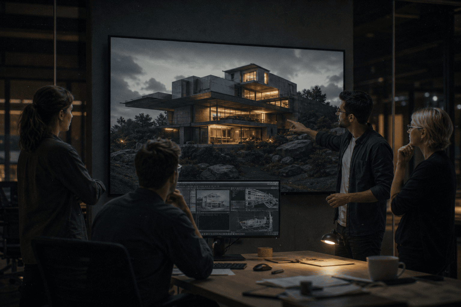
Scenario C: interior architecture for a real-estate client
In archviz, the clients want "detailed" but also "clean" images. Magnific can quickly reinforce wood, textile, concrete, decorative-surface materials.
The trap is to overload the walls and the smooth zones. A realistic room has visually calm zones. Too much micro-detail everywhere gives an artificial render.
Work by gaze priority: hero zone, secondary elements, background. Do not put the same intensity everywhere.
In a client presentation, always show before/after side by side. It eases the decision and reduces the subjective feedback.
Settings, test method, and decision log
You progress fast when you document your trials. With no log, you repeat the same mistakes.
For each version, note: goal, main setting, evaluated zones, verdict. This simple format saves you from "going back at random" on an old render.
Then build a library of homemade presets per image type: portrait, product, architecture, concept art. Your next projects will start much faster.
Finally, do a weekly review of your best renders. Spot what really works in distribution, not only in preview.
Example of a minimal log
- Render name and final use.
- Base version used.
- Main setting tested.
- Defects observed.
- Decision: keep, adjust, reject.
This log is your shortcut to consistency.
Troubleshooting: what beginners break first
Mistake 1: pushing the details everywhere. Fix: zone hierarchy.
Mistake 2: forgetting the material consistency. Fix: texture control at 100%.
Mistake 3: ignoring the background. Fix: preserve the depth and the reading.
Mistake 4: no baseline version. Fix: always keep the untreated source.
Mistake 5: validating only on a calibrated screen. Fix: multi-support test.
Advanced use cases: production, client pipeline, and final render
Use case 1: premium product visual with color variants
When you have to decline the same product in several colorways, Magnific can quickly break the consistency from one variant to another if you treat each image independently. The trap is subtle: each render is beautiful alone, but the series no longer looks like a visual family.
The solution is to define a "master" version with validated settings, then duplicate the pipeline on the variants without modifying the main parameters. Only then do you locally adjust micro-zones.
You must also lock a neutral texture reference. With no this reference, the dark colors can receive more micro-detail than the light colors and create a perceived quality inconsistency.
In e-commerce delivery, this series stability is more important than an extreme detail gain on a single image.
Use case 2: key visual for a poster or campaign
In a key visual, you want a strong impact at a distance and a richness in zoom. Magnific helps a lot on this duo, but it must be steered with a clear reading hierarchy.
Start by identifying the hero zone (face, product, narrative object), then the support zones. You reinforce the hero first and you stay more sober elsewhere.
If you reinforce everything uniformly, you lose the composition. The eye no longer knows where to land, and your poster becomes visually noisy.
The best result is the one that looks natural in global reading, then reveals details in second reading.
Use case 3: integration into a video pipeline
Even if Magnific is often used on a still image, it can serve in a video pipeline via keyframes, reference cards, or extension visuals. Here again, consistency is the keyword.
The danger is to produce keyframes too "magnified" relative to the rest of the shots. In movement, these gaps become visible.
You must therefore validate the improved images in a sequence context: raw edit, base grade, provisional sound. It is the only way to judge the narrative credibility.
Finally, keep a fallback chain. If an improved image breaks the continuity, you must be able to quickly go back to a more neutral version.
Settings and strategy: a method to stay master of the render
The best strategy is in three passes: moderate exploratory pass, consolidation pass, finishing pass. This method protects you against the tunnel effect.
In the exploratory pass, you test the sensitivity of the image. You observe where Magnific brings gain and where it invents too much. You are not looking for the final version yet.
In the consolidation pass, you fix the main parameters and you eliminate the too-extreme variants. You build a stable version.
In the finishing pass, you adjust locally and you harmonize globally (grain, contrast, detail density). It is this last step that gives a premium render.
Decision grid before validating a version
- Does the image respect the original material logic?
- Is the light consistent everywhere?
- Do the skin and textile zones stay credible at 100%?
- Is the visual depth preserved?
- Does the render hold on mobile and desktop?
If the answer is "no" to a single critical point, the version goes back to adjustment.
How to avoid the "AI look" drift on 3D renders
The AI look often appears when the micro-details are too uniform and too perfect. Visual reality is irregular. You must therefore reintroduce natural variations.
Keep calmer zones. Not all surfaces need the same level of micro-relief. This visual breathing is indispensable.
Add a subtle global grain at the end of the pipeline. Never a local grain only on the reinforced zones. The grain must unify, not mask.
And above all, compare regularly with your base. If the improved version tells another image than the original, you have exceeded the good zone.
Client pipeline: presentation, validation, iteration
When you work with a client, the problem is not only technical. It is also decision management. With no validation frame, the feedback becomes subjective and endless.
Always present three versions maximum: base, moderate improvement, pushed improvement. Ask for a decision on a precise criterion: material, readability, style fidelity.
Then, lock the chosen direction before applying it to the whole image series. This discipline avoids the costly back-and-forths.
Finally, archive the chosen settings in a simple document. On the next projects, you will start from validated proofs, not intuitions.
Quality indicators to judge an improved render
You can objectively evaluate your render with five indicators: material consistency, light stability, narrative readability, visual fatigue, series consistency.
Material consistency: each surface keeps its nature.
Light stability: no "out of logic" zone.
Narrative readability: the eye goes to the right place.
Visual fatigue: no texture overload.
Series consistency: all the images hold together.
If these indicators are good, your enhancement serves the project. Otherwise, it just serves the technical demonstration.
Final delivery checklist
Before delivery, go through this checklist:
- A/B comparison on key shots or visuals.
- 100% validation on sensitive zones.
- 25-50% validation for global reading.
- Desktop + mobile validation.
- Master export + derived exports.
- Archiving of the source version and the finalized version.
This routine avoids the "it looks too retouched" feedback that often comes late.
Useful external references
To go deeper, check Magnific AI, the resources of Adobe Photoshop, and the workflows of Frame.io Insider.
FAQ
Does Magnific AI replace a good base 3D render?
No. Magnific AI is an amplifier, not a universal corrector. If your base render has light, composition or material problems, the tool can sometimes reinforce them instead of correcting them. The good practice is to lock a clean base in your 3D software, then use Magnific for the finishing.
How to avoid the too "crispy" or artificial render?
Start with moderate passes and always compare in gaze movement, not only in fixed zoom. Check the faces, the edges, and the smooth zones. If the image impresses at first glance but tires afterward, lower the intensity. Credibility is built in consistency, not in escalation.
Should you use the same setting for all the images of a project?
No, but you must keep a common logic. Create a base preset, then adapt it slightly according to the image type. The goal is to have a stable visual identity while respecting the needs of each shot. Too many free variations break the final consistency.
Is Magnific useful for e-commerce product renders?
Yes, especially to reinforce the readability of the materials and the perception of quality. You must however watch the contours and the texture fidelity. In e-commerce, the trust depends on the visual consistency between promise and perceived product.
Can you use it for stylized portraits without losing the original style?
Yes, if you work with a locked style reference and light passes. The danger is to excessively "realize" a style that must stay graphic. The improvement must respect the starting art direction.
What is the best criterion to validate a final version?
Ask yourself whether the improved image better serves the starting intention without drawing attention to the treatment. If the viewer looks at the scene rather than the effect, you are on the good version. Then validate on several screens to secure the distribution.