Typography and Titles: Avoiding Gibberish in AI Production
When to generate text, when to create it in post, and an After Effects workflow for clean film titles.
You ask the model to write "SUMMER LAUNCH 2026" on the poster. You get "SUMNER LAUNCH 2O26" with letters that melt. The client reads it in three seconds. Game over. Typography in AI production is not a graphic detail: it is a breaking point between a premium video and a demo that screams fake.
This guide decides: when to try to generate text, when to create it in post (After Effects, Premiere, Figma), and how to deliver clean film titles with no gibberish. Same logic as on a real title sequence: the text is designed, not improvised by an engine that does not know how to spell.
Why AI produces fake text
The image and video models learn the texture of the letters, not the spelling. They reproduce shapes that resemble an alphabet. On a moving shot, each frame reinvents micro variations: letters that are born, strokes that connect badly, impossible kerning.
The gibberish appears faster when you ask for a lot of text, decorative fonts, or text in perspective on an object (sign, screen, packaging). The more cluttered the scene, the more the model "paints" symbols instead of composing.
💡 Frank's Cut: agency rule: zero readable client text generated in video. Text created in vector, composited in post. The generation only serves for backgrounds with no critical typography.
Table: generate vs compose
| Need | Method | Risk if generated |
|---|---|---|
| Main film title | After Effects / Figma | Spelling, kerning |
| Short subtitle | Post, licensed font | Mutant letters in video |
| Blurred background sign | OK in AI if deliberately illegible | Readable fake words |
| Product screen UI | Compositing of a real capture | Deformed icons |
| 3s title sequence | Motion design | Guaranteed gibberish |
After Effects workflow for clean titles
Step 1: locked typo charter
Choose one or two licensed fonts (contrasted sans serif for impact, serif for fiction). Define minimum mobile sizes: title ≥ 5% of the frame height in 9:16. Tracking +5 to +15 on caps titles. Airy line spacing.
Export a one-page PDF guide: font, sizes, colors, 10% safe margins.
Step 2: video background with no text
Generate your AI shots with no readable text instruction. Forbid "logo", "title", "sign with words". If a sign appears with fake words, blur it in post or regenerate.
Step 3: composition and animation
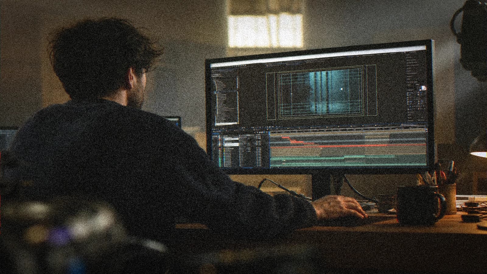
Import the master. Create the vector text layers. Animate a short entrance (opacity + position 8 to 12 frames). Avoid the excessive glow effects that bleed at H.264 compression.
Plan a version with no title for platform A/B tests.
Step 4: multi-format export
Export 16:9, 9:16, 1:1 from the same comp by adapting the safe zones. Check the readability on a phone in real lighting conditions (outdoors, not only a dark studio).
Real cases
Festival teaser: title 1.5 s, background an AI shot of a night city with no readable signs. SaaS: sans serif typo, figures on a separate layer (not generated). Fiction trailer: 8s title sequence, serif + grain harmonized to the video master.
Troubleshooting
Trembling letters: text generated in video, redo in post. Illegible blur: insufficient contrast, soft drop shadow. Wrong language: no auto translation on the layer, native review. Inconsistent case: missing style guide.
- the complete Seedance 2 workflow
- a two-character dialogue scene with no broken match
- turning an AI image into a fluid video
- structuring an AI video like a real film
Foire aux questions
Réponses rapides aux questions les plus fréquentes sur cet article.
Can you generate a single correct word in an AI image?
Sometimes on a still image, with several tries. In video, the probability drops strongly. For a critical word (brand), always use post.
Which font for mobile?
A high-contrast sans serif, medium or bold weights, avoid the thin ones that disappear after compression.
After Effects or Premiere for the titles?
After Effects for motion and precision, Premiere for fast simple titling. What matters is the vector, not the tool.
How to handle bilingual title sequences?
Two masters or two layers with identical timing, QA by a native speaker, no automatic translation on the design.
Should you avoid all text in the AI background?
Blurred or illegible text OK for atmosphere. As soon as a word becomes readable, it must be wanted and controlled.
How to harmonize the title with the AI video grade?
Same contrast curve, light grain on the letters, no extreme digital sharpness on the typo.
What to do if the client insists on generated text?
Show failure examples, propose an A/B test post vs generated, document the reputation risk.
Do burn-in subtitles follow the same rules?
Yes for the readability. See the dedicated accessible-subtitles article: contrast and safe zones.
Pro typo in AI is almost always out of the engine. You generate the visual emotion, you compose the words. The viewer does not know how you did it, they only know whether it looks like a film or not.
Field practice: client brief and shared QA
When you work on AI title typography in real conditions, the chaos comes from the deadlines, not from the tutorials. This field practice is what I put in the deliverable folder so that the team lands on its feet a week later without me.
Before each batch, reread the brief in five lines. A "fast" prompt change without rereading the brief creates gorgeous but unusable-at-the-edit shots. The editor will thank you if each file carries a logical name and an A/B/C note.
For the validation, impose two screens: bright phone + neutral monitor. Many typography-and-title flaws only appear on one of the two. If it holds on both, you can move on. Otherwise, a single lever changes, not five.
In the client meeting, show a ten-second excerpt with sound, not a gallery of stills. The movement and the audio sell the credibility. Still images lie about the final quality of AI videos.
Document the owned debts (grain, micro drift, text composited in post). Transparency avoids the "redo everything" when the creative director sees the master on a big screen.
💡 Frank's Cut: if you do not feel like explaining a technical choice to the client, that choice is probably a debt to own in black and white, not to hide.
Always cross-reference with why my AI videos look fake when you doubt the global realism. Often the problem is not the subject of the article, but a missing pilot or sound upstream.
Typical session (45 min): brief 10 min, generation 20 min, QA 10 min, post 10 min, mobile export 5 min. If you have no A shot in one hour, pivot the brief, not the caffeine.
Final checklist: message readable with no sound (if subtitles), message audible with sound (if voice-over), consistency with the charter, platform export tested privately, files named and archived. Keep an archive of the seeds and prompts, test the mobile compression, lay the sound before validating the image, and document the visual debt rather than hiding it.
Related articles
 Tutoriels
Generating a Realistic Crowd With No Clones or Identical Faces
Breakdown, depth, costume variation and post for credible crowd shots in fiction and advertising.
 Tutoriels
How to Generate Photorealistic AI Images Without the Plastic Look
A field method to get a realistic, textured, credible image, with no waxy skin or artificial render.
 Tutoriels
Accessible Burn-In Subtitles on AI Video
Readability, contrasts, safe zones and multi-platform export for subtitles that survive compression.