Why Your AI Images Lack Contrast, and How to Fix It
Histogram, curves, selective saturation, and shadow-highlight ratio cinema style.
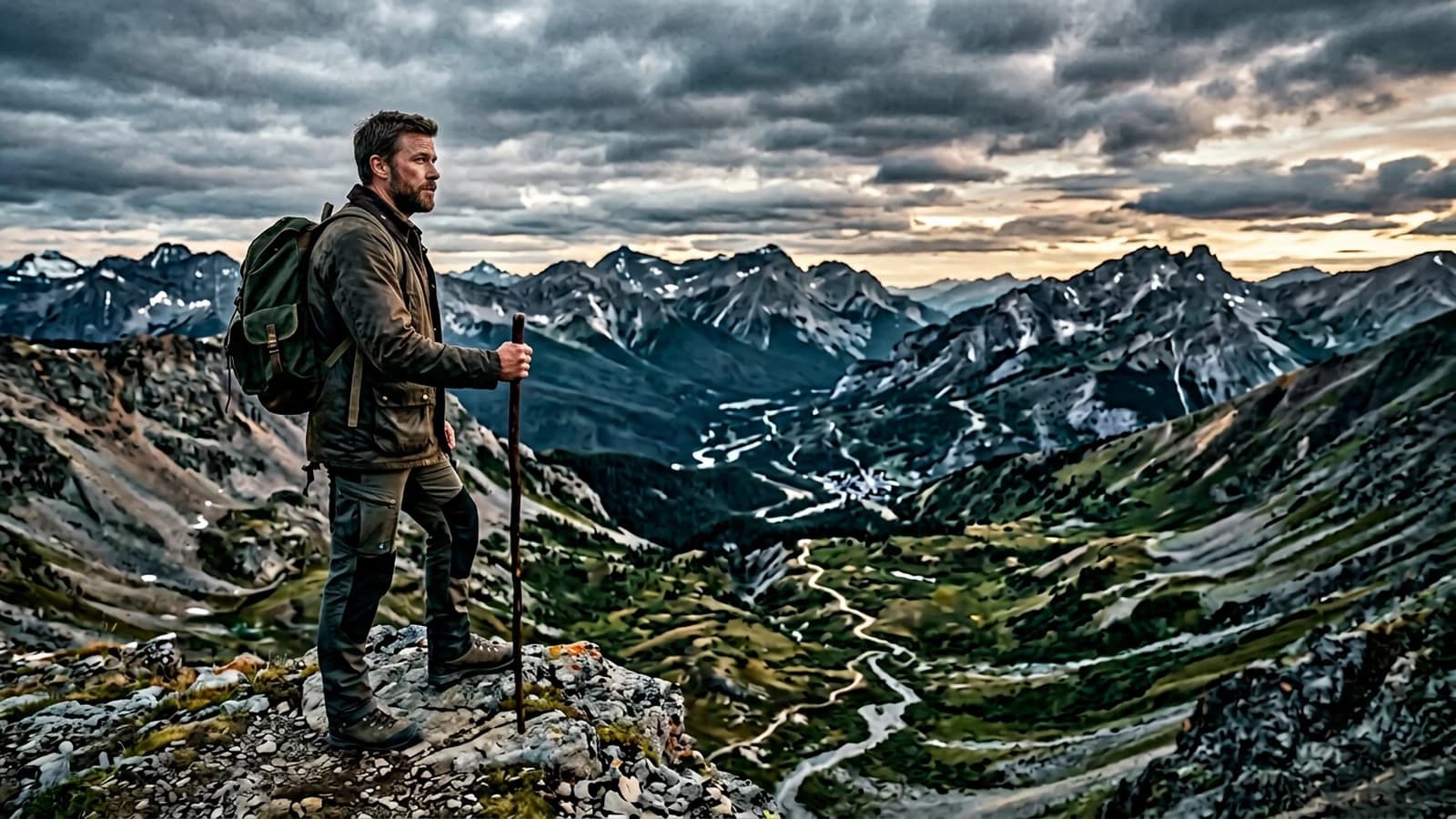
You zoom in on your export, you see gray everywhere, you raise the saturation in the hope of a miracle, you get a supermarket poster. This reflex is universal, it says nothing about your level, only that no one has yet shown you the order of operations between prompt, generation, and grading. The problem is not that your eye is too demanding, it is that contrast was confused with "more color". The models like images readable in thumbnail, often flat, often smoothed. Your work starts when you take back the curve.
Three short stories. Vincent, a retoucher in Paris, delivered AI portraits for an agency: the faces seemed 3D-made-up because he pushed the reds before having clean blacks. Clara, an illustrator in Marseille, was preparing keyframes for a video: each shot had a different sky because she saturated the blue instead of locking a curve reference. Omar, an amateur developer in Casablanca, believed that "high contrast" in the prompt was enough: the model added halos and blocked shadows with no hierarchy. The three would have saved time with a common roadmap: read the histogram, correct the light in the text, then only push the color.
Contrast, in the image sense, is the relationship between light zones and dark zones in an image. The basic notion is well summarized on contrast in vision, useful so you no longer mix luminance and saturation in your head.
Histogram: read before touching
Open your histogram. If everything is stacked in the middle, you have a flat image.
Ten-minute exercise with no generating
Take three old AI images you no longer like. For each, note in one sentence: is the problem global (the whole image is gray) or local (the face is good but the sky lies)? In the first case, global curve and light prompt. In the second case, masks and maybe a targeted regeneration. This sorting avoids saturating an image already condemned on the geometry.
If the edges touch the two extremes with no detail, you have crush or clip on the highs. The cinema goal is not always to stretch to the maximum, it is to place the information where the eye must go.
For a portrait, you often want to keep detail in the dark hair and in a part of the sky or the wall, while leaving a credible black somewhere in the frame to give volume. For a night scene, you want a real black, not muddy gray, but you keep a small hold on the face or a practical.
Pro tip: if you do not know where to start, slightly pull the shadows down on a soft curve, then raise the middle so you do not lose the face. A single curve before any saturation.
Prompt: light with hierarchy
Contrast starts in the text. Write a dominant key, a weak or absent fill, and what happens in the background. Example:
single strong key from window left, weak ambient bounce, deep shadows,
no fill light, practical warm lamp in background, subject lit by window,
skin retains midtone detail, not HDR sky
If you ask for "beautiful soft light everywhere", you ask for a flat image by definition. The soft and the contrasted can coexist if you specify: soft on the cheek-to-shadow transition, strong on the global room ratio.
To describe light like on a set, how to describe light like a director of photography in a prompt extends this section.
Post: curve first, saturation after
Step 1. Duplicate your layer or your node, work non-destructively if possible.
Step 2. Global RGB curve: set an anchor point on the midtones of the face if it is a portrait. Pull the shadows down until you see a black that still breathes, not mud.
Step 3. Highlights: lower slightly if the sky or a lamp burns. Look for a soft roll off, not a brutal straight line over the whole frame.
Step 4. Selective saturation: if you want teal on the shadow, first isolate the skin with a soft mask so you do not burn the face reds.
Step 5. Fine grain in overlay to link the too-clean zones to the textured zones.
Lightroom-type clicks or equivalent
Import your PNG. Switch to the Develop module or equivalent. Slightly raise Texture on the clothes if you want relief without touching the skin, but mask the face first. Use the brush or the linear mask on the sky to lower the highlights without dulling the bust. Activate the saturation target and click on a too-neon sky blue, pull the saturation down until you find a sky that breathes, then raise the luminance if the sky becomes mud.
If you do not have Lightroom, the logic stays identical in DaVinci Resolve (Color page), Capture One, or even nodes in a node-based workflow: separate the problems by zone instead of a single curve that martyrs the whole frame.
For the dark look with no mud, how to create a dark and cinematic atmosphere with AI gives markers compatible with this correction.
Table: symptom, bad reflex, better reflex
| Symptom | Bad reflex | Better reflex |
|---|---|---|
| Gray image | saturation +30 | curve, blacks |
| Neon sky | global vibrance | sky mask, roll off |
| Orange skin | less yellow at random | skin mask, blood reds |
| Muddy shadows | raise everything | masked local contrast |
| Weird halos | sharpen | remove "HDR" from the prompt |
| Plastic details | clarity max | lower micro contrast |
Pro tip: always compare with a fixed reference on the edge of the screen. The eye adapts, the reference does not.
Flux, SDXL, and contrast "at the source"
If you generate locally, Flux and SDXL do not have the same default render on the shadow-light transitions. The useful comparison of tools and workflows is read in Flux vs SDXL: which AI to choose for realistic images. Whatever the engine, keep a moderate guidance window: too high, the skin becomes wax and the micro contrast disappears in smoothing.
Raise the steps to the point where the texture appears, stop before the over-definition that eats the local contrast. Note your settings in a text file next to the PNG.
When you compare two engines, keep strictly the same prompt, the same ratio, the same base resolution, and change only the checkpoint. Otherwise you believe that "Flux makes more contrast" while it is your resolution or your scheduler that moved. Also note the sampling temperature if the interface exposes it: a noise variation can simulate a trompe-l'oeil contrast without being stable between two seeds.
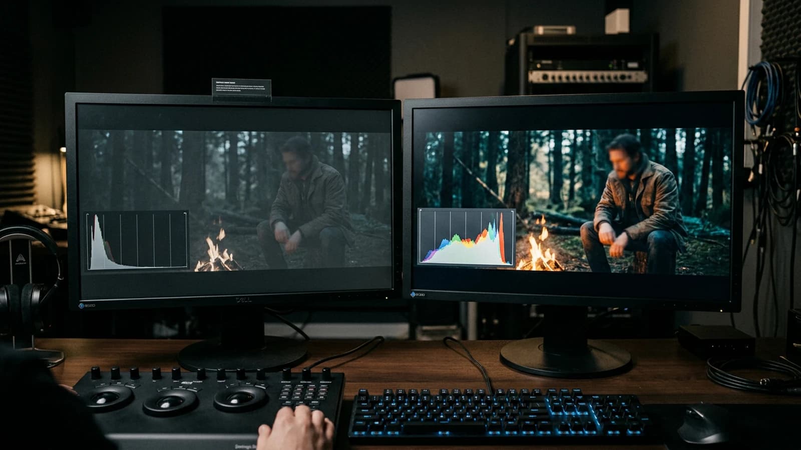
Preparing the image for a video sequence
If your still goes toward a video tool, avoid the aggressive sharpen and the halos on the contours. Keep headroom on the highs so the video compression does not create flicker. Export a "flat" version and a "grade" version in two clearly named files. Document the focal length and the light direction in a txt; the idea-to-film workflow insists on this habit.
Pro tip: a too-contrasted image before video interpolation can make the texture jump on the cheeks. Better a mastered contrast and a bit of global grain.
Trench warfare: what beginners miss, and how to repair it
You confuse global contrast and local contrast. The first gives the architecture of the image, the second gives the aggressive smartphone-HDR-type texture. Push the global with the curve, keep the local under control.
You are afraid of the black, you raise the shadows up to the universal gray. You get a flat demo. Keep a black point somewhere in the frame, even small, to anchor the eye.
You apply a cinema LUT on everything with no mask, the faces go orange. Isolate the skin, bring blood back into the reds, then apply the look on the environment.
You want teal and orange with no chromatic discipline. You get a poster. Separate the axes: cool the shadows without saturating the sky to neon, warm the highs without burning the skin.
You generate in 16:9 then you recrop in vertical without rebalancing. The perceived contrast changes with the framing. Re-evaluate the curve after recropping.
You compare on a single too-bright consumer screen. On a cold calibrated screen, your image changes. Test two screens before client validation.
You add a heavy vignette to "make it cinema". You eat the information in the corners with no narrative reason. Light vignette only if it guides the eye.
You want a "film look" by sticking on a random LUT found online. The LUT assumes a neutral exposure at input. If your AI is already shaky, the LUT caramelizes the problem. Correct the base exposure, then apply a soft LUT at 40 or 50% intensity to start.
You work on a laptop in full sun near a window, you push the contrast to "see something", then you open the same file in the evening and everything is too hard. Stabilize your work environment or test on a phone before delivery.
You forget the perceptual gamma: a correction that seems good on a single image becomes aggressive when the image is next to another in an Instagram grid. If you prepare a series, apply the same base curve to all the exports, then adjust locally.
Pro tip: if a zone is false in light, no curve will save it. Regenerate with a brighter key, correct in post only when the physics is almost good.
Pro tip: for the neons, keep a neutral breathing in the image, a gray surface, a washed-out wall, otherwise the visual fatigue rises and the viewer reads you as "saturated AI".
When you have integrated this routine, keep three "master reference" images in a folder: a soft interior one, a hard exterior one, a night one with a practical. You open them in a corner of the screen at each grade session. This small ritual takes thirty seconds and prevents you from drifting toward gray or neon on each new model released.
Foire aux questions
Réponses rapides aux questions les plus fréquentes sur cet article.
My blacks are always gray, why?
Often fear of the black combined with a prompt that asks for too much ambient fill, or a social export too protected on the shadows. Curve first, check the histogram, then decide whether you really want cinema black or a discreet lift.
Saturation or vibrance first?
Neither one nor the other first. Curve and balance first. Then selective saturation if needed. The global vibrance is a last resort, not a foundation.
Is the "high contrast" prompt enough?
Rarely alone. With no light direction, the model adds halos and hard shadows in the wrong place. Describe the key, the depth, and what must stay readable.
How to keep the sky without burning the face?
Mask the sky, roll off on the sky highs only, or regenerate with a more balanced exposure. The soft mask on the face protects the flesh tones while you treat the top of the frame.
I am preparing an image for video, what contrast to aim for?
A bit less aggressive than for a poster, highs with headroom, no extreme sharpen. The movement will reveal the halos the still hid.
Why does my image "jump" after upload on social media?
Compression and phone screens. Plan a light grain, master the highs, test privately. The network adds its layer, you cannot ignore it.
Flux or SDXL for natural contrast on skin?
It depends on the checkpoint and your prompt. Do an A/B test in twenty minutes on the same brief, note which one lies the least on the cheek-to-shadow transitions. The site's comparison article helps you structure this test.
Can inpainting correct the local contrast?
Yes for small zones, no for a whole false scene. Inpaint eyes, hands, small surfaces. If the key is inconsistent over the whole bust, start again from a more honest generation.
How to prevent teal and orange from killing the skins?
Work in two mask passes: first protect the face and the neck with a soft mask, apply the look on the rest, then come back on the cheek reds with a separate smaller setting. If you do everything in one click, you get apricot-jam faces.
Is the HDR in the prompt always a mistake?
No if you own a stylized world. Yes if you aim for urban or documentary photorealism. For the realism, replace "HDR" with an exposure description: slightly compressed sky, face still readable, deep shadows under the roof edges, no halo around the branches.
Should I calibrate my screen before grading?
Ideally yes, at minimum stabilize the brightness and avoid the "vivid" modes of the monitor during the session. Otherwise, keep an external reference, an image you know by heart on several devices, so you do not deliver only for your screen of the moment.
How to align the contrast between several characters in the same shot?
Generate first with a single clear key in the prompt, "both faces lit by same window left". If one is still more contrasted than the other, mask per character and harmonize the mids. Avoid saturating to compensate for an exposure imbalance.
Does the black-and-white conversion reveal the contrast problems?
Yes. A fast black-and-white pass shows whether you still have material in the midtones or whether you crushed everything into two gray plates. Use this test before sending to the client.
Can you use AI to re-grade an image already contrasted too hard?
Sometimes, with restoration or "relight" tools, but it is risky. Better start from the least destructive file possible, PNG or TIFF with no sharpen, and redo the curve calmly. If you no longer have the source file, save what you can with a soft inverse curve and accept that some zones are definitively lost in detail.
Related articles
 Tutoriels
Why Your Prompt Does Not Work, and How to Fix It
Diagnosing contradictions, bad hierarchy, and three-pass tests to take back control.
 Tutoriels
Why Do My AI Videos Lack Realism
Inconsistent light, slipping texture, implausible camera movement, and disconnected sound: the most frequent causes.
 Tutoriels
Why Are My AI Images Blurry and How to Fix It
Upscale too early, aggressive denoising, implicit motion blur, and bad base resolution: diagnosis and concrete fixes.