Creating YouTube Thumbnails Consistent With Your AI Video
A thumbnail approach oriented toward click-through rate and editorial consistency to attract without deceiving the viewer.
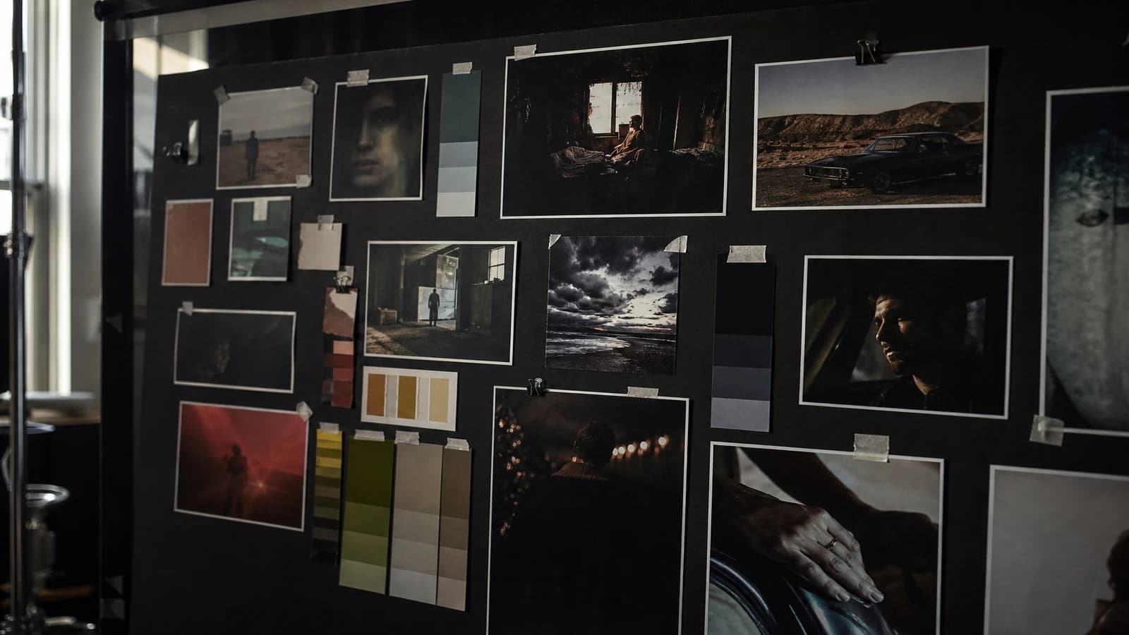
Your thumbnail promises a neon explosion. The video opens on a calm, pedagogical shot. The viewer clicks, feels betrayed in two seconds, and leaves. The CTR was good. The retention is dead. Creating YouTube thumbnails consistent with your AI video is not the enemy of the click. It is what transforms a click into a loyal viewer.
The thumbnail and the video form a double promise. In AI, the temptation is to generate a hyper-saturated thumbnail separately from the body of the video. This guide teaches you to align the two without sacrificing the attractiveness. I have seen channels explode their CTR then stagnate because each thumbnail lied slightly. Consistency is not a moral option. It is a distribution strategy.
Why thumbnail and AI video diverge
The thumbnail is optimized for 120 pixels wide. Many overcompensate: more contrast, more emotion. In AI, two different aesthetics of the same project.
The thumbnail generated after the video, with no references, creates a new style. Clickbait kills long-term distribution.
Consistency = same subject, same promise, same register, plus small-size readability.
See designing 3-second AI video hooks and A/B testing AI YouTube thumbnails.
💡 Frank's Cut: generate your thumbnail from a validated frame of the video. Upscale, reframe, reinforce the contrast. Do not regenerate a different face.
The three pillars
Same subject, same promise. Thumbnail and title aligned.
Same visual register. Palette, grain, light.
Mobile readability. One focal point, strong contrast, 3-4 words max. YouTube Creator Academy.
| Element | Video | Thumbnail | Adjustment |
|---|---|---|---|
| Palette | Desaturated | More contrasted | +10-15% |
| Face | Natural | Expressive | Reframe |
| Text | Long title | 3 words | Reformulation |
| Set | Complete | Simplified | Crop |
Field workflow
Step 1: common promise
One sentence for the title, the thumbnail and the hook.
Step 2: hero frame
The most representative of the promise, not the most beautiful in isolation.
Step 3: thumbnail derivation
Reframe 16:9, light contrast, text if needed. Image-to-image weight 0.7+ if needed.
Step 4: text overlay
Two to four words, strong contrast. Test at 160px.
Step 5: consistency test
Thumbnail and frame 0 side by side. "Same video" with no hesitation.
Step 6: A/B test
Two compositions, same promise.
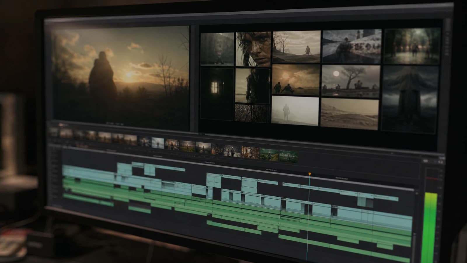
Step 7: graphic chain
A recurring structure for the subscribers. See adapting brand storytelling.
Thumbnail as the first shot
Frame 0 identical to the thumbnail, then a slight zoom out or pan. The viewer has the impression of entering the image they clicked. This continuity reduces the post-click disappointment more effectively than a spectacular unlinked hook.
For the aligned hooks, see designing effective 3-second AI video hooks. To test two versions, A/B testing AI YouTube thumbnails.
Real scenarios
Technical tutorial. Before/after split. Text "LIGHT FIXED".
Vlog. Strong-moment frame, authentic expression.
Series. Figma template, image zone + fixed text.
Frequent mistakes
Thumbnail from scratch. Fix: derive from the frame.
Different face. Fix: same reference.
Too much text. Fix: 4 words max.
Colors off-charter. Fix: project LUT on the thumbnail.
Exaggerated promise. Fix: holds up in 30 seconds.
YouTube thumbnail specifications and Google helpful content.
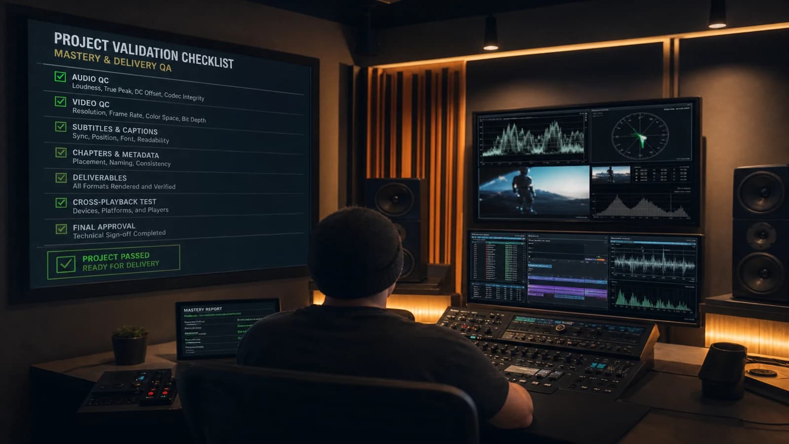
Text overlay: three words are enough
The text on a thumbnail is not a second YouTube title. It is a visual reinforcement. "LIGHT FIXED", "3 AI STEPS", "BEFORE / AFTER": these structures perform because they compress the promise without repeating the title word for word. Avoid the long questions unreadable at 120 pixels wide. White contrast on a dark background or the opposite. Never gray on gray.
Test at 160 pixels wide on your phone before publication. If you squint and no longer read the text, it is too small or too long.
Graphic chain and long-term retention
When a subscriber browses your grid, your thumbnails are watched together. Ten uploads with ten different styles signal an immature channel. Define: dominant palette, presence or not of a face, text position, saturation level. It is not a clone. It is a family.
The metrics to follow: CTR at 24h and 7 days, retention at 30 seconds, click rate on the next suggestion. High CTR + weak retention = lying promise. Modest CTR + strong retention = a channel that is building.
Foire aux questions
Réponses rapides aux questions les plus fréquentes sur cet article.
Do you have to choose between CTR and thumbnail-video consistency?
A false dilemma in the short term. A thumbnail consistent with a strong subject and a readable composition CTRs very well. Clickbait maximizes the initial click then destroys the retention, which the algorithm interprets as a disappointment. Invest in a kept promise rather than an isolated shock. Over ten videos, consistency beats the single flash.
What resolution and format for AI thumbnails?
1280x720 pixels minimum, 1920x1080 recommended. Export high-quality PNG or JPG. Avoid the multiple recompressions via messaging apps. YouTube already recompresses: start from a clean file. Strict 16:9 ratio.
Can you use a shot absent from the final video?
Not recommended. If you use a cut shot, it must faithfully represent the content. A thumbnail generated only for the click with no equivalent in the video betrays the viewer. Exception: a frame of a sequence present but shortened at the edit.
How to handle multilingual thumbnails?
Same image, text translated by layer. Keep the composition identical for brand recognition across the markets.
Do AI thumbnails require a specific disclosure?
Depending on the platform and the jurisdiction. Transparency about AI content reinforces trust with a technical audience. The thumbnail follows the same rules as the video for your editorial positioning.
How much time to devote to the thumbnail?
Ten to fifteen percent of the total production time. On four hours of video, thirty to forty minutes of thumbnail is reasonable. It is the most-seen shot. Underinvesting in it costs more in lost views.
Should there be a face on every thumbnail?
Only if you are the brand of the channel. Technical tutorials often perform with a before/after visual with no face. Vlogs with an authentic expressive face. The subject of the video takes precedence over the formula.
How to avoid the recognizable "AI thumbnail style"?
Same grain as the video, no over-saturation, no aggressive sharpen. Derive from the validated real frame. The thumbnails that look like Midjourney posters attract the wrong audience.
The thumbnail is not a separate poster. It is the entry door of your video. When it keeps the promise, the click becomes a view, then a subscriber. Apply this approach to creating YouTube thumbnails consistent with your AI video.
Hero frame and clean derivation
The hero frame is not the most beautiful shot of the video. It is the most representative of the title + thumbnail promise. Export in high resolution, reframe 16:9, light contrast (+10-15%), text 3 words max. Image-to-image from the frame (weight 0.7+) if you need to simplify the composition.
First image = thumbnail
Frame 0 identical to the thumbnail, then a slight zoom out. The viewer enters the clicked image. Reduces the post-click disappointment more than a spectacular unlinked hook.
Subscription grid
The last ten thumbnails form a family: palette, text position, face presence. Not a clone, a consistency.
High CTR + weak retention = lie. Modest CTR + strong retention = a channel that is building. Note both metrics at 24h and 7 days.
Text, contrast and tests
Text structures that perform: "RESULT", "3 STEPS", "BEFORE / AFTER". Three words max, strong contrast, test at 160px wide.
Do not regenerate a different face to "make it prettier". Derive from the validated frame. A thumbnail face different from the video face destroys the trust immediately.
For the A/B tests, see A/B testing AI YouTube thumbnails. Two compositions, same promise, not two different promises.
YouTube thumbnail specifications: 1280x720 minimum, 1920x1080 recommended.
The thumbnail rarely lies alone: it lies with the title. Align the three. A moderate title and an aggressive thumbnail create a cognitive dissonance. The viewer clicks furious or confused, either way you lose. Consistency is a retention strategy, not an ethical option.
Frequent thumbnail mistakes
Thumbnail generated from scratch with no video frame. Different face thumbnail vs frame 0. Too much text. Colors off the project LUT. Exaggerated promise vs content. Ignoring the subscription grid on a recurring channel.
Adapting brand storytelling to AI video content also applies to thumbnails: register, palette, promise.
Google helpful content: user satisfaction takes precedence over the isolated click.
Step-by-step thumbnail workflow
Common promise title + thumbnail + hook. Hero frame HD export. Reframe 16:9, contrast +10-15%. Text 2-4 words if needed. Test 160px. Frame 0 consistency test. A/B test if volume. Project LUT on the thumbnail. Publication.
Scenarios: tutorial split before/after, vlog authentic expression, series Figma template.
Ten to fifteen percent of the total production time. On 4h of video, 30-40 min of thumbnail.
The thumbnail and the video form a contract. Keep it. CTR with no retention is a false victory.
YouTube Creator Academy insists: mobile readability above all. The consistent thumbnail converts better in the long run than the isolated shock. Hero frame, derivation, mobile test, consistency test, publication. Five steps, thirty minutes if the video is ready.
Apply this approach to creating YouTube thumbnails consistent with your AI video. The thumbnail-video consistency is not the enemy of the CTR: it is the condition of an audience that comes back.
Derive from the frame. No regenerated face. Project LUT. Subscription grid test. Honest thumbnail, durable channel.
For the channel storytelling, adapting brand storytelling to AI video content. Thumbnail, title, hook and body form a single editorial promise.
Conclusion
The thumbnail is not a poster separate from your video. It is the first second of the experience, frozen in an image. When it derives from frame 0, the viewer feels the betrayal even before having formulated the thought. Derive from the validated hero frame. Apply the project LUT. Test at 160 pixels wide. Check the subscription grid on the last ten uploads.
CTR with no retention is a false victory. The thumbnail-video consistency builds an audience that comes back because it knows what it will receive. Ten to fifteen percent of the total production time on the thumbnail, that is the ratio I apply on every tutorial or AI demo video.
Apply this approach to creating YouTube thumbnails consistent with your AI video. Hero frame, 16:9 derivation, text three words max, mobile test, publication. The click becomes a view, then a subscriber, when the promise holds.
Thumbnail and algorithm
YouTube often tests several thumbnails on the same video. If you do A/B, keep the same visual promise and change a single lever: expression, contrast, or text position. Two different promises distort the interpretation of the metrics. See A/B testing AI YouTube thumbnails for the method.
Archive and reuse
Save the PSD or the Figma file of your thumbnail with the text layers separated. The title retakes or multilingual translation become fast. The thumbnail is a deliverable in its own right, not a disposable export after publication.
When you prepare a series, define the subscription grid before the first upload: palette, face presence, text position. Ten consistent videos signal a mature channel. Ten different styles signal uncontrolled experimentation. Consistency does not stifle creativity: it channels the viewer's attention.
The honest thumbnail builds a durable channel. The isolated shock burns out fast. Keep the promise, and the algorithm will follow your rhythm.
Thumbnail / video consistency
The thumbnail is not a separate poster: it is the promise of the first shot. Character: same costume and same light as the exported frame 1. Typo: three words max, readable at 120 px wide. Contrast: face or product on a simplified background, not the raw cluttered frame. A/B: keep two color variants before publishing. If the thumbnail lies relative to the first three seconds, the retention collapses even with a good edit.
💡 Frank's Cut: export frame 1 and the thumbnail side by side. If it is not the same story, redo one of the two.
Document the validated version with the date: the project's memory is worth more than the last winning prompt.
Publication threshold: do not validate as long as the mobile test with no sound is not passed.
Never publish a thumbnail you would not dare to put as frame 1 of the final video itself.
Related articles
 Tutoriels
A/B Testing YouTube Thumbnails Generated with AI
Variants, metrics, testing ethics and alignment with the video to optimize CTR without toxic clickbait.
 Tutoriels
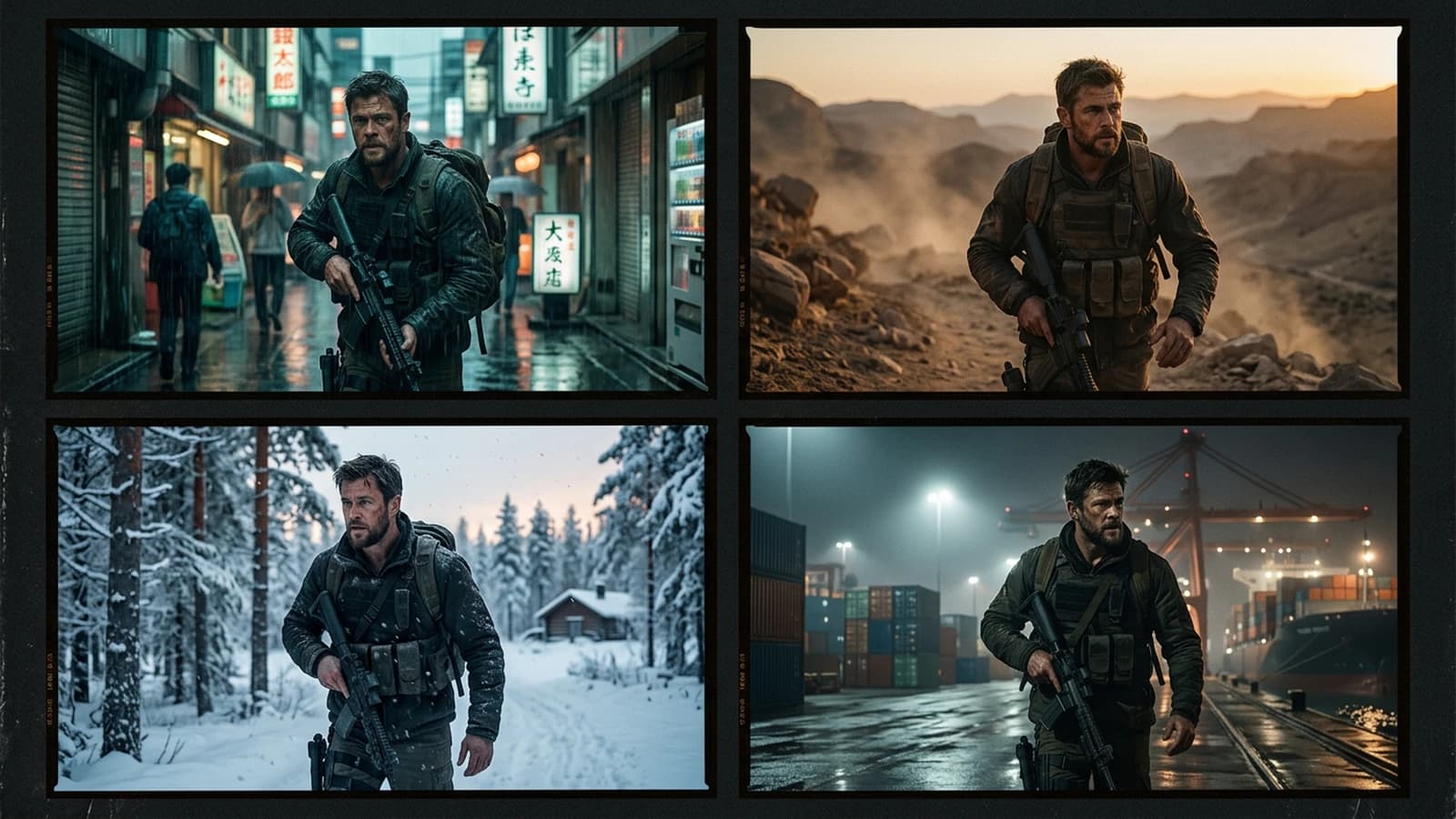
How to Create Consistent Scenes with Several Shots in AI
Light, character, set continuity, and prompt breakdown for a readable sequence.
 Tutoriels
Creating Reusable AI Post-Production Presets
How to build robust presets that accelerate projects without uniformizing every render.