A/B Testing YouTube Thumbnails Generated with AI
Variants, metrics, testing ethics and alignment with the video to optimize CTR without toxic clickbait.

Contents · 25 sections
You can have an excellent video and lose half the potential at the thumbnail. On YouTube, the thumbnail is your first edit. It tells the promise in one second, in the middle of a saturated feed. If it lies, you win a click and lose trust. If it is blurry, you win nothing.
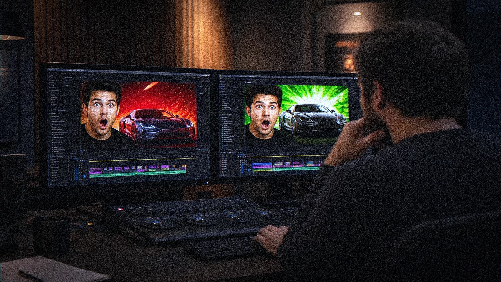
A/B testing YouTube thumbnails generated with AI is often misunderstood. Many creators test radically different images, change ten variables at once, then conclude "version B works better". No. You learned nothing. You just observed a variation with no causality.
This guide gives you a Frank method: clear hypothesis, controlled variants, readable metrics, and respect for video-thumbnail alignment. The goal is not to cheat the CTR. The goal is to increase the good clicks, the ones that actually watch.
What you really test with a thumbnail
You do not test "the prettiest image". You test:
- Subject clarity at reduced size.
- Narrative promise (what the user understands in 1 second).
- Hierarchical contrast (where the eye goes first).
- Brand consistency (channel recognition).
- Alignment with the video (no toxic clickbait).
If your thumbnail gains clicks but drastically lowers retention, your test is a business loser.
💡 Frank's Cut: a good thumbnail test improves the CTR and keeps the retention of the first 30 seconds. If retention drops, your thumbnail overpromises.
The variables to isolate (one per test)
You must change one main variable at a time:
- Face framing (tight vs medium).
- Background (simple vs textured).
- Dominant palette (warm vs cold).
- Overlay text (with vs without, short vs longer).
- Direction of the gaze.
- Key object in the hand.
What you do not do: change the face, the color, the text, and the set all at once.
Pro A/B workflow for AI thumbnails
Phase 0: written hypothesis
Example:
Hypothesis: a tighter face framing increases the CTR on mobile audience without degrading the 30s retention.
This sentence protects you against the opportunistic interpretation of the numbers.
Phase 1: consistent visual base
Create a common base:
- Same channel visual identity.
- Same video promise.
- Same level of overall contrast.
Then generate the AI variants while controlling the changes.
Phase 2: preparing the variants
Name them cleanly:
thumb_A_face_close.webpthumb_B_face_medium.webp
Add a simple sheet:
- tested variable
- publication date
- objective
- test duration
Phase 3: test window
Leave a significant period before concluding. Avoid judging in two hours. Depending on channel volume, adapt the duration, but keep an exploitable statistical minimum.
Phase 4: reading the metrics
Look together at:
- CTR.
- Impressions.
- 30-second retention.
- Average view duration.
A higher CTR with collapsing retention is not a victory.
Visual design of thumbnails that read on mobile
On a smartphone, the thumbnail is small. You have to simplify.
Concrete rules
- Main subject immediately readable.
- A single focal point.
- Strong contrast between subject and background.
- Short text if text is necessary.
- No overload of elements.
Classic mistake
Making a gorgeous "cinema" thumbnail on desktop, unreadable on mobile.
Fix
Reduce the secondary details and reinforce the visual hierarchy.
AI prompting for performance-oriented thumbnails
Describe the intention, not only the aesthetic:
Close-up expressive portrait, clear subject separation, high readability at small size,
clean background, strong directional light, realistic skin texture, no clutter,
YouTube thumbnail composition, eye contact, premium but honest emotion
Add constraints:
- no tiny text
- no distorted hands
- no overprocessed skin
Then refine in light post instead of asking for twenty contradictory styles in a single prompt.
Brand consistency: winning without diluting
The best one-off CTR is not always the best long-term system.
Work with:
- a stable channel palette.
- a recognizable framing structure.
- controlled use of text.
- a consistent emotional tone.
You want the user to recognize your video before even reading the title.
Three realistic test scenarios
Case A: creative tutorial channel
Tested variable: overlay text.
Version A: no text. Version B: 2-word text.
Reading:
- CTR +1.2 point on B.
- stable retention.
Decision: keep short text on this format.
Case B: business channel
Tested variable: direction of the gaze.
A: direct gaze to camera. B: gaze toward a graphic element.
Reading:
- B wins on CTR but loses on average duration.
Decision: go back to gaze to camera for promise alignment.
Case C: storytelling channel
Tested variable: simple background vs detailed background.
Result:
- simple background wins on mobile.
Decision: simplify the art direction of the series thumbnails.
Testing ethics: what protects your channel
Toxic clickbait = trust debt.
Avoid:
- exaggerated expressions with no connection.
- a visual promise absent from the video.
- a deceptive before/after.
- unjustified alarmist text.
You can be visually aggressive without lying. It is even more durable.
Pre-publication control table
| Criterion | Yes/No | Comment |
|---|---|---|
| Subject readable at 20% of size | ||
| Single test variable | ||
| Alignment with video intro | ||
| Sufficient mobile contrast | ||
| File versioning | ||
| Hypothesis noted |
This table avoids decisions made on feeling.
Team / agency process
If you manage several client channels:
- Create a thumbnail brief template.
- Centralize the variants in a standard folder.
- Note the results by niche, not just globally.
- Build a library of patterns that perform.
Example:
client_youtube_q3/
- episode_12/
  - thumbs_raw/
  - thumbs_tested/
  - analytics_snapshot/
  - learnings.md
In learnings.md, note what worked and why.
Advanced reading of performance
Good tests look at the context:
- seasonality.
- video subject.
- traffic source.
- competition of the day.
Do not bluntly compare two videos on different subjects to validate a thumbnail rule. Compare similar formats.
Useful links to strengthen the full chain
- Creating thumbnails consistent with AI video
- Adapting brand storytelling to AI video content
- Structuring a final validation checklist
- Complete Seedance 2 workflow
The thumbnail sells the entry, the video sells the trust.
The concepts of A/B testing recall a simple rule: without an isolated variable, no reliable learning.
Frequently asked questions
Quick answers to the questions readers ask most about this article.
How many variants should you test at once?
Two to three max. Beyond that, you dilute the learning and complicate the reading of the results.
Which indicator is the most important: CTR or retention?
Both together. CTR attracts, retention confirms. A high CTR with low retention often signals a poorly aligned promise.
Can AI thumbnails be fully automated?
You can speed up production, but the art direction and the metric validation stay human. Automation with no control ends in weak uniformity.
Is text on the thumbnail mandatory?
No. Many channels perform without text. If you add some, keep it short and readable. Text must clarify, not shout.
How do I know if my thumbnail is readable on mobile?
Display it at real reduced size on a smartphone. If the main subject is not obvious in one second, simplify.
How often should you run A/B tests?
On strategic and recurring content. No need to test every upload, but you must test regularly to avoid stagnation.
Does a more "extreme" thumbnail always give more clicks?
Sometimes in the short term. But if it breaks trust, overall performance drops over time. Consistency wins over the long run.
What do I do if the results are too close?
Consider that there is no clear winner. Re-test with a more marked variable and a sufficient volume of data.
Should I change my visual direction after a single winning test?
No. Validate the pattern on several comparable videos before transforming your editorial line.
What is the biggest trap of AI thumbnails?
Excess detail and style. A thumbnail is not a 4K poster. It is a promise readable as a thumbnail.
A good thumbnail A/B test is not there to flatter the creative ego. It is there to better connect the right audience to the right content. You do not optimize an empty click. You optimize a relationship.
Typical session (50 min)
: 10 min hypothesis, 20 min variant generation, 10 min selection and normalization, 10 min putting into test/documentation.
Final checklist
: single variable, named versions, validated mobile readability, confirmed video alignment, defined test window, listed metrics to track.
Advanced playbook: building a winning thumbnail system
A high-performing thumbnail is not luck. It is a system that learns. To move from "I had a good week" to "my channel progresses every month", you have to document the decisions and accumulate an exploitable history.
Step A: create a taxonomy of formats
Classify your videos into families:
- quick tutorial;
- case study;
- comparison;
- opinion;
- storytelling.
Why? Because a thumbnail pattern that performs on a comparison does not necessarily work on a tutorial.
Step B: tag each thumbnail
Add simple tags:
- framing type (face close, face medium, object focus);
- text (0 words, 2 words, 4 words);
- emotion (neutral, surprise, concentration);
- visual density (low, medium, high);
- dominant color.
In three months, you can correlate these tags with CTR + retention and get out of intuition.
Step C: monthly dashboard
Once a month:
- top 10 thumbnails by adjusted CTR;
- top 10 by 30-sec retention;
- worst combinations to abandon.
The keyword here: adjusted. A viral video can skew your reading. Also analyze consistency across several uploads.
Metrics: how to avoid bad conclusions
Raw CTR is misleading if it is not put in context. You have to look at:
- traffic source (browse, search, suggested);
- age of the video;
- competition on the subject;
- title quality;
- video intro quality.
Example:
A thumbnail A gains +1.5 CTR but the video loses 18% retention after 45 seconds. In that case, the thumbnail promised too strongly or too differently from the actual content.
Practical metric:
- Qualified CTR: CTR combined with a minimum target retention.
This is not an official YouTube indicator, but a useful business one.
How to write testable hypotheses
A valid hypothesis contains:
- one modified variable;
- a targeted population;
- a measurable expected effect;
- a test window.
Solid example:
On "AI comparison" videos, replacing 4-word text with 2-word text increases mobile CTR by at least 0.8 point without degrading 30-sec retention over 7 days.
Weak example:
We think this thumbnail looks more pro.
The more precise your hypothesis, the cleaner your final decision.
Thumbnail brief template (copy-paste)
VIDEO:
- provisional title:
- format:
- target audience:

PROMISE:
- what the video delivers in 1 sentence:
- dominant emotion:

CONSTRAINTS:
- mandatory element in the thumbnail:
- forbidden element:
- channel style to respect:

TEST:
- tested variable:
- version A:
- version B:
- main metric:
- secondary metric:
- test window:
This template seems basic. That is exactly what avoids useless creative drift.
Avoiding the "generic AI thumbnail" effect
When everyone uses similar tools, thumbnails converge. You see the same lights, the same expressions, the same saturated colors. To get out of that noise:
- work on brand micro-codes (angle, texture, negative space);
- favor readability over effect;
- keep recurring visual elements.
A recognizable style beats an interchangeable aesthetic.
Ethical testing and audience trust
Trust is not measured on a single video, but it is destroyed fast. You can have an excellent month of CTR and a quarter of unsubscribes if your thumbnails systematically oversell.
Practical rule:
- the thumbnail must summarize the energy of the video, not invent another promise.
You can exaggerate the visual contrast, not the narrative contract.
Multi-language and multi-market optimization
If you publish in several languages:
- test text vs no text per market;
- adapt the emotional codes to the culture;
- keep the visual core for channel consistency.
Some languages need more typographic space. If you force the same layout everywhere, you lose readability.
Team process: who decides in the end?
To avoid endless discussions:
- one person decides go/no-go;
- one person reads the metrics;
- one person validates editorial consistency.
Three roles, a clear decision, no committee of 8 people for an emoji on a thumbnail.
Internal pattern library
Create a library with:
- a documented winning pattern;
- the context where it works;
- the context where it fails.
Example:
Pattern: tight face + simple background + 2-word text.
Works on: short tutorial, mobile audience.
Fails on: long analytical videos with a complex promise.
The gain is enormous after 40 to 60 videos.
Weak signals to watch
If you observe these signals, your system is drifting:
- rising CTR but falling overall watch time;
- increase in "misleading title/thumbnail" comments;
- visual dispersion between videos in the same series;
- internal feedback "we no longer know what we are testing".
When that happens, stop testing for 1 week and reset the variables.
Advanced FAQ
Should you test thumbnail and title at the same time?
Ideally no. Start with the thumbnail, then the title, otherwise you mix the effects.
How long should you keep a winning pattern?
As long as it stays high-performing. Reassess each month to avoid visual saturation.
Can thumbnails with no face win?
Yes, especially on product/process content, if the main object is very readable.
Should I fix the thumbnails of old videos?
On evergreen videos, yes, if you have a clearly superior pattern. Do it methodically, not en masse with no tracking.
Does a low CTR always mean a bad thumbnail?
No. The subject, the seasonality, the title, and the distribution also play a part. The thumbnail is a major factor, not the only one.
Does the "ultra colorful" style always work?
No. In some segments, it tires the eye and reduces perceived trust. Test by niche.
How do I handle creative vs data disagreements?
Set a rule before the test: the final decision follows the defined metric, except for an explicit, documented brand impact.
Can you use the same thumbnail for Shorts and a long video?
Sometimes, but not systematically. The consumption context differs.
What do I do if A and B are equivalent?
Keep the version most consistent with the brand, then launch a new test with stronger contrast.
What test cadence is healthy for a weekly channel?
One main test per video is enough, plus a thorough monthly review.
In the end, the real competitive advantage is not "generating fast". It is learning fast without losing your identity. A high-performing AI thumbnail is instrumented visual strategy, not a shiny filter.
These tests only pay off once the channel already publishes on a steady rhythm. On building that rhythm, see my AI film YouTube channel experience.
30-day sprint to install a real system
If you want to get out of permanent experimental mode, apply this sprint:
Week 1 - Audit
- classify your last 30 thumbnails;
- spot the three patterns that perform best;
- cut the patterns that clearly underperform.
Week 2 - Targeted tests
- launch two single-variable A/B tests;
- keep the same title and the same publication timing;
- check mobile readability systematically.
Week 3 - Consolidation
- compare CTR, retention, watch time;
- validate one main pattern per video type;
- create a mini visual charter version 1.
Week 4 - Industrialization
- update the production templates;
- document the winning rules;
- prepare the next month's tests.
This sprint does not give you "the magic formula". It gives you a continuous improvement engine.
A final field reminder: the best thumbnail system is the one your team actually applies. If your method is brilliant but too heavy, it will be abandoned after three weeks. Keep simple, regular, measurable rituals. An average visual decision taken with consistency often beats an excellent idea applied one time in five.
Operational consistency is the real multiplier.
And yes, even a single extra word can clarify a visual decision when it is well placed.
Related articles
 Tutoriels
Creating YouTube Thumbnails Consistent With Your AI Video
A thumbnail approach oriented toward click-through rate and editorial consistency to attract without deceiving the viewer.
 Tutoriels
Client Contract Clause for AI-Generated Content
Useful wording, transparency, liability and retouching scope to avoid disputes.
 Tutoriels
How to Improve the Smoothness of a Generated Video
Perceived smoothness, temporal stability and production chain: a concrete method to improve the smoothness of a generated video with no marketing illusion or random settings.