AI shot analysis: a good shot, frame by frame
AI shot analysis layer by layer: framing, optics, light, texture, physics, motion. The checklist I run before I keep or bin a render, on two real shots.
You generated a shot. It looks great. You drop it on your timeline, watch it three times, and something bugs you. You can't say what. So you hit generate again. Twenty times. You swap one adjective, then another, and an hour later you have twenty versions that all bug you a little, for reasons you still can't name.
Most of the time what you're missing is a way of looking. Until you can break a shot into layers, you're fixing blind, and every new render is a lottery ticket.
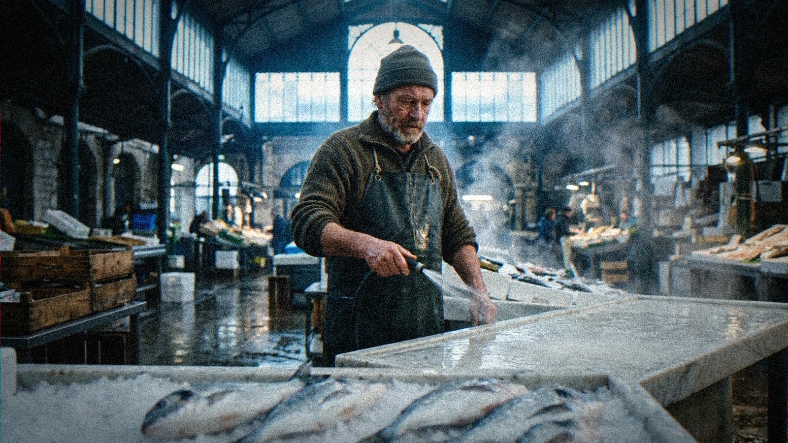
So let's do the exercise on a real shot. The image at the top of this post, I generated it the morning I wrote this, with the house prompt this blog uses. I'll take it apart layer by layer, flaws included, then show you how to do the same thing on a video shot, one frame at a time.
AI shot analysis: what you actually look at
A shot is one unit of camera time between two cuts. Not a sequence, not a whole film. We stay on that smallest unit on purpose, because that's where believability lives or dies. If one shot in ten is off, that's the one the audience remembers.
You can't read an AI shot quite the way you read a filmed one. On a real set, physics comes free. Light behaves, water runs downhill, steam has something hot under it. A model guarantees none of that. It produces something plausible on average, and your eye snags right in the gap between plausible and true.
I always split a shot into seven layers, in the same order:
- Framing: where the camera is, what's in, what's out.
- Optics: apparent focal length, depth of field, how the blur behaves.
- Light: where it comes from, how many sources, whether they fight each other.
- Texture: skin, fabric, wet surfaces, wear.
- Physics: gravity, water, smoke, steam, reflections, shadows.
- Motion (video only): speed, motion blur, whether shapes hold steady from frame to frame.
- Intent: what the shot says, and whether it still says it once it's cut into an edit.
Order matters. Start with skin and you'll miss a lopsided frame. Start with intent and you'll forgive everything because "the vibe is there."
The shot, taken apart: the fish market
The prompt asked for a fishmonger in his fifties wearing a rubber apron, hosing down a marble counter at dawn in an old covered market. Cold light slanting in from tall iron-framed windows, crushed ice and sea bream in the foreground, wet floor, camera at chest height. The blog's image script then adds grain and a light vignette in post, so the grain you see doesn't come from the model.
Framing: symmetrical, and it holds
He's almost dead center, framed from the waist up. Behind him the market hall runs toward a big arched window, and every line (steel beams, rows of stalls, bays) converges on his head. The vanishing point lands right on him.
Beginners learn the rule of thirds as gospel, so a centered frame gets a bad rap. It works here because the architecture does the composing for you. The eye comes in low (the fish), climbs the arm and the spray, and ends on the face. That's the read we wanted.
The camera does sit at chest height, as asked. We meet him eye to eye, neither crushed nor made heroic. For a shot that introduces a character, that's the right height.
If you want to brush up on the basics first, I covered how to frame an AI image like a film set, with the eight ideas that come up in every analysis.
Optics: three planes of focus, no anamorphic
Depth of field is one of the wins here. In the foreground, the sea bream on ice are properly soft and give the frame some thickness. The fishmonger is sharp, falling off gently toward his shoulders. Behind him, the hall, the shoppers and the other stalls stay readable but softened. Three clean planes of focus. That layering is what gives the image volume.
The prompt also asked for an anamorphic lens, and the image doesn't show one. No oval bokeh in the background lights, no horizontal flare off the window, no particular squeeze. The model read the word as a vague "make it cinematic" hint.
Typing "anamorphic lens" guarantees nothing. Only the image counts, and that's exactly what analysis is for: checking what the model actually did with your words.
Light: a consistent backlight
The key source is the big window at the back, behind him. It's a committed backlight: the steam is lit from behind and pops white against the dark areas, his shoulders get a thin rim, the wet floor throws back the glass.
His face gets softer light, from the front and slightly above. In a real market hall that would be sky bouncing off pale surfaces and the side windows. It's believable. You don't feel a hidden lamp off camera.
One small tension: the pendant light high up at the center of the window is on and has no effect on the scene. At dawn in full daylight, you can justify it. But if this shot had to cut to a tighter shot of the ceiling, you'd need to decide whether that lamp lights anything.
Texture: the best layer in the shot
Patchy grey beard, lines around the eyes, a thick wool sweater that's pilling, a dark matte apron, hands red from the cold. The skin has pores and unevenness, no plastic smoothing anywhere. The wet concrete shines in patches, never evenly.
Recent models handle this layer best, and it's also the one that fools you most. Flawless texture gives an overall feeling of realism that hides worse problems elsewhere. Which is exactly what happens here.
Physics: where the shot breaks
The steam has no heat source. A man is rinsing a counter with cold water, early morning, in an unheated hall. There should be no steam at all. Yet it curls up across the whole right half of the frame. I asked for it myself, because "steam and water mist" sounds cinematic. The model did what it was told. The result is beautiful and physically wrong. A viewer won't be able to say why, but they'll feel the air is too dramatic for what's going on in it.
The marble slabs meet at an impossible angle. Look at the corner of the counter to his right: two marble tops cross into a point that matches no real piece of furniture. The model fused two neighboring stalls into one object.
The hose has no readable path. You see the nozzle in his right hand, then a hose looping under his forearm and vanishing. You can't tell where the water comes from. On a still, you get away with it. In video, at the first arm movement, that hose will twist or split in two.
None of these flaws show up in a thumbnail. All of them jump out full screen after ten seconds of real attention.
Intent: does the shot say something?
Yes. A man alone getting his stall ready before opening, in a huge space that's still empty. The shot sets up a character, a trade, a time of day, a loneliness. It could open a short film.
Verdict: keep it, after fixes. Framing, optics and texture are good. The physics has to be repaired before this image becomes a start frame for a video generation, because in motion, every physical flaw gets worse.
💡 Frank's Cut: tag every flaw with its layer in brackets, like "[physics] steam with no source." After ten shots you'll see which layers break most often for you. On both shots in this post, it's physics, and on the market shot it's my own fault: I asked for atmosphere that had no reason to exist.
The checklist in one table
My checklist fits in seven rows, each with a sign that the layer works and the failure today's models produce most often. Print it and tape it to the edge of your monitor.
| Layer | Question to ask | Sign it works | Typical AI failure |
|---|---|---|---|
| Framing | Does the eye know where to go? | Lines leading to the subject, a useful foreground | Subject centered by default, empty or cluttered background |
| Optics | Does the blur follow a logic? | Several planes of focus, gentle falloff | Everything sharp, or a "cut-out" blur around the subject |
| Light | How many sources, and do they agree? | One readable key direction, shadows all falling the same way | Face lit from the front while the source sits behind |
| Texture | Have the surfaces lived? | Pores, wear, irregularities | Waxy skin, brand-new fabric, uniform floors |
| Physics | Do water, smoke and steam have a cause? | Every phenomenon has a source in frame | Decorative haze, impossible reflections, fused objects |
| Motion | Do shapes stay stable from frame to frame? | Hands, faces, objects stay constant | Fingers multiplying, textures that "boil" |
| Intent | Does the shot say one clear thing once cut in? | You can sum it up in one sentence | Pretty image that serves no scene |
The last two layers are the ones people skip. Physics because it takes a conscious effort (you have to ask why each thing is there), motion because we watch video at real speed, and real speed hides everything.
For the wider question of making a whole set feel real, I collected the levers that make an AI scene more believable, including the "one physical law per shot" rule that would have saved my steam.
Frame by frame: analyzing a video shot
On a still, everything is in front of you. A five-second video shot at 24 frames per second holds about a hundred and twenty frames, and your eye really sees a handful at playback speed. The worst flaws in generated video live between those frames: a hand that grows a finger for four frames, a shirt pattern that slides, a face that ages halfway through.
The only reliable method is to pull the frames out and look at them one by one.
Extracting frames with ffmpeg
ffmpeg is free, runs on Windows, Mac and Linux, and its fps filter does exactly what we need: it converts video to a set frame rate by dropping or duplicating frames. The official fps filter documentation lists the parameters, and the ffmpeg wiki has examples for grabbing one frame every X seconds.
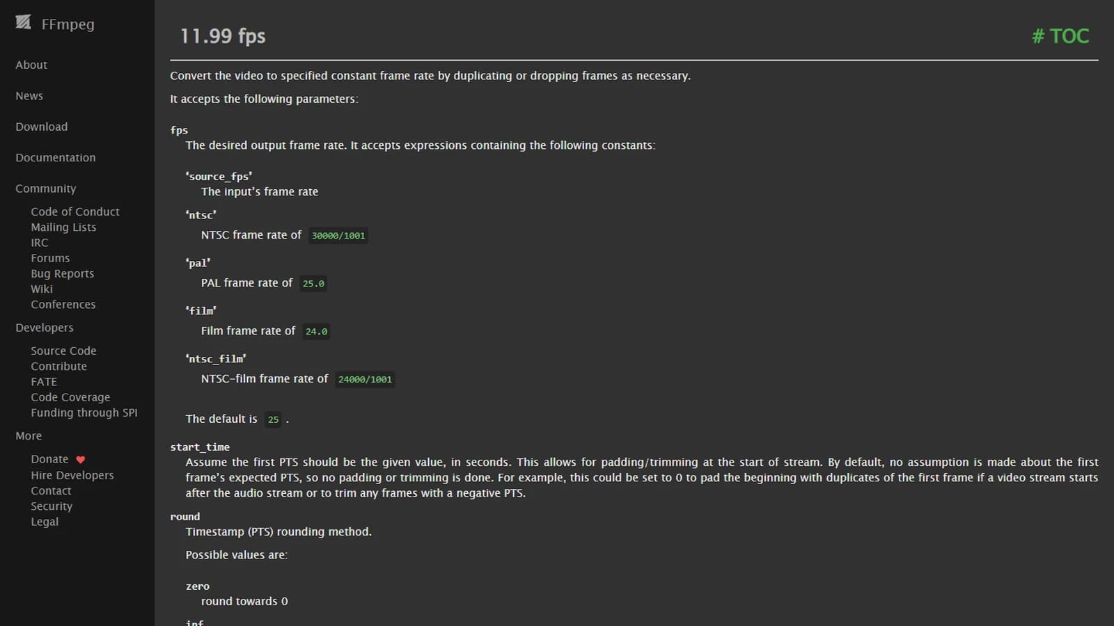
Source: ffmpeg.org, filters documentation, section 11.99 fps. Captured October 9, 2026.
For an AI shot I run three passes:
ffmpeg -i shot.mp4 -vf fps=4 sheet_%03d.png
Four frames per second, so about twenty frames for a five-second shot. That's your contact sheet: lay them out as a grid and spot the big drifts (character changing, set morphing).
ffmpeg -i shot.mp4 detail_%04d.png
No filter, every frame. You don't look at all of them. You only go to the suspicious spots you found on the contact sheet and step through frame by frame.
Third pass: first frame and last frame, side by side. If this shot has to cut into another one, those two frames carry the match.
What I check on the contact sheet
I go through the sheet in a fixed order that follows the most common failures:
- Hands, first. Finger count, joints, grip on objects. Models drop the ball here more than anywhere, especially when a hand touches something.
- The face, next. I check consistency: same age, same nose, same hairline from start to finish.
- Patterns. Checks, stripes, bricks, text. A regular pattern that slides or rearranges itself gives the game away instantly.
- Objects in contact. A held hose, a mug set down, a baker's peel. Contact points between two objects are the least stable areas.
- The background, last. Figures popping in or out, windows changing count.
For light or texture flicker from frame to frame, I wrote a dedicated piece on fixing flicker in AI video, with the post settings that rescue an almost-good shot.
Motion blur, the clue nobody checks
A shot filmed on a real camera has motion blur set by the shutter. RED explains in its shutter angle tutorial that the most common cinema setting is an angle near 180°, which works out to a shutter speed near 1/48 of a second at 24 fps. So an arm moving fast leaves a visible smear on every frame.
Video models often render fast movement too crisp, or smear it in a direction that doesn't follow the gesture. On your sheet, isolate the frame where the movement is fastest and look: is the blur along the direction of travel? Does it scale with speed? A perfectly sharp hand in the middle of a sudden gesture is a red flag.
I went through how to add realistic motion blur to AI video when the model gets it wrong.
Four viewings before you sign off
Once the frames check out, I go back to the moving shot and watch it four times, differently each time:
- Real speed, full screen, with sound if the shot has any.
- Slowed to 25% in the editor.
- On a loop, cut between the shot before and the shot after.
- Small, on a phone, because that's often where it'll be watched.
The fourth one tends to surprise people. Flaws you can't see full screen pop out small, especially light and contrast problems, because the eye reads mass, not detail.
💡 Frank's Cut: never approve a shot the day you generated it. Next morning you've forgotten what you meant and you see what's really on screen. A shot that vaguely bugged you the night before will show you its flaw in three seconds.
Second case: the 3 a.m. baker
To check that the checklist works on more than one shot, I generated a second image under opposite conditions: night, interior, two light sources in two different colors.
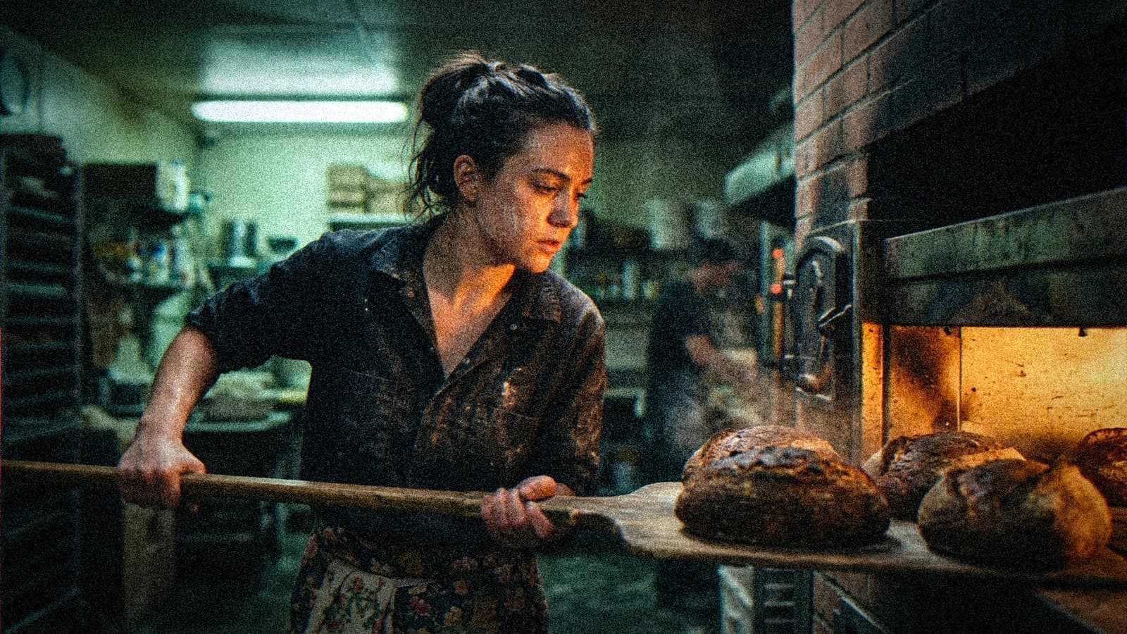
The prompt asked for a young baker pulling loaves out of a deck oven with a wooden peel at 3 a.m., lit by the orange glow of the oven, with a cold greenish fluorescent tube in the back room, flour dust in the air, sweat on her temple, and a low camera near the oven mouth.
Let's run the checklist, faster this time.
The framing holds thanks to the peel. She sits in the left third, and the handle crosses the whole image diagonally to the loaves and the oven mouth on the right. That diagonal does the job the market's beams did in the first shot. Optics deserve no comment: subject sharp, back room and coworker soft, nothing wrong, nothing special.
Light is the strong point. Her face is warmed on the oven side, the background sits in cold fluorescent green, and the two colors don't mix into brown mud. That warm-against-cold contrast says "night shift" without a line of dialogue. And the glow does come from the right, the side where the oven opening is.
Texture is about as good as I could do by hand: flour on the dark shirt, strands escaping her bun, crusts burnt in spots, blackened bricks around the oven mouth.
Physics snags in two places. The oven door, handle and all, floats next to the opening with no readable hinge. And the loaves on the peel blend into the ones still in the oven, so you can't tell where the peel ends. If I animated this shot, that contact point between peel and oven floor would be the first thing I'd watch on the contact sheet.
Then there's what the model simply ignored: the low angle. I asked for a low camera near the oven mouth. The image is shot at chest height, almost level. Same story as the anamorphic lens in the market, a camera instruction tucked into a long prompt and treated as optional.
Intent comes through without effort: an hour, a trade, a tiredness. As a still, I'd keep it as is. Animated, it would need close watching.
Across these two shots, the same pattern shows up: models are excellent at texture and light, average at physics, and unreliable on camera instructions when those are buried in a scene description.
From analysis to fix: rewriting the prompt
Analysis is worthless if it doesn't turn into one precise re-render. The rule I hold myself to: one flaw, one fix, one re-render. Fix three things at once and get a better result, and you'll never know which one mattered.
For the market, here's the order I'd re-render in.
Re-render 1, the steam physics. Two options. Drop the steam from the prompt, and the shot gets drier, more honest. Or give it a cause: "hot water hose" instead of "hose", or a steaming crate of cooked crabs on the next stall. I'd go with the second, because the steam does a lot for the backlight, and with a source in frame it turns into a story detail instead of a decoration.
Re-render 2, the counter geometry. I add one simple spatial instruction: "a single straight rectangular marble counter, parallel to the camera." Models handle furniture badly when you say nothing about its shape, and much better when you describe its orientation relative to the camera.
Re-render 3, the optics. If I really want anamorphic, I describe it by what it looks like rather than by name: "oval bokeh in the background lights, subtle horizontal lens flare from the window." A model reproduces a described look better than a named piece of gear.
The hose I leave alone on the still. I write it down for the video pass: that's the first place I'll look on the contact sheet.
For the baker, one re-render: move the camera instruction to the front of the prompt, right after the template, in a more directive form ("low angle shot from oven height, camera looking up at her"). Word order weighs on what the model keeps.
💡 Frank's Cut: keep a text file with the original prompt, the flaw you found and the corrected prompt, side by side. That log is worth more than any prompt pack you can buy, because it records how your model actually behaves on your subjects.
Analysis mistakes that cost you hours
Almost all of them come from an understandable impatience: you want to know right now whether the shot is good.
Judging from thumbnails
The generation screen shows four small images. At that size, everything looks great. Sourceless steam, fused slabs, a lost hose: none of it shows. Always open the image full screen before deciding anything. If your tool makes that awkward, download it.
Analyzing a shot on its own
A shot never stands alone in a film. The market shot can be perfect in isolation and still fail to cut with the next one, if that one shows the same hall under different light. Put your shot between the one before and the one after before you approve it. Continuity problems are covered in my piece on continuity errors in AI films.
Mistaking style for a flaw
Heavy grain, a slightly underexposed image, a very soft foreground: those are choices. A six-fingered hand, a reflection that matches no object: those are flaws. The question that settles it: could I defend this detail to a cinematographer? If yes, it's style. If you start mumbling, it's a flaw.
Trusting the prompt over the image
I showed it twice in this post. You type "anamorphic", you type "low angle", and because you typed it, your brain sees it in the image. Before you analyze, reread your prompt word by word and tick what's really on screen. Anything without a tick isn't there.
Analyzing when you're tired
After forty generations your eye gets used to the model's flaws and starts treating them as normal. Save the serious analysis for when you're fresh, even if that means a quick sort in the evening and the real decision next morning.
Fixing everything at once
You spotted five flaws, you fix them all in one re-render, the result gets better on three and worse on two. You don't know why. You start over. One flaw, one re-render. Slower on paper, much faster in practice.
Foire aux questions
Réponses rapides aux questions les plus fréquentes sur cet article.
How long does it take to analyze an AI shot?
For a still, two to three minutes with the checklist once it's become a habit. The first few times, give it ten minutes while you learn to look layer by layer instead of judging the whole thing at once. For a five-second video shot, add the ffmpeg extraction time, a few seconds, then five to ten minutes on the contact sheet and the suspicious spots. That sounds slow next to a one-click re-render. In practice it's the reverse: ten minutes of analysis often saves an hour of random re-rolls, because each new generation fixes a named flaw instead of rolling the dice again.
Should I analyze every generation or only the keepers?
Only the serious candidates. When you generate four variations, first cut the ones that miss the intent in thumbnail view (wrong framing, wrong mood, off-brief character). That quick sort is fair, since it's about what you can see small. Then run the full checklist only on the one or two images that might end up in the film. Analyzing every generation in detail burns your attention for nothing, and attention is exactly what you need to catch physical flaws. Save your sharpness for the shots that matter, and jot down in your log the recurring flaws you notice while sorting.
Can I use an AI to analyze a shot an AI generated?
You can ask a multimodal model to describe an image and flag inconsistencies. It's useful as a second pair of eyes, especially for hands or garbled text. But these models often share the blind spots of the generators: sourceless steam or contradictory light look perfectly plausible to them, for the same reason they looked plausible to the generator. I use one as an automated checklist, never as the final judge. The question that matters stays human: does this shot say what I want, and will an attentive viewer buy it? No tool answers the intent question for you, however good it gets.
What frame rate should I use to extract frames from a video shot?
For the contact sheet, four frames per second is enough in most cases: about twenty frames for a five-second shot, enough to catch drift without drowning. For a shot with fast movement (a sudden gesture, someone running, a thrown object), go up to eight or twelve frames per second over that stretch. For frame-by-frame detail, extract everything with no filter, but only look at the suspicious spots. Keep in mind that ffmpeg's fps filter drops or duplicates frames to hit the rate you ask for, so at a low rate a brief glitch can fall between two extracted frames.
Why does my shot look real as a still and fake once animated?
Because animation exposes physics. A still can hold sourceless steam, a hose with no path or a fused object without the eye noticing, since nothing moves. As soon as the model has to evolve those elements over time, it has to decide how they behave, and since they had no logic to begin with, they twist, split or vanish. That's why I always repair the physics layer of an image before using it as a start frame for video. A physically clean still gives you a much more stable video, whatever model you run it through, and saves you the most painful kind of re-render.
Is the rule of thirds required for a good shot?
No. The market shot is centered and works, because the architecture leads the eye to the subject. The rule of thirds is a good starting point for beginners, since it steers you away from flat frames where everything sits in the middle for no reason. But a good frame comes down to a simpler question: does the eye know where to go, and in what order? A centered frame with strong vanishing lines, a diagonal like the baker's peel, a subject on the edge with lots of space ahead: all of it works when it's deliberate. What rarely works is the default centering the model picks when you say nothing.
How do I know if a flaw needs a re-render or can be fixed in post?
Look at the layer. Light, color, grain, contrast and a bit of motion blur fix very well in the edit or the grade. Texture fixes partly, say with inpainting on a patch of skin. Physics and framing, on the other hand, almost always need a re-render: you can't cleanly remove steam that crosses half the image, and you can't reframe your way into a low angle that doesn't exist. Motion is the hardest case, since an extra finger over four frames can sometimes be hidden by trimming the shot, but rarely any other way. Keep re-renders for what post can't repair, and you'll spend your credits where they count.
What I take away
A good shot is one where every layer stands up on its own. The framing leads the eye, the blur has a logic, the light has a direction, the texture has lived, every physical effect has a cause, the motion holds steady, and the whole thing says one clear thing.
The market shot holds on framing, light, texture and intent. The optics ignored my anamorphic request, and the physics breaks, largely because of my own prompt. That happens all the time: the model does what you ask, and what you ask sometimes contradicts itself.
Take the last shot you were happy with, open it full screen, and run it through the checklist. You might be surprised.
Related articles
 Tutoriels
Over-the-Shoulder Shot: Eye-Line Continuity and Depth
OTS framing, axes and prompts to link two characters without crossing the line of action.
 Tutoriels
Pika Labs vs Runway: Choosing the Right Engine for an Action Shot
A field comparison on movement, hands, duration and post to decide in twenty minutes which engine carries your action shot.
 Tutoriels
Choosing the Right Shot Duration According to AI Intention
A practical guide to calibrate the duration of each shot according to emotion, action and editing rhythm.