Accessible Burn-In Subtitles on AI Video
Readability, contrasts, safe zones and multi-platform export for subtitles that survive compression.

You export your AI video with thin white subtitles at the bottom. On TikTok in full sun, no one reads. On Reels, the text passes under the UI. Failed accessibility, lost message, and algorithm that penalizes the retention. The burn-in subtitles are not an "if we have time" option: on social, they are often the only channel of comprehension.
This guide covers readability, contrasts, safe zones, reading rhythm and multi-platform export for subtitles that survive compression and really serve deaf viewers, hard-of-hearing ones, and those who watch with no sound.
Accessibility principles (with no bullshit)
An accessible subtitle is readable, synchronized, complete on the essential, and non-invasive visually. In social practice: sufficient size, strong contrast, semi-transparent background if needed, no more than two lines, speed 14 to 17 characters per second for English.
The WCAG guidelines recommend a high contrast for text. On video, the background changes frame by frame: hence the use of a box background or a controlled drop shadow.
💡 Frank's Cut: always test burn-in on a light background AND a dark background of your video. A pure white that works on the black disappears on a bright window.
Burn-in settings table
| Parameter | Starting value | Goal | Frequent mistake |
|---|---|---|---|
| Size | 4.5 to 5.5% of height | Mobile reading | Microscopic text |
| Contrast | White 90% + shadow 40% | Separation from background | Pure white with no outline |
| Max lines | 2 | Fast scan | 4-line paragraphs |
| CPS | 14 to 17 (EN) | Comfort | Too-long blocks |
| Safe zone | 80% central | Avoid platform UI | Text stuck to the edge |
Subtitles workflow on AI video
Step 1: transcription and script
Start from a validated script or a corrected human transcription. No raw unreviewed STT on technical terms. Segment by unit of meaning, not by fixed length.
Step 2: style and template
Create a Premiere / AE / CapCut preset: bold sans-serif font, outline or box, bottom-third position above the TikTok UI zone (about 15% of the bottom free in 9:16).
Step 3: aligning on the video
The AI videos sometimes have micro audio offsets. Manually adjust the entries on the strong beats. Avoid the subtitles that arrive 200 ms before the voice.
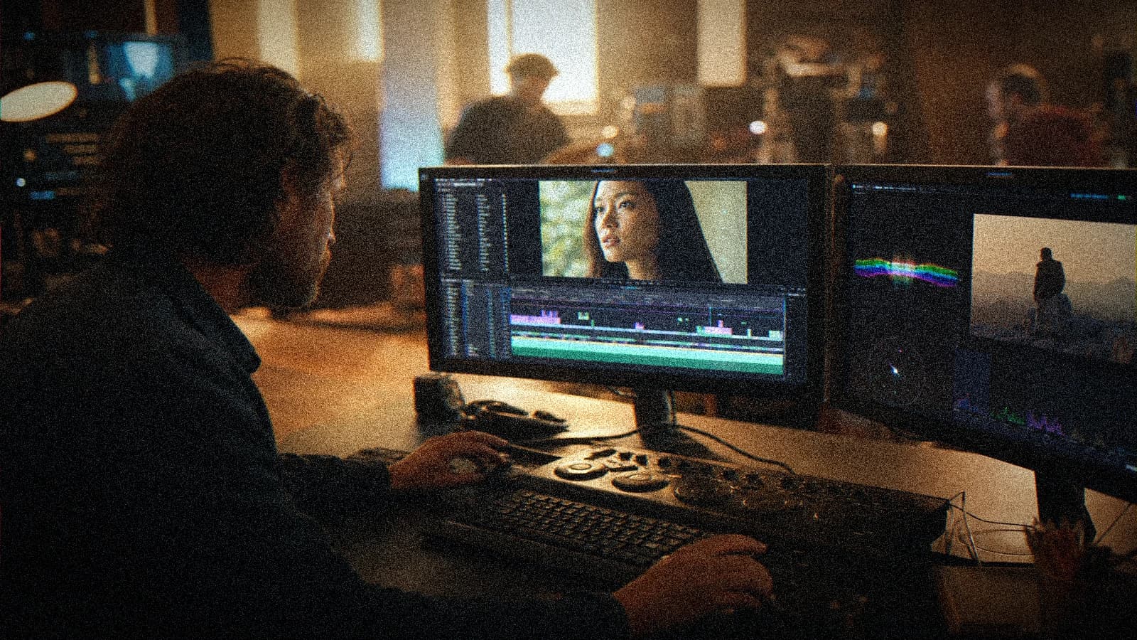
Step 4: exports
Master with burn-in for social. Version with no subtitles + .srt file for YouTube if needed. Test a private upload, watch on a phone.
Scenarios
Vertical interview: semi-opaque box, 2 lines max. Soundless fashion ad: the subtitles carry 100% of the message, max size. Tutorial: technical terms in a secondary color, no more than 3 colors.
Troubleshooting
Unreadable outdoors: outline thickness + box. Hidden by UI: raise the safe zone. Overload: cut the parasite words, keep the meaning. Desync: re-align on the voice waveform.
- complete Seedance 2 workflow
- two-character dialogue scene with no broken continuity
- transform an AI image into a fluid video
- structure an AI video like a real film
Foire aux questions
Réponses rapides aux questions les plus fréquentes sur cet article.
Burn-in or separate file?
Burn-in for TikTok/Reels/Stories where the viewer does not load a .srt. Keep the .srt for long YouTube and accessibility.
Which font to avoid?
The ultra-thin and the decorative scripts. Bold readable sans-serif.
Should you translate the burn-in?
One master per target language, no unreviewed auto-translation on the on-screen text.
How to handle proper nouns?
Human re-reading, a list of names upstream, no STT alone.
Do the subtitles mask the AI image?
Position them in the low-information zones (sky, wall), never on the face if avoidable.
Too-fast CPS: symptom?
A viewer who pauses. Cut the segments or simplify the text.
Legal accessibility?
Depends on the country and the broadcaster. Even with no obligation, the social retention justifies the effort.
Same style as the film titles?
No. Titles = brand design. Subtitles = max readability, more neutral style.
Successful burn-in subtitles on AI video is audiovisual UX. You do not "stick text", you secure the comprehension on each screen and each brightness.
Field practice: the working routine
When you work on accessible AI video subtitles in real conditions, the chaos comes from the deadlines, not the tutorials. This section is what I put in the deliverable folder so the team lands on its feet a week later with no me.
Before each batch, reread the brief in five lines. A "quick" prompt change with no rereading the brief creates magnificent but unusable shots in the edit. The editor will thank you if each file carries a logical name and an A/B/C note.
For the validation, impose two screens: bright phone + neutral monitor. Many defects on accessible burn-in subtitles on AI video only appear on one of the two. If it holds on both, you can move on. Otherwise, a single lever changes, not five.
In a client meeting, show a ten-second excerpt with sound, not a gallery of stills. The movement and the audio sell the credibility. The fixed images lie about the final quality of AI videos.
Document the owned debts (grain, micro drift, text composited in post). Transparency avoids the "redo everything" when the creative director sees the master on a big screen.
💡 Frank's Cut: if you do not feel like explaining a technical choice to the client, that choice is probably a debt to own in black and white, not to hide.
Always cross-reference with why my AI videos look fake when you doubt the global realism. Often the problem is not the subject of the article, but a missing pilot or sound upstream.
Typical session (45 min): brief 10 min, generation 20 min, QA 10 min, post 10 min, mobile export 5 min. If you do not have an A shot in one hour, pivot the brief, not the caffeine.
Final checklist: message readable with no sound (if subtitles), message audible with sound (if VO), consistency with the brand guidelines, platform export tested privately, files named and archived.
Related articles
 Tutoriels
Typography and Titles: Avoiding Gibberish in AI Production
When to generate text, when to create it in post, and an After Effects workflow for clean film titles.
 Tutoriels
Underwater Shots: Caustics, Limits and AI Workarounds
What the engines hold underwater, when to prefer hybrid compositing, and a validation workflow.
 Tutoriels
Multilingual Voiceover Localization: AI Workflow and Lip-Sync
Adapted scripts, voices, rhythm and QA for FR / EN / ES versions without losing the intention of the edit.