How to Avoid the 'Generated Image' Effect
Suspicious symmetries, plastic material, gratuitous HDR, and 'catalog' poses: a checklist to slip under the visual radar.

The "generated image" effect is not a technical label. It is a social reading: too clean, too symmetric, too saturated, too "perfect on all axes at once". To avoid it, you do not look for perfection, you look for a measured human consistency.
The language mistakes: the prompt mistakes that make an AI image look artificial. For the plastic skin: how to generate photorealistic AI images without the plastic look. To structure the frame before polishing the textures: fixing an AI composition without regenerating everything. For the tonal hierarchy that avoids fake HDR: why your AI images lack contrast and how to fix it.
Checklist 1: a single "demo" at a time
HDR + extreme bokeh + hyper-detailed texture + perfect reflections: the "AI 2024" cocktail.
Fix: remove one spectacular lever. Keep the hierarchy.
Checklist 2: deliberately break a symmetry
A frame too balanced with no narrative reason smells of generation.
Fix: light reframe, off-center prop, off-axis cast shadow.
Checklist 3: grain and global sharpness
A global sharpen on the whole frame screams digital. A fine homogeneous grain often helps glue the too-clean zones.
See how to add cinema grain to an AI image.
Checklist 4: pose and gaze
A gaze to camera with a catalog smile and no context: a cliché.
Fix: a one-line narrative intention, even a banal one: "waiting for a message, hands on a cup".
Table: "AI" signal, action
| Signal | Action |
|---|---|
| plastic | skin texture + less HDR |
| perfect teeth | neutral mouth |
| weird hands | off-frame or a simple action |
| impossible reflections | simplify the sources |
"Perfection" is a stack of regular defects
What betrays an image is almost never an isolated detail: it is a predictable combination. Pushed HDR on smooth skin, near-mathematical symmetry of the set, a frontal smile with no motivation, a global sharpness that draws a halo around the edges: the brain quickly classifies that as a demo image. Your job consists in reintroducing useful irregularities: a dirtier shadow under a chair, dust on a window, a micro-asymmetry of the gaze, a blur zone that fits a plausible focal length.
On a series for a brand, set an "authorized defects palette": three recurring micro-imperfections (light grain, slight vignetting, local temperature variation) that you apply deliberately to avoid the showroom render. It is not aesthetic sabotage: it is a controlled human signature. You can calibrate this palette with the site's guides on cinema versus amateur render and on truly photographic prompts.
When you compare two versions, avoid the religion of the detail at 400%. First ask yourself if the image tells an intention in three seconds on mobile: if the thumbnail looks like a generic ad, full screen will not save the reading. For portraits, a banal but motivated pose beats an empty "hero" pose; for landscapes, a blurred frame entry beats total sharpness from the first to the last plane if your focal length does not allow it. These are visual-language decisions, not just sliders.
Finally, anticipate the double compression: a social media export, then a messenger recompression. An image already too contrasted and too saturated becomes caricatural after two encoder passes. Keep headroom on the highlights and test a "worst case" export before validation. It is often at that moment that the famous "AI effect" appears while the master was still acceptable.
Useful external references
To structure your quality assurance from a method standpoint: the NIST AI Risk Management Framework. For the tonality part and corrections with no fake shine: the Adobe tutorial on adjusting tonality and color in Photoshop. For the sharpen with no garish halo: the Unsharp Mask explained guide at Cambridge in Colour.
Field deep dive: How to avoid the "generated image" effect
This chapter extends the angle "Suspicious symmetries, plastic material, gratuitous HDR, and 'catalog' poses: a checklist to slip under the visual radar." for the real subject behind comment-eviter-effet-image-generee-ia. The goal is not to stack adjectives, but to install a short QA loop you can reuse on every deliverable: capture, note, compare, decide, archive. Most creators waste time because they mix three variables in one session, then blame the model. When you separate light, composition, texture, intention, you get back an honest diagnosis and measurable progress.
"One variable" protocol (30 minutes)
Minute 0 to 5: write the sentence "what the viewer must believe with no caption". Minute 5 to 12: list three possible visual proofs (cast shadow, prop in use, consistent reflection). Minute 12 to 22: generate two images that differ by only one of those proofs. Minute 22 to 28: test on a mobile thumbnail and full screen. Minute 28 to 30: choose A or B and name the winning criterion in the project file. This protocol avoids the drift where each regen changes everything except the initial problem.
Scenarios A, B, C with pivots
Scenario A. Render too clean, too showroom. Pivot: add a localized trace of use and a more marked side light, without touching the subject if the geometry is good. Scenario B. Cluttered image with no hierarchy. Pivot: remove two objects from the prompt, recenter the contrast on the subject, or tighten the framing. Scenario C. Spectacular but cold image. Pivot: lower the global saturation slightly, add a fine, even grain in post, then regenerate only if the geometry or the perspective still lies.
Trench warfare: ten frequent traps
- Fixing everything at once. You no longer know what saved the image.
- Comparing only full screen. Mobile often exposes fake luxury.
- Ignoring rhythm upstream of the video. Even upstream, think about cutting and the breathing of shots.
- Copy-pasting prompts with no local brief. The words must fit your real subject.
- Aggressive global sharpening. Garish edges read as "digital".
- Too many contradictory adjectives. One dominant intention is enough at the start.
- No archive text file. You lose the seed, the version, and the reason for the choice.
- Validating while tired. Fatigue makes "beautiful" out of what is only familiar.
- Stacking models on the same day. You compare different chains, not settings.
- Delivering with no A/B. The client or your future self will not know what was acceptable.
Quick decision table
| If you observe | Priority action |
|---|---|
| inconsistent light | simplify the sources |
| subject drowned | framing or contrast hierarchy |
| plastic texture | fine grain or less HDR |
| impossible hands | off-frame or trivial action |
| catalog set | micro wear and a functional prop |
| empty sky | cloud volume or motivated haze |
| impossible reflections | reduce the contradictory sources |
Client or commissioner workshop
Even for yourself, write a mini brief: audience, channel, expected reading time, prohibitions (violence, brands, real faces). For a team, add a "proof of compliance" column: capture of the service's terms, model version, export date. That column saves you when a broadcaster asks where the image comes from.
Recurring questions (workshop)
Should I deliver two versions? Yes, A and B with one named sentence of difference, otherwise the discussion stays vague. Should I document the prompts? Yes, even partially: it is your internal quality insurance. What if the model changes? Set a test brief and compare before continuing a series. Does manual retouching cheat? No if you own the chain and the contractual limits. How much time per serious image? Often longer in validation than in raw generation, plan for it in the quote. Do I need a technical target? Yes: final resolution, color space, headroom on highlights if there is social compression. And intellectual property? Check the terms of service and the rights on the references included in the prompt.
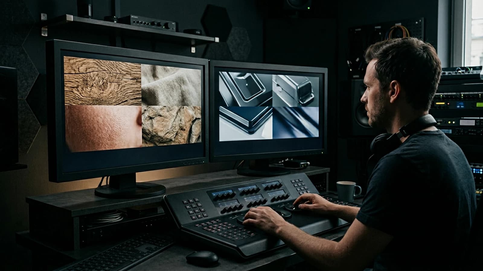
Multi-screen control station
Minimum chain: main monitor, standard laptop, smartphone. If you only have two screens, send a test export to your phone through a clean channel (not a messenger that recompresses endlessly). Note the perceived difference on skin, edges, and micro-contrasts. Many "AI" images become so mostly after a second involuntary compression.
Useful internal links
Cross-reference with why your prompt does not work, and how to fix it, the prompt mistakes that make an AI image look artificial, and how to control visual style in an AI generation. If your subject touches video, also link to how to structure an AI video like a real film and to how to improve motion realism in AI video.
End-of-session log (template)
Date:
Slug / file:
Hypothesis of the day:
Variable tested:
Result A vs B:
Decision:
Next test:
Operational summary
For comment-eviter-effet-image-generee-ia, keep three lines in your notebook: intention in one sentence, lighting law in one sentence, material proof in one sentence. If one is missing, you are not ready to regenerate en masse: you are ready to diagnose. Long-term quality comes from that discipline, not from the latest model released on Tuesday.
Series B extension: deliverables, risks and governance
How to avoid the "generated image" effect: the excerpt "Suspicious symmetries, plastic material, gratuitous HDR, and 'catalog' poses: a checklist to slip under the visual radar." often sets an implicit expectation: a stable, defensible, reproducible deliverable. The slug comment-eviter-effet-image-generee-ia serves as a guiding thread: each export must be linkable to an intention, a proof, a limit. This section adds a governance + risks + deliverables layer you can copy into your internal Notion or your project drive.
Deliverables: what you really promise
A deliverable is not "an image": it is a package (master, social adaptations, light note, naming, date). For a series, set a convention: slug prefix, suffix _v02_client, an exports_sociaux folder separate from masters. If you deliver a video, add a line on the target bitrate and the safety reframe for stories. If you deliver AI shots, specify whether manual retouching is included or optional. These details avoid the discussions where everyone talks about a different object.
Risks: contractual and technical blind spots
The risks are not theoretical: a broadcaster can ask for the provenance, a client can compare two differently compressed versions, a tool can change its pipeline overnight. Document the service version and the date in a text file in the folder. If you use external visual references, note whether they are authorized by your contract. If you work with faces, clarify whether you stay in non-realistic generations or whether you go through specific consents. For the comment-eviter-effet-image-generee-ia chain, the goal is simple: reduce the uncertainty when you reopen the project six months later.
Governance: minimalist roles (even solo)
Even alone, you can wear three hats: brief, execution, control. The brief forbids touching the model until the intention is written. The execution forbids changing three variables at once. The control forbids validating without mobile. When you grow into a team, these hats become columns in a table: who validated, with what proof, at what time. Light governance beats theoretical governance: five mandatory fields are often enough.
Export pipeline: zero surprise at upload
Before uploading, go through a short checklist: metadata cleanup if necessary, color profile consistent with the platform, test on a cold screen (low brightness). For long formats, check the black chapters and the gray backgrounds that reveal banding. For very textured visuals, a light even grain sometimes masks the artifacts better than aggressive sharpening. For comment-eviter-effet-image-generee-ia, think of the viewer who will first see the thumbnail, not the 4K version.
Collaboration: how to avoid infinite loops
Infinite loops are born when no one decides. Set a rule: two rounds of feedback then a decision, except for a blocking bug. Each piece of feedback must name one criterion and propose one action. "I do not like it" is forbidden; "the subject is too low in the frame, raise it 8%" is allowed. If you are a service provider, write in black and white how many variants are included. If you are an internal creator, keep a decision log so you do not redo the same debates.
Useful metrics (with no heavy spreadsheet)
You do not need complex analytics: count the average time per iteration, the abandonment rate (discarded images), and the first-try validation rate. If the first try is always rejected, your brief is probably vague. If you discard everything, your protocol mixes too many variables. For How to avoid the "generated image" effect, these metrics tell you whether you are progressing or moving sideways.
Quality escalation: when to stop regenerating
Stop when you correct a detail that only appears at 400% zoom, except for giant print use. Stop when the geometry is good but only a micro-texture bothers you: go to targeted post. Stop when you change the model to flee a light problem: you reset all the rest. The slug comment-eviter-effet-image-generee-ia must stay a mastered project, not a spiral.
Archiving: what a future you will thank you for
Archive: main prompts (even partial), two annotated A/B captures, the list of tools and versions, and a sentence "why we decided this way". If you deliver to a client, a clean zip with a short README beats ten badly named files. For the angle "Suspicious symmetries, plastic material, gratuitous HDR, and 'catalog' poses: a checklist to slip under the visual radar.", the archive proves you followed a process, not just a momentary intuition.
Test bench: comparing without going wrong
When you compare two outputs, align them: same duration, same test framing, same screen. If you compare two different models, note that you are measuring two chains, not two settings of the same chain. For videos, sync on a fixed shot before judging the movement. For images, compare first in full frame, then in detail on a problem zone agreed in advance.
"Ready to deliver" checklist
- Intention readable in three seconds on mobile.
- Light consistent with the action and the set.
- No useless "burned" zone on the main subject.
- Stable naming and clear version.
- Light note or delivery email that summarizes the known limits.
Series B questions (contracts and deliverables)
Do I need a written contract for a micro-job? A short email exchange with the scope and the number of back-and-forths avoids 80% of tensions. Should I deliver the prompt? Depending on the contract; otherwise, deliver an equivalent functional description. What if the platform compresses? Plan headroom on the highlights and test a "worst case" export. How do I handle late feedback? If it is out of scope, propose a priced addendum rather than a vague negotiation.
Series B summary
For How to avoid the "generated image" effect and the scope comment-eviter-effet-image-generee-ia, keep in mind: deliverable = package, risk = written trace, governance = roles and dated decisions. The excerpt "Suspicious symmetries, plastic material, gratuitous HDR, and 'catalog' poses: a checklist to slip under the visual radar." becomes actionable when you link each sentence of the brief to a visual proof or an owned limit. This is not pessimism: it is what lets you deliver fast with no regret.
FAQ
Foire aux questions
Réponses rapides aux questions les plus fréquentes sur cet article.
Is it subjective?
Yes, but the patterns above come up often in team reviews.