How to Simulate an Anamorphic Lens in AI Generation
Bokeh, falloff, flare, slight distortion, and when not to use the word anamorphic.
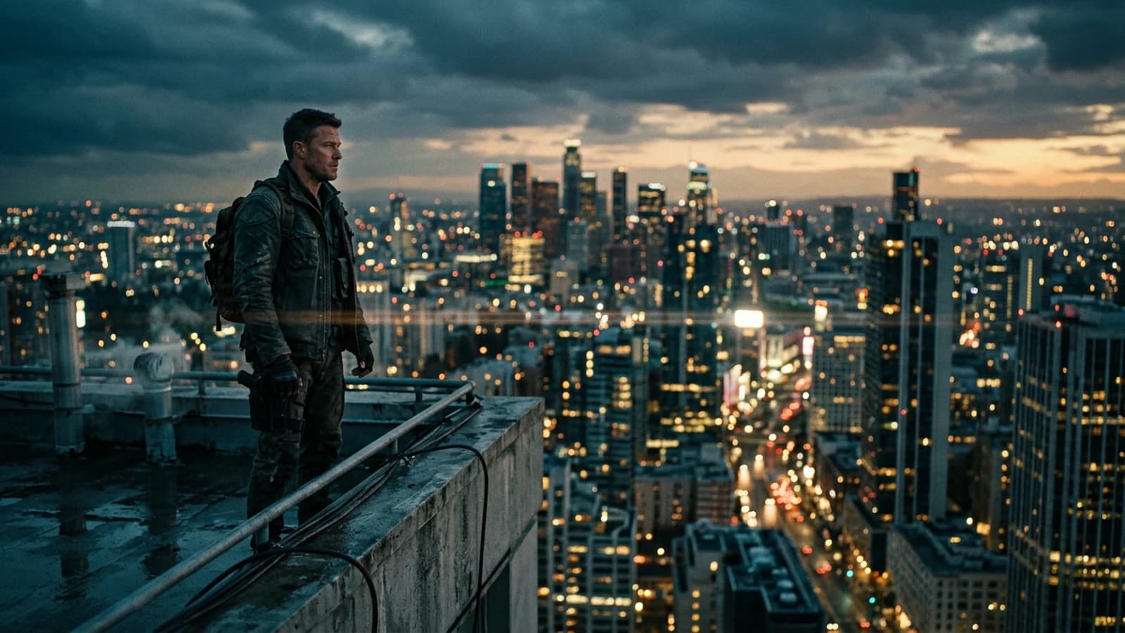
A real anamorphic lens compresses the image on the film or the sensor then decompresses it in projection. It is not just an Instagram filter. You can use it as a cultural reference without claiming to reproduce a precise lens series to the micron.
The goal here is simple: give language levers to guide the model, then verify at zoom and with an eye step back. If an image pleases you immediately but lies about the light, you will keep it for a thumbnail, not for a long scene. You get a particular geometry, an often stretched bokeh, in-line flares, a sharpness falloff that has nothing to do with a simple gaussian blur. In image generation, the word "anamorphic" quickly becomes a sticker: you think you have cinema, you often get dirty blur and incoherent ovals.
This guide aims for a plausible result: not the perfect copy of a precise lens, but an image that does not betray the physics of the gaze. We describe what the model can hold, we avoid contradictions, and we sometimes finish in post when the prompt alone rarely suffices.
You can read the sections in order or skip directly to the workflow if you already have a failed image in front of you. In both cases, keep one rule: one simulated optical decision per image, not three different lenses in the same prompt paragraph.
The checkpoints and interfaces change, but the viewer's logic changes little. They compare your image to thousands of hours of film and photo references. Your work is to stay in a credible band, not to push every slider to the maximum.
What an anamorphic really changes
The bokeh is not round as on many classic spherical lenses. Often, the out-of-focus highlights take an oval or cat eye shape toward the edges. The sharpness falloff can be more progressive or more "cine" depending on the lens series, but the essential is the consistency: the same type of bubbles across the whole field, not a mix of rounds and ovals for no reason.
The classic anamorphic flares often include horizontal streaks when a strong source enters the field. If your set has no intense source and you pull blue streaks, the brain screams digital set.
The slight horizontal distortion can widen the faces at the frame edge if you simulate an anamorphic wide angle without reframing. You can own it for the style, or you compensate with framing and a longer virtual focal length.
For the natural light that often accompanies this kind of look, cross-reference with how to create natural light in an AI image: a consistent soft key avoids the bokeh becoming the only subject of the image.
When not to write "anamorphic"
If you only want a clean blurred background on a portrait, a spherical 50 mm describes your need better. The word anamorphic calls for specific artifacts; the model will sometimes add them at random.
If your image is already saturated with contrast and neons, adding anamorphic + flare + oval everywhere gives a soup. In that case, why your AI images lack contrast, and how to fix it helps you replace the contrast before simulating a lens.
Three scenarios
Urban night, neons, rain. You own flare and ovals. You describe strong sources, ground reflections, a lateral key on the face. You ask for stretched highlights in the bokeh, not on the sharp skin. You keep a clear reading of the gaze even if the background screams in colors.
Daytime interior, wide window. You want a soft falloff and a discreet oval bokeh. You avoid aggressive flares. You specify the subject-background distance so that the blur follows a depth law.
Sober portrait, neutral background. Often you do not need anamorphic. A spherical 85 mm and a simple light give a more stable result. Only use the anamorphic if you own the imperfection as a style sign.
Scene with a lot of text or UI in the set. The ovals and streaks can make the letter edges unreadable and "dirty". Either you simplify the set, or you go spherical to keep the readability. The cinema look must not kill the information.
For the clips where the movement reveals the errors, why my AI videos look fake, and how to make them realistic complements this guide: a simulated lens must stay consistent frame after frame.
Workflow: from prompt to retouch
Step 1: define the virtual focal length and the distance
Write: camera at eye level, subject at two meters, background at six meters, anamorphic lens characteristics only if you master the rest. Otherwise start with "shallow depth of field" and add progressively.
Step 2: describe the bokeh by behavior, not by slogan
Replace "cinematic bokeh" with: oval highlight shapes in out of focus areas, cat eye toward frame edges, smooth falloff. These terms orient with no magic.
Step 3: flares or not
If yes: horizontal lens flare streak from a strong practical in the frame edge, subtle veiling glare. If no: no artificial streak flares, clean highlights.
Step 4: generate three variants
Same prompt, three slightly different lights. Choose the one where the ovals are even and the face does not melt.
Step 5: targeted post
If the bokeh is almost good but too uniform, a slight selective horizontal stretch on the out-of-focus highlights can suffice. If the skin is plastic, fix the skin before pushing the ovals, otherwise you burn the transitions.
Step 6: multi-shot consistency
For a mini story, how to write an effective script for an AI-generated video helps you lock what must stay identical between shots: same time, same type of simulated lens, same key direction.
If you change the simulated lens between two shots of the same dialogue for no narrative reason, the viewer reads a production error. If you change deliberately to mark a flashback or a world change, signal it with the sound or a voice sentence, not only with a bigger oval.
Example of a structured prompt:
35mm anamorphic-style spherical emulation, eye level medium shot.
Subject 2m from camera, background lights 8m+ away, strong separation.
Oval bokeh highlights, gentle edge softness, no plastic skin.
Optional: subtle horizontal flare from bright sign at frame edge, not on face.
Negative: duplicated catchlights, warped geometry, cartoon CA, text, watermark.
Second example, more sober:
50mm spherical lens look, shallow depth, natural round bokeh.
Soft window key, no anamorphic streaks, realistic skin texture.
Negative: oval bokeh, fake anamorphic, extreme halation.
Light, contrast and color with an anamorphic look
The classic anamorphic look in cinema is often associated with strong contrasts and visible sources, but it is not an absolute rule. What matters is that the light justifies the optical artifacts. A credible horizontal streak almost always starts from a strong practical, a hard backlight, or a direct reflection in the lens. If your scene is soft and diffuse and the model adds streaks, you get an immediate inconsistency.
Work the hierarchy: a clear key, a fill often weak or absent in a contrasted look, a background that carries the light points that will become bokeh. If the whole frame is uniformly lit, there is no material to draw interesting ovals: you will have generic blur.
On the skins, the local contrast must stay controlled. The "blockbuster" looks sometimes push the mids, but if you add halation and flare with no control, the cheeks and the nose lose their structure. A stable solution: keep the face in a narrower contrast range than the background, then push the drama on the distant lights.
For exterior daytime scenes, the simulated anamorphic is often wisely underused: a too-sharp sky with artificial ovals on leaves gives a collage. Prefer a clear spherical approach, or own a strong backlight that creates stretched highlights far from the face.
Grain, sharpness and resolution
Fine grain helps to glue the very sharp zones and the very blurred zones when the model creates a too-clean separation. Add the grain often in post rather than as an overload in the prompt, to control the density in the shadows.
Go up in resolution only when the bokeh geometry suits you at the working scale. Otherwise you enlarge incoherent shapes. Smart upscale does not "guess" a better lens: it extrapolates what you give it.
If you use several passes (base image, then img2img), note the settings at each pass. Slight dénoise variations can break the bokeh homogeneity between two images of the same series.
When you compare two resolutions, also check the apparent sharpness on the bokeh highlights: sometimes the upscale makes these zones harder, more "CG", and you must soften them locally. It is not a betrayal of the look, it is finishing like in classic grading.
Micro adjustments and model limits
The models sometimes confuse chromatic aberration and anamorphic style. A violet fringe everywhere is not an optical signature, it is often an error. If you see colors that detach from the edges, reduce the effect or go through a second generation with a targeted negative.
The straight lines at the frame edge: a slight mosquito effect can go with the look, but walls in waves betray the generation. Reframe to put the verticals far from the edge or simplify the set.
The foreground skin must stay readable: suggested pores, not a grid. If the model smooths everything to "make it cinema", lower the guidance or add controlled imperfections in the prompt.
Choice table: anamorphic or not
| Visual need | Useful keyword | Risk if you force anamorphic |
|---|---|---|
| Clean portrait | spherical, 85mm | incoherent ovals |
| Neon night | anamorphic + practicals | flare and mud |
| Architecture landscape | spherical wide | twisted geometry |
| Interior dialogue | soft key + falloff | bokeh distractions |
| Wide-field action | spherical + clean motion blur | optical double language |
A "cinema" look comes first from the light and the framing. The simulated lens does not replace a key that lies, nor a scene geometry that is fuzzy in your brief, nor a set too cluttered to hold in depth.
Honest A/B comparison
When you hesitate between spherical and simulated anamorphic, export two series with the same light and the same framing. Put the images side by side, reduce the size to a thumbnail. Often, at a small scale, you see immediately which version tells a credible lens and which version looks like a filter.
Also ask your eye to squint: do the sharp-to-blur transition zones form a soft curve or a staircase step? The violent steps betray the digital collage even if the ovals are pretty.
What you can promise a client
If you deliver for a brand, name what you simulate: "anamorphic look inspiration", not "shot with such a real lens" unless it is true. Document the retouches. The optical style is a legitimate creative decision; the lie about the provenance is not.
For a poster series, lock a style sheet: three sentences on the bokeh, two on the authorized flares, one on the prohibitions. Any drift in the middle of the project costs dearly in regeneration.
Trench warfare: frequent mistakes
Pasting "anamorphic" ten times in the prompt. The model amplifies at random. A physical description of the bokeh beats ten repetitions.
Forgetting the subject-background distance. With no distance, the blur has no law, the ovals float.
Asking for flare and a low-light scene with no strong source. The streaks with no readable cause break the scene.
Global sharp afterward. You harden the bokeh artifacts. Mask the face.
Mixing several lens styles in a series. Shot 1 heavy anamorphic, shot 2 sharp smartphone: the viewer feels the seam.
The article anamorphic format sums up the historical idea: optical stretching to gain field height on the film. In pure digital, you do not have the same physical constraints, but the viewer has integrated visual codes. Your work consists of staying within these codes without caricature.
Thematic LoRAs are tested on a short prompt before committing a whole project: a pack trained on neons can ruin a daytime portrait. The 2.39:1 ratio does not force the anamorphic, it is a framing question. If the model ignores your ovals, remove half the prompt and raise the guidance in steps. In video, a pulsing bokeh often comes from a too-aggressive movement: reduce the amplitude or freeze the background. A real reference photo of the same type of scene is worth more than twenty adjectives to calibrate your eye.
Foire aux questions
Réponses rapides aux questions les plus fréquentes sur cet article.
Is the word anamorphic enough?
Rarely. Add the bokeh shape, the presence or absence of flare, and the distance of the planes.
Do I absolutely need ovals everywhere?
No. Lenses and focus change the bokeh drawing. Look for homogeneity, not maximization.
Does the anamorphic help the depth?
It influences the rendering of the blur, not the real scene depth. Always describe the geometry.
Why is my image muddy?
Too many accumulated effects, badly calibrated guidance, or flare that eats the contrast. Simplify one layer at a time. If the mud stays after simplification, change the checkpoint or lower the working resolution: sometimes you push the model beyond its stable zone on your subject.
I am preparing a video from the image: any precaution?
Avoid the flares that move with no logic between frames. Prefer a sober look in the pilot if the video amplifies the flaws.
Mandatory post?
Often a little: highlight roll-off, fine grain, sometimes a selective bokeh correction.
English or French in the prompt?
A common mix: French for you, technical tags in English if your model responds better to them on your precise current setup.
Is it "cheating" to stretch the bokeh in post?
No if you own a look and you stay consistent over the series. Digital cinema has combined capture, optics and finishing for a long time.
A last principle, keep the consistency from one shot to the next.
Useful internal links
Related articles
 Tutoriels
How to Use the Rule of Thirds in AI Generation
Using the rule of thirds to immediately improve readability, balance and visual impact in an AI image.
 Tutoriels
How to Control Visual Style in an AI Generation
References, LUTs, words that lie, and separating style from subject so you do not mix everything.
 Tutoriels
How to Avoid Distorted Faces in AI Generation
Framing, resolution, useful negatives, inpainting and iterations without breaking everything.